What’s In A Format?
Terry Odell
Happy New Year. It’s hard to believe we’re already two weeks into 2026. And that’s all I’m going to say about that.
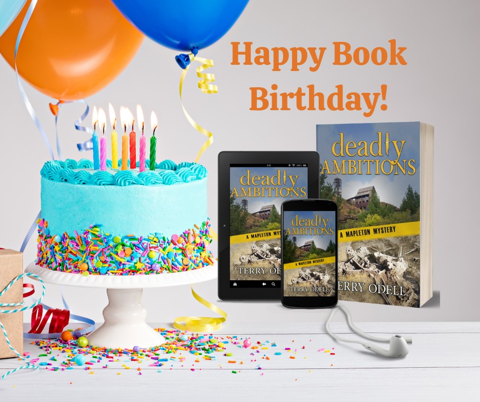 I hope you don’t mind if I indulge in a little BSP. It’s release day for Deadly Ambitions. Happy Book Birthday!
What’s it about?
Here’s the description:
Mapleton Police Chief Gordon Hepler is juggling a bitter town council candidate who refuses to accept election results and a new council member determined to cut his department’s funding, funding he needs to finance refresher training modules for his officers. Grant money is slow in coming.
Meanwhile, Angie’s diner remodel continues to suffer setback after setback. During the process, she uncovers an old journal. Her search for the girl who wrote it, along with the mysterious “Johnny” help keep her mind off the construction. Are the delays normal? Or are they personal?
When Angie’s in danger, Gordon must balance following the letter of the law with caring for his wife. Could there be a connection to the remodel? Or the journal? Or something else?
Does the threat to Angie come from history or from much closer to home?
I had a lot of fun—along with the sweat and frustration—writing the book. Fun because it was another in my Mapleton Mystery series, and I always enjoy spending time with the familiar characters.
Frustration because it’s always a challenge to keep things moving forward when I’m tempted to spend time chasing plot threads that entertain me, but aren’t needed for the story. In writing/researching Deadly Ambitions, I learned a lot about Colorado history along with Angie and Gordon.
Also, I wrote about health issues that (I hope) will sneak a little education into my readers, should they not already know about them. (No spoilers here.) And, I confess to taking some small pleasure in putting my own spin on some of the chaos of the ‘outside world.’ Justice might be hard to come by there, but in a book, I get to make sure it’s meted out.
Advance readers have given wonderful and positive feedback.
- “Her crisp writing paints a visual picture of the town and its workings, incorporating real world situations that readers can relate to.”
- “Odell does a skillful job of weaving in and out of the subplots to bring the reader to a satisfying, and somewhat surprising, resolution. A great read!”
- “Before you start reading, set aside some time because you will not want to put this book down. This Mapleton mystery grabs you from the start and just keeps getting better.”
- “A great addition to the series. This one is tough to put down and you have more than one mystery to solve. Will the diner ever get completed? How can it possibly be involved with the death of the ex-mayor? Or is it? Who is behind all of the mysteries?”
- “Deadly Ambitions drops the reader right into a small town cozy mystery complete with well-drawn characters, unexpected plot twists, and unidentified bones found in an abandoned mine. Personalities clash between Police Chief Hepler and local politicians, well balanced with a sweet love story as Angie’s bakery runs into construction delay after delay.”
Okay, and on with what the subject of the post says I’m supposed to be talking about.
Deadly Ambitions is available in three formats: ebook, trade paperback, and audio, which brings me to a pet peeve. I’ve seen far too many social media posts talking about Real Books.
They’re adamant in saying if it’s not printed on paper, it’s not real.
I say hogwash.
I spent months writing 85,000 words in the creation of Deadly Ambitions. Actually, a lot more of that before edits kicked in.
Then, when it was as good as I could get it, I published it as an ebook. After that, I adjusted formatting, changed front and back matter, and published those same 85,000 words in trade paperback format.
And, I hired the narrator who’s done all my Mapleton mysteries, and he read those same 85,000 words and created an audiobook.
Which one is real, I ask you?
Is my book club member who confesses to dyslexia not getting the same story when she listens to the audiobook? What about the person who has trouble holding a print book, or the one with vision problems who prefers a digital format she can manipulate to suit her eyes?
What do you think, TKZers? Does format matter? (And if you want a copy in the format of your choice, you can find them here)
New! Find me at Substack with Writings and Wanderings
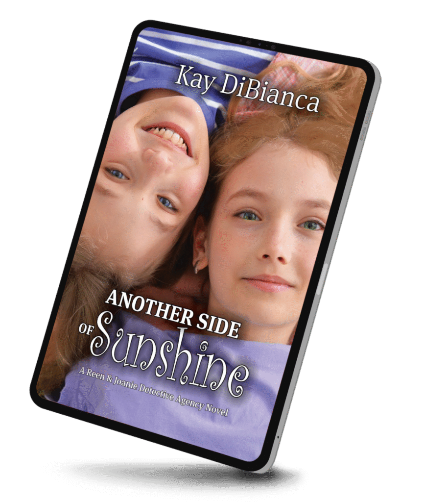
Deadly Ambitions
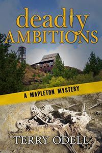 Peace in Mapleton doesn’t last. Police Chief Gordon Hepler is already juggling a bitter ex-mayoral candidate who refuses to accept election results and a new council member determined to cut police department’s funding.
Meanwhile, Angie’s long-delayed diner remodel uncovers an old journal, sparking her curiosity about the girl who wrote it. But as she digs for answers, is she uncovering more than she bargained for?
Now, Gordon must untangle political maneuvering, personal grudges, and hidden agendas before danger closes in on the people he loves most.
Deadly Ambitions delivers small-town intrigue, political tension, and page-turning suspense rooted in both history and today’s ambitions.
 Terry Odell is an award-winning author of Mystery and Romantic Suspense, although she prefers to think of them all as “Mysteries with Relationships.”

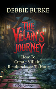 Is 2026 the year you want to learn to write fascinating villains and antagonists? Please check out Debbie Burke’s bestselling craft guide, The Villain’s Journey-How to Create Villains Readers Love to Hate.