Self-Publishing Words of Wisdom

Self-Publishing Words of Wisdom

Last September I gave a presentation on self-publishing at the Newport, Oregon Public Library, for the Coast Chapter of Willamette Writers. It was well-attended, and there were a lot of thoughtful questions asked by the engaged audience. One of my challenges was focusing on evergreen advice rather than tips for the passing moment. Digital self-publishing has seen a lot of changes since 2008. Gold rushes have come and gone, as have marketing fads. The market has matured. But, you can still make money, possibly pretty good money, perhaps even enough to live well on, and, as important, you can still reach readers directly.

With that in mind, this Saturday’s Words of Wisdom shares excerpts on self-publishing from past January Kill Zone posts. James Scott Bell gives timeless advice on succeeding as a self-publisher, while Joe Moore gives tips on editing yourself, and P.J. Parrish looks at giving your book covers a makeover. It is always a challenge being selective in choosing an excerpt, but especially today. All three posts are worth reading in their entirety, and I provide links to each below.

So what does all this mean for the indie writer, new and used experienced? Is the “gold rush” over? Is the sky falling?

First of all, just like in the Old West, the gold rush made scant millionaires. There were never going to be abundant strikes except for the few. If the gold rush in digital publishing ever was, it was irrelevant to the vast majority of authors.

Second, the key to making a living as a writer (subtle plug for my book of the same name), has not changed and will never change, because it’s always been the same!

To wit:

You have to write books that are good enough to get the people who read them to want to read more from you, and to recommend you to their friends and social circles.

It doesn’t matter how glitzy your marketing or how cleverly you try to game algorithms. You have to be good at what you do. Imagine that! You get rewarded for merit, not gamesmanship!

And that also goes for discoverability, a word that has overstayed its welcome and is too often used as a Cassandra cloak for expostulations of impending doom.

Phooey.

The indie writers I know who were making a living writing in 2013 were still making a living—and in most cases, a better one—in 2014.

I’ve noticed a few things they have in common:

  1. They know their craft.All the successful indie writers I know personally paid their dues back in the “trad old days.” They studied and wrote and sacrificed and wrote and submitted and got rejected and kept writing. They spent years getting good at what they do. When the trad publishing contracts started looking grim compared to what self-publishing offered, they jumped in with one or both feet. And they were ready.

So what does this mean for the newbie writer? It means that you must set your standards high and create what I call a grinder. You must set up a system that holds your writing feet to the fire, and makes you get better at your craft.

Early in my career I was fortunate to work with one of the best fiction editors in the business. He would send me long, single-spaced letters, ripping into my books at the plot, character, and style levels.

I feared those letters. I would place them unopened on the corner of my desk and just look at them for a few days. I had to work myself up into readiness. Finally, I would read them several times, highlight things with a felt-tip pen, and then take a few hours to recover. Then I’d start revising.

I also had to get rid of any chip on my shoulder. I had to be willing to make changes. Yes, on occasion there were things I fought for. But I came to realize that this editor knew his stuff, saw things I could not, and thus made me a better writer.

As a new author, you have to figure out a way to get this kind of grinding feedback, and be willing to dig in and work hard. Some time ago I listed a way to do that with beta readers and a professional editor. Look for it within this post.

James Scott Bell—January 11, 2015


The next type of editing is called line editing. Line editing covers grammar and punctuation. Watch for incorrect use of the apostrophe, hyphen, dash and semicolon. Did you end all your character’s dialogs with a closed quote? Did you forget to use a question mark at the end of a question?

This also covers making sure you used the right word. Relying on your word processor’s spell checker can be dangerous since it won’t alert you to wrong words when they are spelled correctly. It takes a sharp eye to catch these types of mistakes. Once you’ve gone through your manuscript and performed a line edit, have someone else check it behind you. A fresh set of eyes never hurts.

On-the-fly cut and paste editing while you were working on your first draft can get you into trouble if you weren’t paying attention. Leftover words and phrases from a previous edit or version can still be lurking around, and because all the words might be spelled correctly or the punctuation might be correct, you’ll only catch the mistake by paying close attention during the line edit phase.

The many stages of editing are a vital part of the writing process. Editing your manuscript should not be rushed or taken for granted. Familiarity breeds mistakes—you’ve read that page or chapter so many times that your eyes skim over it. And yet, there could be a mistake that you’ve missed every time because you’re bored with the old stuff and anxious to review the new.

Read your manuscript out loud, or better yet, have someone else read it to you. Mistakes and poor writing will become obvious.

Spend the time needed to tighten and clarify your writing until there is not one ounce of fat or bloat. And once you’ve finished the entire editing process, put the manuscript away for a period of time. Let it rest for a week or even a month if your schedule permits while you work on something else. Remember that indie publishing means that you set the deadline and pub date. Then bring it back out into the light of day and make one more pass. You’ll be surprised at what you missed.

Joe Moore—January 20, 2016


What I think we should pay attention to is:

  • Professionalism
  • Consistency of brand
  • Messaging

Professsionalism means you can’t get away with a lousy, cheap-looking cover. Because it yells in neon to a potential reader “I am an amateur!” This applies especially if you are just starting out. Like they used to tell us in “women’s magazines” — dress for the job you want, not the one you have. Don’t design your own cover unless you have solid graphic background and even then — GET INPUT! Would you edit your own story? No…you get beta-readers, you hire copy editors. (If you do edit your own books, you’re a fool). You might have to hire a pro to do this. There are lots of good ones out there. Please don’t skimp on this. Please.

Consistency of Brand means your books have to look alike. I don’t mean literally, but they have to all be of a kind so potential readers can immediately sense a unified brand.  All good authors do this. And periodically, they go back in and re-design their older books en masse to give them face lifts. Time for an object lesson….

My friend Neil Plakcy (a member of my old critique group) has been publishing his Golden Retriever mystery series for about ten years now. His books are a lot of fun (the dog helps solve the crime), light in tone, but also deal with some serious issues. (his hero did prison time for computer crimes.) Recently, Neil decided he needed a make-over.  The first line is before, the second line is after. Click to see enlarged.

What was wrong with the first ones? Inconsistency in type-faces. Type too small. The main important image (the dog!) was usually too small and static (the dog is just sitting or standing around mainly). No one compelling image for the eye to focus on. The pictures didn’t capture the books’ playful tone. Dull colors. And hard to find Neil’s name!

What is right with the second ones? The type is consistent and DOG is set bigger and in contrasting color to drive home the content in a glance. The subtitle “A Golden Retriever Mystery” is always the same size and in the same place. Neil’s name is consistent and authoritative. There is negative space for blurbs. And the dogs are so cute they make you want to adopt them. These covers look designed, not slapped together.

Disclaimer time: My sister Kelly designed the new covers. She does this as a side business and this is not an infomercial to get her work because I don’t want her attention on anything else but our stuff for now. But she and I also are redesigning our own back list covers.  And, I gotta tell you, it’s not been easy.

P.J. Parrish—January 1, 2019

***

Are you a self-publisher?

What evergreen tips do you have?

What constants do you see in self-publishing?

Evolution of a Book Title and Cover

by Debbie Burke

@burke_writer

A good title and cover can make a book. A bad title and cover can break a book.

That’s a lot of pressure. No wonder authors struggle so hard to get it right.

If you’re with a traditional press, those decisions are usually made by the publisher.

But, if you’re an indie author, the task of both title and cover fall on YOU.

Are you cracking under the weight of those responsibilities? I know I am so I checked the TKZ Library for guidance.

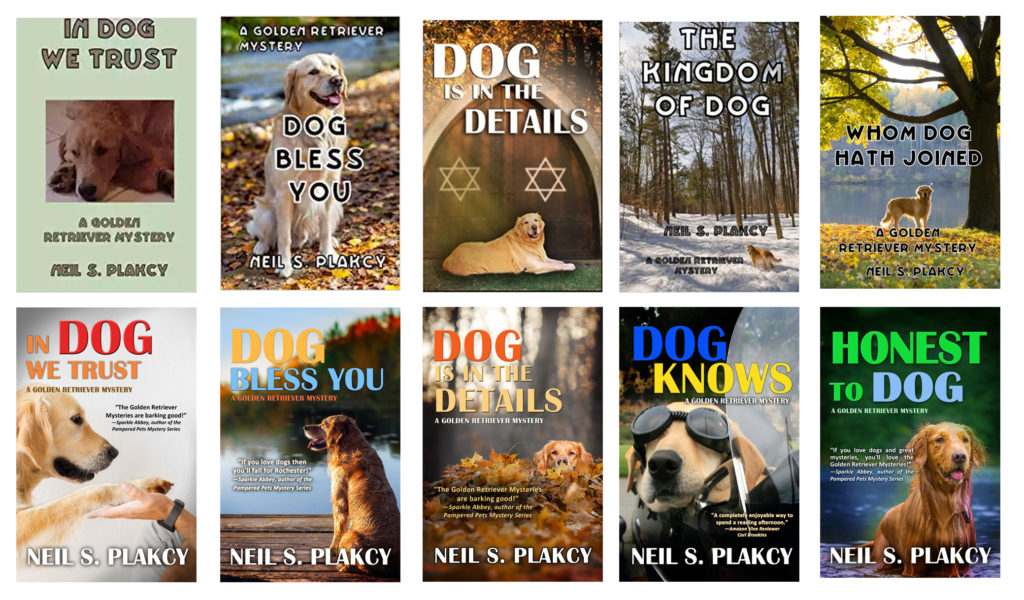
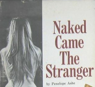
Several TKZers have posts about revamping covers after getting their rights back from the original publisher. Please check out the excellent information shared by Jordan Dane, P.J. Parrish, and Laura Benedict.

TKZ emeritus Nancy J. Cohen explores how to use covers to establish a brand.

Jim Bell offers invaluable advice on choosing a title.

With my fourth book coming out this summer, right now I’m deep into working on title choice and cover creation. I want to share the steps I’ve taken, not because I’m an expert, but because they demonstrate the mysterious, murky process of creative evolution.

My first book in the series, Instrument of the Devil, was traditionally published. They retained my title but nixed my cover idea. They offered several redesigns and, with my approval, decided on this:

I wasn’t in love with it but, hey, they paid me so they’re the boss.

Then, six months after publication, they shut down operations and I became an orphan.

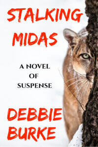
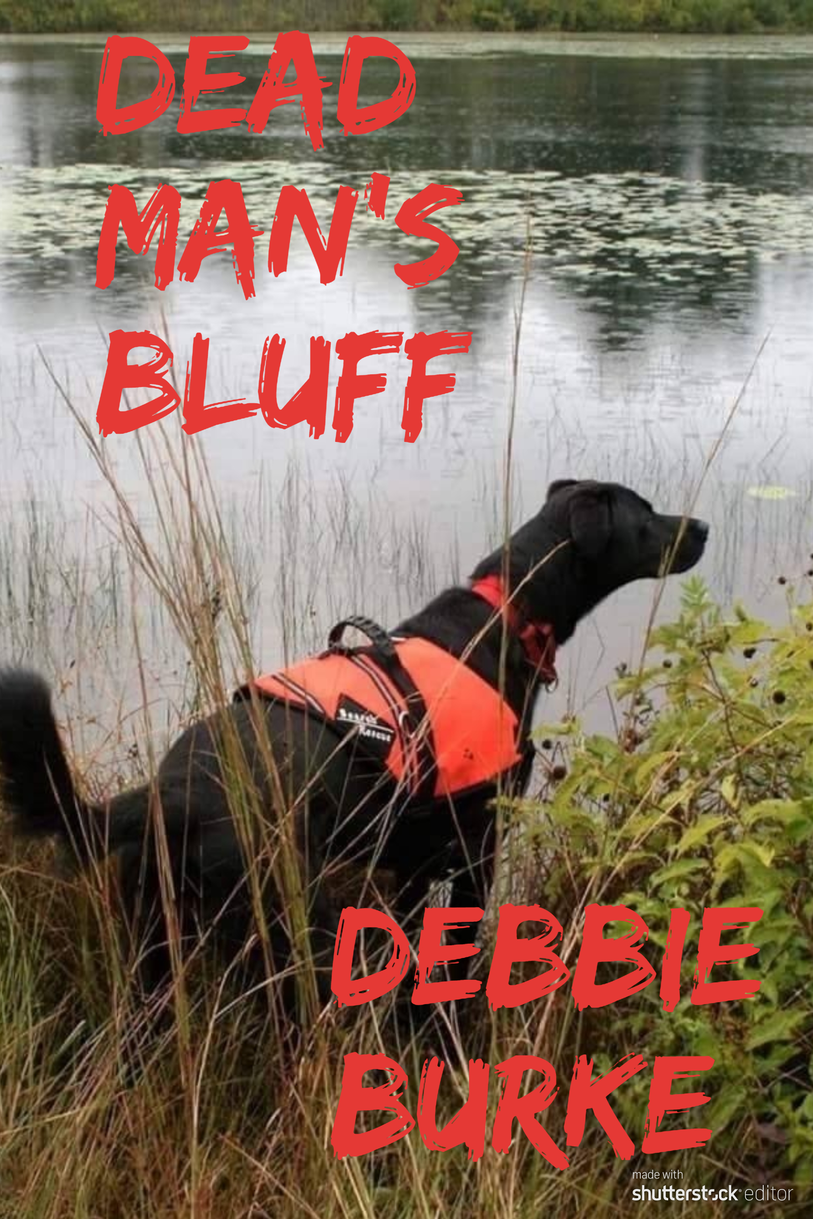
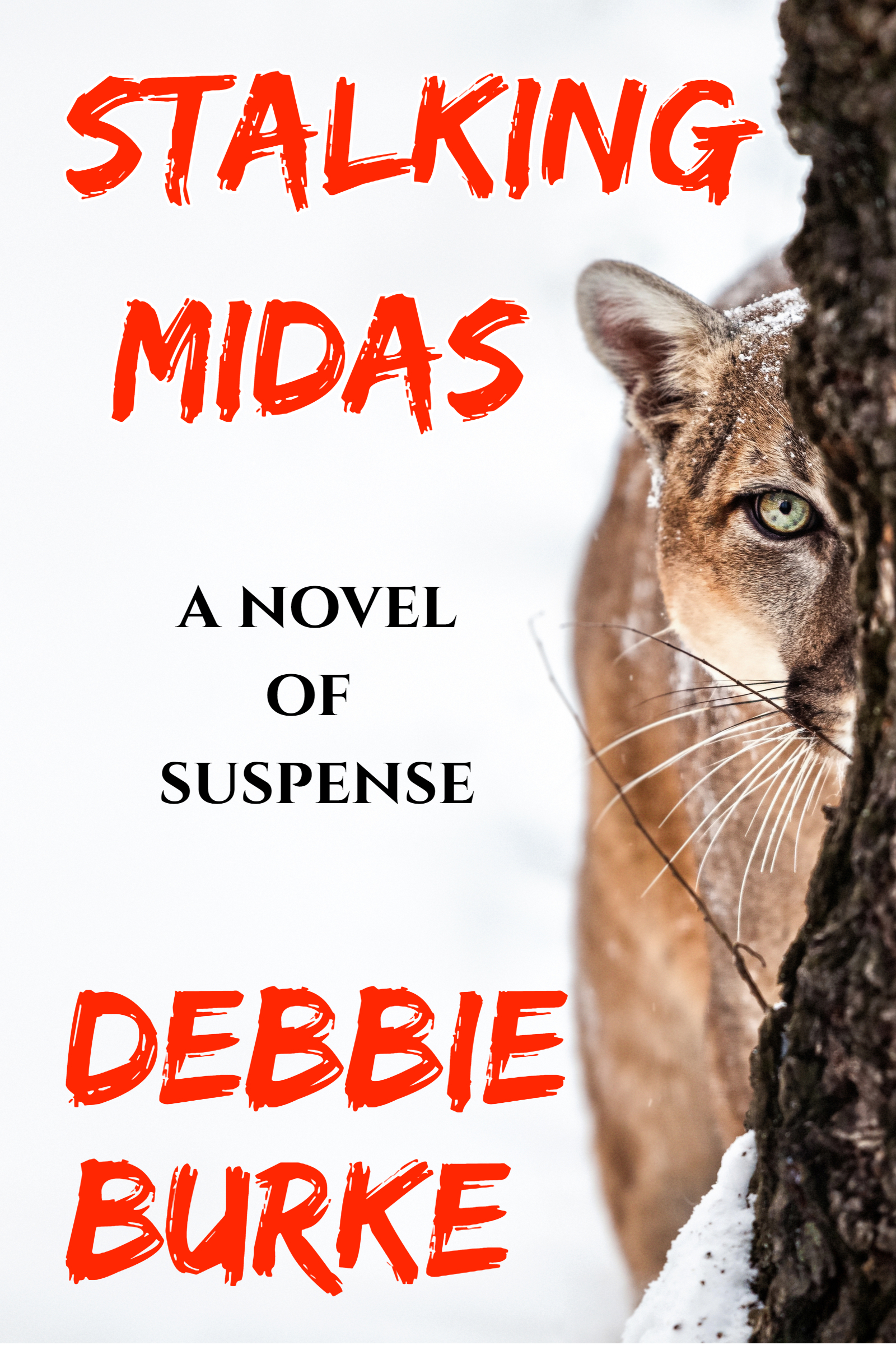
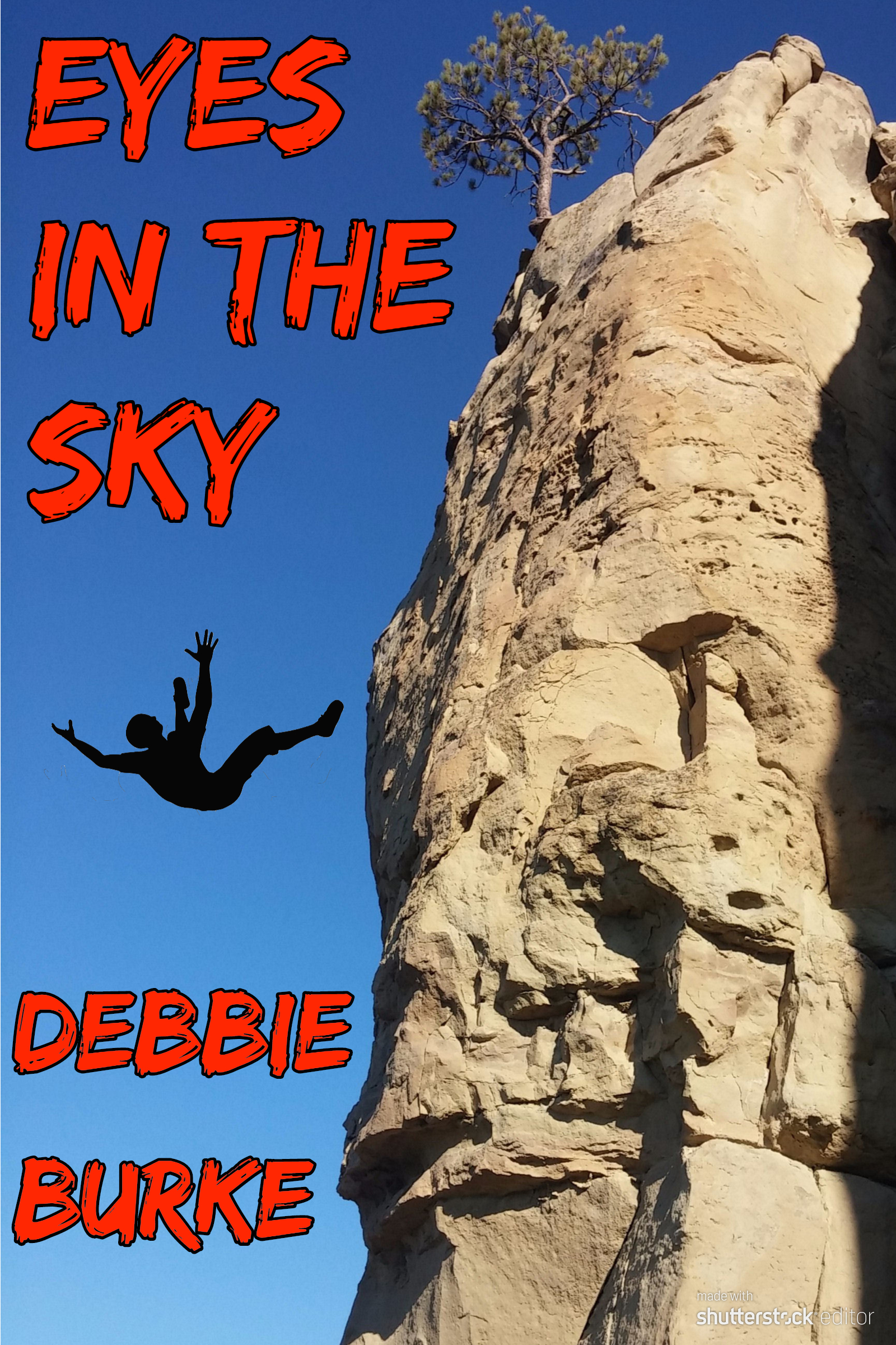
I decided to go indie and published the second book, Stalking Midas, in August, 2019, and the third, Eyes in the Sky, in January, 2020.


Publishing those two books taught me a lot but there were more lessons to be learned while wrestling with the unruly gorilla that was book #4.

Here’s a quick story summary:

Investigator Tawny Lindholm’s plans for a romantic Florida vacation with attorney Tillman Rosenbaum vanish when they’re caught up in Hurricane Irma. Tillman’s beloved high school coach, Smoky Lido, disappears into the storm, along with a priceless baseball card. Is he dead or on the run from a shady sports memorabilia dealer with a murderous grudge? During a desperate search in snake-infested floodwaters, Tawny becomes the bargaining chip in a high-stakes gamble. The winner lives, the loser dies.

Here are the realizations and steps along the twisty paths I followed to find a title and cover:

#1: I can’t do it alone.

The author is too close to the story, too enmeshed with the subplots, relationships, and minute details. Objectivity and distance are close to impossible to achieve.

Fortunately, I’m surrounded by a smart, supportive community of writers. They provide that much-needed objectivity and distance.

First, I asked the gang for title ideas.

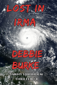
The working title was Lost in Irma, because the story is set in Florida during the 2017 hurricane that knocked out power to millions of people.

Lost in Irma was lame so I tried variations like Flight into Irma, Escape from Irma. Finally, a member of my critique group pointed out an obvious reason that “Irma” would never work for a thriller—it brings to mind the legendary humorist, Erma Bombeck. Well, duh, why didn’t I realize that? Because I lacked objectivity.

A title needs to convey the genre, main plot, subplots, and themes, all in a few select words. Pretty overwhelming, right? Let’s break the elements down, piece by piece, and see if any of them trigger ideas.

The genre is thriller. The main plot is the search for the missing man, Smoky. Subplots include difficulties caused by the hurricane, including power outages and cell phones that don’t work; gambling addiction; baseball; the troubled relationship between Tawny and Tillman; a teenager trying to teach her rambunctious pup how to be a search dog. The themes are friendship, loyalty and betrayal.

Now, how to combine them into a title?

Another critique buddy, an attorney, specializes in laser focus. She said: “Somehow you should convey there is a mystery to be solved and it happens in the middle of a hurricane.”

#2: Get out of the corner.

A five-day-long power outage underscored much of the story, resulting in these title ideas: The Long Darkness, Flight into Darkness, Time of Darkness.

Sometimes the mind gets stuck, fixated on a single idea, even if it’s a bad idea. I felt like a Roomba, trapped in a corner, bouncing off the same two walls, getting nowhere.

Another critique pal pointed out, while darkness is important to the story, it’s not relevant enough to include in the title.

She kicked my mental Roomba out of that corner and sent me in new directions.

More tries: Presumed Dead, Gamble in Paradise, No Escape. Still not there.

The McGuffin is a valuable stolen baseball card and another suggestion was to use the baseball motif: Foul Pitch, Curveball, Pinch Hitter. Still not there.

Another suggested using pivotal plot events, like the discovery of Smoky’s deserted, wrecked boat and the gruesome evidence the dog finds in the swamp. Those ideas didn’t yield good titles but merited consideration for cover art, described in #5 and #6 below.

#3: Many Brains are Better Than One.

Creativity feeds off imagination. The more imaginations at work, the more creativity thrives. It’s like shaking a bottle of carbonated beverage. Open that cap and watch what bubbles up.

My smart friends stimulated my imagination with their varied ideas. At last, a title bubbled up that says thriller and suggests the root of Smoky’s problems—gambling.

Dead Man’s Bluff

For now, I’m pleased with that unless something better comes along.

~~~

Finding the right cover image is every bit as hard as finding the right title.

Many authors hire a professional designer and that is often the wisest path. My experience with pros has been expensive and unsatisfying but that isn’t always the case. If I find an artist who’s the right match, great. For now, it’s DIY.

#4: The Author Can’t See the Obvious


I searched for images of Hurricane Irma. Here’s an early choice I sent to my critique group:

Several immediately shot back: “That looks like a breast with a nipple.” Just shows how blind an author can be, even when it’s right in front of her nose!


#5: Don’t Be Afraid to Experiment


There’s a lot of trial and error in this creative process. You need to learn what doesn’t work before you can recognize what does. Most experiments aren’t great.

Tried a color version here.

A bright, eye-catching picture but it did nothing to draw reader into the story. It was also too busy and hard to read.


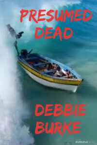
Next, I searched for images with people or objects tied to important plot developments.

After Smoky disappears, Tawny and Tillman find his wrecked boat, indicating he might have drowned while trying to make a getaway by sea. This photo seemed promising.


#6: People are Happy to Help

A subplot involves a Lab pup in training to be a search dog. He eagerly plunges into the swamp to search for the missing Smoky. Although he finds crucial evidence, he also screws it up, adding more complications to the story.

The dog angle became another avenue to explore. A friend put out a call to Search and Rescue (SAR) colleagues for photos of a dog working in water. SAR responded with many great pictures. These good folks were happy to help out a complete stranger. They didn’t even want payment. If I used their photos, their only request was acknowledgement of the SAR group, the dog, and the handler.

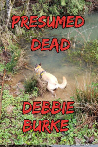
Photo courtesy of Sean Carroll, Clackamas County Sheriff Search and Rescue, OR


Here are a few dog samples:

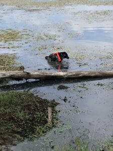
Photo courtesy of Steve Deutsch, Search One Rescue Team, Lewisville, TX

#7: Don’t Let Your Cover Mislead the Reader

I drafted several covers with dogs and sent them to the group. One woman made the astute observation that having a dog on the cover sent the message that it’s a dog story. She was dead on—while the subplot is important, it isn’t the main focus.

A cover shouldn’t mislead readers. If you raise their expectations for one type of book but it turns out to be another, they rightfully feel cheated.

Fortunately, that same woman sent a hurricane photo that caused bells to ring in my mind. More on that in a minute.

#8: Ask an Artist

Another writer pal is a gifted watercolor artist with an excellent eye. I sent her three samples. She patiently explained what worked and what didn’t and why.


The colorful wave and boat: “An image directly in the center of the frame is not as appealing as one off center; the imbalance creates a sense of movement or dynamics that a centered image does not.”


Photo courtesy of Kerrie Garges, Alpha K9 SAR, Bucks County, PA


She liked the offset title of the dog cover. However, the dog wasn’t a good choice as discussed in #7 above.


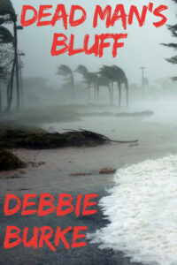
The windswept beach: “A Left to Right orientation appeals to me better than the R to L orientation on the shore design.”


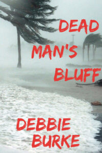
So, I flipped the photo to a mirror image of the original. Now the palm trees blew to the right. That required cropping a different area of the photo and rearranging the lettering. Yet, one subtle change of orientation made a big difference.


Then I remembered a different artist had made a similar suggestion about my third book, Eyes in the Sky. In the original photo, the cliff was to the left. She suggested flipping the image to put the cliff on the right to make it consistent with the design of the second book, Stalking Midas. Again, the objective outsider’s view looked past the author’s tunnel vision for a better solution.

Artists notice small details like photo orientation that authors may not. That might make the difference between a reader choosing your book or passing it by.

#9: Enlist a Focus Group

Once you have three or four polished contenders for cover finalists, it’s time to attract cold readers. How do you capture the interest of someone browsing in a bookstore (hope they reopen soon!) or scanning thumbnails of covers online?

Find a focus group. But how?

Seek out reading groups on social media. Become active and contribute to discussions in your genre. Then politely ask for their help. Post several sample covers and take a vote. Even better, connect the voting to a drawing for a free book when it’s published.

Locate avid readers among your friends, coworkers, neighbors, acquaintances from the gym, clubs, churches or temples, librarians, your kids’ teachers—anyone who loves to read.

Book clubs have been great supporters of my previous three books and are an ideal focus group. I sent emails to more than forty people with a brief plot summary and three sample covers–the boat, the dog, and the windswept beach–and asked them to vote for their favorite.

Votes came in overwhelmingly for the wind-swept palm trees on the beach—the same photo that had set off bells in my head. Their opinions confirmed my intuition that this hurricane photo captured the right mood and tone that accurately depicted the book.

An added benefit: the book club folks enjoyed being part of the creative process. “I love voting on the choices,” wrote one. Another said, “This is fun.” Several asked to be notified which cover won. I benefited from their valuable feedback and they’re eagerly anticipating the next book in the series. Win-win.

When people play a part in the mysterious, creative process of building a book, they become invested in the outcome.

Interested, engaged readers are treasures to an author.

#10: Embrace New Ideas. At this point, I’m satisfied the title and cover do a good job of conveying the genre, mood, and plot. But better ideas might still come along…maybe even from TKZers’ comments!

During the creative process, an author should remain open to suggestions, especially from readers. You don’t have to take them but always listen.

Control and autonomy are two major benefits of self-publishing. An indie author isn’t locked into anything until s/he hits the “Publish” button.

~~~

This sums up my process through the evolution of title and cover. When Dead Man’s Bluff is published this summer, readers will have the final vote.

The creative process is mysterious and highly individual. What I find helpful, you might find useless. There are no right or wrong ways, only ways that work for you.

Ultimately, it doesn’t matter how you start the evolution as long as you start it.

Get ideas flowing, no matter where they come from. What starts as a trickle may turn into a torrent that carries you to your goal.

~~~

TKZers: What makes a book cover appeal to you?

Do you have a system for choosing titles and/or cover designs?

~~~


To read a sneak preview of Dead Man’s Bluff, visit this link.

Can Slick Marketing Sell Bad Books?

by James Scott Bell
@jamesscottbell

Kris titled her post last week “Naked Came the Stranger,” and slyly didn’t give us the story behind the title. I’d like to do that now, because I well remember one of the most famous literary hoaxes in publishing history.

This was back in the 1960s, the halcyon days of big, trashy novels like Valley of the Dolls and The Love Machine. A Newsday reporter by the name of Mike McGrady, over drinks with some pals, posited that a novel with no social value and even less literary quality could sell, if it was about sex and had a titillating cover.

To prove it, he got a couple dozen of his newsroom colleagues (19 men and 5 women, including two Pulitzer Prize winners) to conspire to write a lurid tome. The simple concept was a housewife having a series of adulterous flings, one per chapter. As the New York Times put it in McGrady’s obituary, “She has sex with a mobster and sex with a rabbi. She has sex with a hippie and sex with at least one accountant. There is a scene involving a tollbooth, another involving ice cubes…” You get the picture. The conspirators wrote one chapter each, trying their darndest not to make the writing too good.

McGrady edited each chapter, blue-penciling anything even approaching a modicum of literary quality.

The project’s original title was Strangers In The Valley, a cross between Valley Of The Dolls by Jacqueline Susann and Strangers When We Meet by Evan Hunter. But a female colleague, Beulah Gleich, told McGrady that the title was no good. He asked why. She said it needed the word Naked. McGrady suggested The Naked Stranger. Gleich said that was too blatant, that the title should have “more class.” Well, you be the judge.

McGrady decided on the pseudonym “Penelope Ashe” and had his sister-in-law pose for the author photo. (On the back of the dust jacket, “Penelope Ashe” is described as a “demure Long Island housewife.”)

He then submitted it to publisher Lyle Stuart, known for “edgy” books. They accepted it (not knowing it was a hoax) and proceeded to design a salacious cover. If you want to see the entire cover (a rather oxymoronic term considering the context) you can go here. (The photo was purloined from a Hungarian magazine, and when the book became a phenomenon, the photographer and model demanded compensation, and got it.)

When Naked Came the Stranger hit the stores, the reviewers hit back. The Village Voice said the book was “of such perfectly realized awfulness that it will suck your soul right out of your brainpan and through your mouth, and you will happily let it go.”

It became an instant bestseller.

After the book reached the 20,000 sales mark, the hoaxers, perhaps feeling a collective pang of guilt, decided to come clean on The David Frost Show. So the joke was over, right?

Um, no. The book sold even faster, spending 13 weeks on the New York Times bestseller list. It has lifetime sales of over 400,000. Open Road Media has the pub rights now.

I remember my mom and dad laughing about all this while looking at a Life magazine story on the hoax, with a group photo of the co-authors. You can see that photo, along with some others (including one of the cigar-chomping McGrady) by going here.

Takeaways:

1. In the staid publishing world of the 60s and 70s, if a book was about sex, even if poorly written, slick marketing and a suggestive cover sometimes led to heaving, tumultuous, luminescent waves of febrile, smoldering, incandescent sales.

2. That may happen occasionally today, though it’s much more difficult, primarily because of the roiling sea of content now available.

3. If a book is not about sex and is poorly written, slick marketing and a great cover might drive some initial sales, but with a major drop off afterward. This will be of no help to an author’s career.

4. On the other hand, a really good book will always be held back by a bad cover. That will also be of no help to an author’s career.

5. So if you’re self-publishing, don’t skimp on covers. Where do you find designers? Check out 99Designs and this article by Joanna Penn.

6. A great book with a great cover, all other things being equal, is the best driver of what is far and away the most effective marketing: word-of-mouth.

7. Book after book following #4 is the only sure-fire way of building a writing career.

So, writer, don’t play fast and loose with a one-book stand. Commit to a quality relationship with your work, and take a vow to make that a life-long bond.

Okay, Zoners, let’s have your naked opinion. Don’t be a stranger.

Better Book Descriptions in 3 Easy Steps

By SUE COLETTA

Let’s be honest. Writing a book description isn’t fun. It’s grueling, mind-numbing work that I detest with every inch of my being. Mastering the art of back cover copy-writing is an important skill. Therefore, I’m always on the lookout for tips.

Saturday, I sat through yet another webinar on the topic, and a formula emerged, a formula that finally resonated with me (after 11 books, it’s about time). So, I figured I’d share my discovery with you, my beloved TKZers, in the hopes that it’ll work for you, as well.

I should preface this post with, do as I say, not as I do. After my Ah-ha! Moment, I now need to rewrite all my descriptions. Oy. I’d prefer a bullet to the brain.

A 3-Step Formula

Back cover copy follows a simple three-step formula, but we do have wiggle room to experiment. With readers’ short attention spans these days, the advice is to keep the entire description to roughly 150-200 words. If your description runs 25 words longer than the desired range, I wouldn’t sweat it too much.

Step 1: Headline/Hook

To find our hook we need to look at the main conflict of our story. We want readers to identify with said conflict, so don’t shy away from the emotional impact it causes the hero. Don’t dwell on it, either. Every word counts.

The following books sit on Amazon’s Top 10 Bestsellers List in Psychological Thrillers, and each description employs this exact formula. These authors worked hard on their hooks, and it shows.

What would it take to make you intervene? I Am Watching You by Teresa Driscoll 

It begins with a phone call. It ends with a missing child. Guilty by Laura Elliot

When family secrets are unearthed, a woman’s past can become a dangerous place to hide… Twist of Faith by Ellen J. Green

Every time Gwen closed her eyes, she saw him in her nightmares. Now her eyes are open, and he’s not going away. Killman Creek by Rachel Caine

They were all there the day your sister went missing. Who is lying? Who is next? The Reunion by Samantha Hayes

She’s a daughter he didn’t know he had. Until she calls him… from death row. 30 Days of Justis by John Ellsworth

What if you discovered your husband was a serial killer? Tell Me I’m Wrong by Adam Croft

Side note: Adam Croft is a master at hooking readers. This next book he wrote after he created the hook. What a doozy, too!

Could you murder your wife to save your daughter? Her Last Tomorrow by Adam Croft

Wow. Right? If that hook doesn’t grab fans of the genre, nothing will.

Step 2: Short Synopsis

The synopsis also follows a micro-formula…

  1. Introduce the protagonist by showing what defines their role in the story.
  2. What is that character up against?
  3. What’s standing in their way?
  4. Transition paragraph or as Kris called it in a 2014 post, “The Big But.”
  5. End with a cliffhanger.

Let’s go back to our examples to see if this micro-formula has merit. The red-bracketed numbers correspond to steps 1-5.

Synopsis of Her Last Tomorrow by Adam Croft

Nick and Tasha are a couple held together by their five-year-old daughter [1]. Until one ordinary morning, when Ellie vanishes amid the chaos of the school run [2].

Nick knows she can’t have gone far on her own, which can mean only one thing: she’s not on her own. Who would take his daughter, and why? With no motive and no leads, Nick is thrown into a tailspin of suspicion and guilt. Like Tasha, he doesn’t know what to think, or whom to trust… [3]

But then someone starts doing the thinking for him. Confronted with an impossible choice, Nick will have to make a decision, and both options will leave him with blood on his hands. But perhaps that’s to be expected. [4]

After all, Nick’s not quite as blameless as he seems. [5]

I Am Watching You by Teresa Driscoll

When Ella Longfield overhears two attractive young men flirting with teenage girls on a train, she thinks nothing of it—until she realises they are fresh out of prison and her maternal instinct is put on high alert.[1] But just as she’s decided to call for help, something stops her. The next day, she wakes up to the news that one of the girls—beautiful, green-eyed Anna Ballard—has disappeared. [2]

A year later, Anna is still missing. Ella is wracked with guilt over what she failed to do, and she’s not the only one who can’t forget. Someone is sending her threatening letters—letters that make her fear for her life. [3]

Then an anniversary appeal reveals that Anna’s friends and family might have something to hide. Anna’s best friend, Sarah, hasn’t been telling the whole truth about what really happened that night—and her parents have been keeping secrets of their own. [4]

Someone knows where Anna is—and they’re not telling. But they are watching Ella. [5]

Synopsis of Guilty by Laura Elliot

On a warm summer’s morning, thirteen-year-old school girl Constance Lawson is reported missing. [2]

A few days later, Constance’s uncle, Karl Lawson, suddenly finds himself swept up in a media frenzy created by journalist Amanda Bowe implying that he is the prime suspect. [1]

Six years later … [4]

Karl’s life is in ruins. His marriage is over, his family destroyed. But the woman who took everything away from him is thriving. With a successful career, husband and a gorgeous baby boy, Amanda’s world is complete. Until the day she receives a phone call and in a heartbeat, she is plunged into every mother’s worst nightmare. [3]

* * *

Even though Guilty played with the order, the description works. The formula still holds. Hence why I mentioned the wiggle room at the beginning of this post. *grin* Also note: some authors put their characters’ names and/or important details in bold, and the words catch the reader’s eye.

Step 3: Selling Paragraph

The selling paragraph answers two variations of the same question that readers ask themselves:

It sounds good, but how do I know it’s for me?

Sounds good, but will I like it?

There’s two ways we can go here, by showing similar books — if you enjoyed X, you will love Y — or by simply mentioning the genre.

A psychological thriller that keeps you guessing till the last chilling page.

If you like heart-hammering suspense, this book is for you!

A third option is to use clips of reader reviews or blurbs from authors in your genre.

CLEAVED by Sue Coletta


How far would you go to save your child?

CLICK HERE to look inside CLEAVED.


Over to you, TKZers. Do you use this formula for your book descriptions? If not, are you tempted to try it? Any tips of your own to share?

Judging A Book

by Boyd Morrison

I honestly don’t know how important covers are in the ebook age. A print book facing out in a store is designed to catch your eye so that you’ll pick it up and peruse the back cover summary, maybe check out a few pages of the writing. You’ll be able to see tiny details on the cover, as well as possible blurb. Here’s what my cover for THE ARK looks like at full size:


Now here it is at the size you’ll see when browsing the genre lists on Amazon:


Other than my name and the title, which you’ll see anyway next to the cover, you have a hard time making anything out besides the general color scheme. It gets a bit bigger once you click on it to go to the book’s Amazon page, but even at that size you can’t read the blurb. It’s mainly eye candy, to make the brain go, “Oooh, pretty!”

Of course, I’m not advocating putting out a book with a nondescript white cover. The cover will be used for promotional purposes, you’ll want to have it on your website, and it has to hold its own against the other ebooks that have covers. It also has to look professional. An amateurish cover or a poorly worded description are the quickest ways to convey the message that the contents inside haven’t been created with any care, either.

What I don’t know is how often the cover influences buying behavior. It would be fascinating for Amazon to show a simple list of titles and authors with a one-line description and see if that made any difference in which books readers gravitated toward. In fact, it would be interesting for Amazon to let an author craft a Tweet-sized logline to list under the cover, title, and author name.

At the very least, you want a cover that catches the attention of a reader who would like your type of book and accurately represents the story that a reader will find inside. If you are traditionally published, the publisher will design it for you, and you might get consultation on it. They may even listen to you if you object strongly enough to the concept.

If you’re a self-published author, don’t do it yourself unless you are a graphic designer. Slapping something together with Powerpoint will scream amateur. I highly recommend you find someone to do it for you, and there are several options.

The first option is to hire a freelance designer. For my two self-published books, I hired Kim Killion at Hot Damn Designs to create covers that have a similar branding theme since they’re both in the Tyler Locke series. She’s easy to work with, quick, and charges very reasonable prices. Using stock photography, she has produced covers for Allison Brennan, T. Jefferson Parker, and Larry Bond, as well as scores of romance authors. Here are the two covers she designed for me on the left next to their UK counterparts on the right:


I think Kim’s covers are just as good as the British covers, and I highly recommend working with her. There are plenty of other cover designers out there, but make sure you check out their portfolios and get references before working with them.

Another option is a site called Designcrowd. The concept is interesting, although I haven’t tried it myself. You submit a project (such as a book cover) along with a price you are willing to pay and a deadline for submissions. Graphic designers from around the world then submit ideas to you on spec, and you can choose the best one (or none at all if you don’t like any of the choices). I’ve looked at some of the portfolios, and there are some very creative designs in the submissions. If you’re looking for a more unusual design or an illustration that doesn’t have photos in it, Designcrowd might be a good way to go.

I’m sure self-publishers would love to know what other choices are out there. Are there any additional recommended options for cover creators?

The Fine Art of Tooting Your Own Horn, and a Word About Covers

James Scott Bell


Here at TKZ we sometimes joke about “shameless self-promotion.” We greatly appreciate the good rapport we have with our readers, and you all know we are not here just to plug our stuff. But you also understand that we’re working writers who blog, in part, so we can tell you about our new releases when they occur. 
Every writer has to do it. Publishers and agents demand it. If you’re self-publishing, you can’t survive without some form of social media and self-promotion.
Yet many authors feel uncomfortable tooting their own horns. Let me assuage that discomfort. 
Self-promotion need not be “shameless,” and indeed can be a benefit to all, if you remember one simple thing: the Law of Reciprocity. This law holds that when you offer something of value to another, they are much more likely to give something in return.
In social media, for example, the Law of Reciprocity is golden. Many an author makes the mistake of thinking social media is about marketing. In reality it’s about relationships. You build those slowly, through actual engagement, and not  by stringing together a bunch of posts that are little more than “buy my stuff” pleadings.
For a couple of years I’ve monitored some authors on Twitter who make a fundamental mistake. Thinking it’s just a “numbers game,” they hit the Twitterverse with thinly veiled sales pitches, over and over and over. Is that value?
Sometimes I see virtual begging. “Please RT this! Please!” But why would I do that if I don’t see any value in it? Why would I want to send that along to my own network?
I note that these methods have not helped their sales. (The books themselves probably have something to do with it, but I’ve not been interested enough to read one.)
On the other hand, some authors (Joseph Finder comes to mind) do it right, giving us interaction, interesting links, a laugh or two and so on. When he announces a new release, he’s earned trust. I’m happy to hear about it.
So think reciprocity. Give, and you will receive. Don’t just toot your own horn, make some music with it.
I’ll have multiple releases this year—traditional, self-published, short form. What I’d like to do here is turn those into occasions to offer something to writers. I’ll focus in on an aspect of the craft that went into the work, or maybe a bit of backstory about how a particular story sprang to life. Whatever seems apt.
Today, announcing the release of Book #2 in my Mallory Caine, Zombie-at-Law series (written as K. Bennett), I’d like to talk about covers. Take a look at this honey for The Year of Eating Dangerously:

Now that is one beautiful cover. This is what a traditional publishing house like Kensington has going for it—hugely talented designers who do this for a living. The tagline: More Demons, Less Filling, is also brilliant. A designer and a copywriter worked in tandem to produce this stunner.
It does what a cover should do: it feels like a visual representation of the tone of the book. That is not an easy thing to accomplish. And here I must say a word to all you self-publishers:
Do not skimp on your cover art! Spend money and hire someone who knows what they’re doing. In this digital age there is an expanding number of people who can design you a nice cover. Find them. Get recommendations. Look at their portfolios. Get a quote from them. And then do the following:
1. Give them an idea of how you want the cover to look. You do this by going on Amazon or Barnes & Noble and looking for covers in your genre. You collect a number of these that resonate with you and put them into a PDF to send them to your designer.
2. Provide the cover artist with a short squib about your book. Most of the time this should be the book description that you’ve written, just like a copywriter (another fine art I’ll talk about sometime).
3. Ask for a deal that includes at least a revision and a polish. You use the revision to clear up any misconceptions or things you don’t like. The polish is the fine tuning aspect. Try to negotiate this as part of the fee.
4. How much should you pay? There are artists all over the map, but generally between $200 – $400. I know about one poor fellow who spent $2,000 on a cover, which did not look worth it at all. Be very careful about assessing the worth of your artist.
5. If you have several books being readied, ask the cover designer for a package deal and a discount.
Now, there are some of you out there who have design talent, and know how to use photo and illustrator programs, who might want to Do-it-Yourself. If so, let me encourage you to put your cover through as rigorous a design process as you put your book through a revision process. Get feedback from people. Do two or three designs of your cover and have people select which one they like best.
Also: be sure your book cover has the dimensions of a physical book. It shouldn’t look square and squat like this:

And can you see another major mistake? Your cover should not have the word “by” in front of your name.
Instead, your cover should look like this:

So there you have it. Toot your own horn and add value doing so, and you’ll never be an unwelcome guest.

As for covers, if you’re traditionally published, how have you liked yours? How much input did your publisher give you?
If you’re self-published, what have you done to get good covers for your books? What did it cost you?

Judging a Book by its Cover

by Michelle Gagnon

There was an interesting piece in last week’s New York Times on the transition back to so-called “gilded covers.” It confirmed a theory that I’ve had for a few years now. Despite the gloomy predictions of prognosticators, I don’t believe that hardcover novels are facing extinction. For one thing, libraries will always need hardier books to loan out. However, I do think that as eReaders become increasingly prevalent, hardcovers print runs will be dramatically reduced. Not phased out entirely, but the vast majority of books will be released in trade paperback form. The hardcovers that are produced will predominantly be special limited editions. More care will go into cover design and production, from the paper quality to the font to the dust jackets. And chances are that the price will increase as a result, since you’ll be paying for something a bit more special.

Currently, hardcover novel sales are being hit hard. As of September, hardcover sales had declined 25% for the year. Meanwhile, eBook sales rose 161%. Total eBook sales are forecast to reach $10 billion dollars by 2016, and thus far Kindle sales have outpaced Amazon’s rosiest predictions for the Christmas season. Mass Market paperbacks are being phased out more rapidly than anticipated, and many publishers are switching even consistently bestselling novelists to trade paperback rather than hardcover releases.

And let’s be honest– hardcover book sales should be dwindling. Now, before all you fans of “real” books, who extol, “the weight of it in my hands, the smell of ink on paper” jump all over me, hear me out.

Recently I was standing in my father’s library, poring over his collection. He’s always been an avid reader, and he has a stunning collection of leather bound books. Books that are truly works of art, and an experience to read. Books with soft vellum paper and calfskin bindings; books that really do have a special smell and feel to them.

Compare that to my collection of hardcovers. The vast majority of them don’t merit the same level of adulation. The truth is, most are just as mass-produced as MMPs. They’re heavy, cumbersome, printed on relatively cheap paper with cardboard covers and a dust jacket. Honestly, few are dramatically nicer than a trade paperback. By and large, those books don’t look stunning lined up on my shelf.
So given a choice, why would I spent $20-30 for a book that, content-wise, I can enjoy on my Kindle for half that price?
I would, however, pay a bit more for something that was special.

Publishers are finally coming around to that realization. The NY Times piece discusses recent hardcover releases that included special touches. Haruki Murakami’s latest novel 1Q84 features a “translucent jacket with the arresting gaze of a woman peering through.” Based on the book’s impressive sales so far, which has been the reverse of most books, (95,000 hardcover as opposed to a mere 28,000 in eBooks), investing in exquisite covers can help print sales.

The irony of this for me is that for the first time next year, my books will start appearing in hardcover form. Given the current sales climate, I’m nervous about shifting formats at this stage. However, I do think that we have an amazing cover, and hopefully the rest of the production quality will match up to it.