
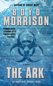
I honestly don’t know how important covers are in the ebook age. A print book facing out in a store is designed to catch your eye so that you’ll pick it up and peruse the back cover summary, maybe check out a few pages of the writing. You’ll be able to see tiny details on the cover, as well as possible blurb. Here’s what my cover for THE ARK looks like at full size:
Now here it is at the size you’ll see when browsing the genre lists on Amazon:
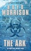
Other than my name and the title, which you’ll see anyway next to the cover, you have a hard time making anything out besides the general color scheme. It gets a bit bigger once you click on it to go to the book’s Amazon page, but even at that size you can’t read the blurb. It’s mainly eye candy, to make the brain go, “Oooh, pretty!”
Of course, I’m not advocating putting out a book with a nondescript white cover. The cover will be used for promotional purposes, you’ll want to have it on your website, and it has to hold its own against the other ebooks that have covers. It also has to look professional. An amateurish cover or a poorly worded description are the quickest ways to convey the message that the contents inside haven’t been created with any care, either.
What I don’t know is how often the cover influences buying behavior. It would be fascinating for Amazon to show a simple list of titles and authors with a one-line description and see if that made any difference in which books readers gravitated toward. In fact, it would be interesting for Amazon to let an author craft a Tweet-sized logline to list under the cover, title, and author name.
At the very least, you want a cover that catches the attention of a reader who would like your type of book and accurately represents the story that a reader will find inside. If you are traditionally published, the publisher will design it for you, and you might get consultation on it. They may even listen to you if you object strongly enough to the concept.
If you’re a self-published author, don’t do it yourself unless you are a graphic designer. Slapping something together with Powerpoint will scream amateur. I highly recommend you find someone to do it for you, and there are several options.
The first option is to hire a freelance designer. For my two self-published books, I hired Kim Killion at Hot Damn Designs to create covers that have a similar branding theme since they’re both in the Tyler Locke series. She’s easy to work with, quick, and charges very reasonable prices. Using stock photography, she has produced covers for Allison Brennan, T. Jefferson Parker, and Larry Bond, as well as scores of romance authors. Here are the two covers she designed for me on the left next to their UK counterparts on the right:
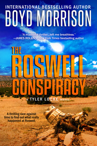
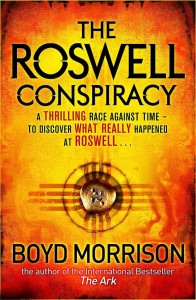

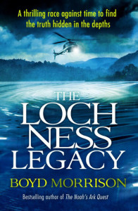
I think Kim’s covers are just as good as the British covers, and I highly recommend working with her. There are plenty of other cover designers out there, but make sure you check out their portfolios and get references before working with them.
Another option is a site called Designcrowd. The concept is interesting, although I haven’t tried it myself. You submit a project (such as a book cover) along with a price you are willing to pay and a deadline for submissions. Graphic designers from around the world then submit ideas to you on spec, and you can choose the best one (or none at all if you don’t like any of the choices). I’ve looked at some of the portfolios, and there are some very creative designs in the submissions. If you’re looking for a more unusual design or an illustration that doesn’t have photos in it, Designcrowd might be a good way to go.
I’m sure self-publishers would love to know what other choices are out there. Are there any additional recommended options for cover creators?
I have no cover design recs, but the cover of a book is still of critical importance to me. That’s my first and instantaneous book-screening tactic. There are certain rule outs I look for on a cover (purely due to my reading preferences) that the second I see them on the cover, I immediately move on to the next book. That enables me to scan a lot of thumbnails in a short time (probably eliminates 80% (conservative) of the thumbnails.
After that, I’m looking to see what cover designs look interesting and reveal a possible setting and storyline that might hold my attention. That’s when I go to reading blurbs.
A good book cover is absolutely crucial I feel. I DO judge a book by its cover, especially if I don’t know the author. For authors I know and love, I actually don’t care that much: I know I’m going to get a good read. So, for new authors, or established authors trying to gain new readers, a great book cover is a must. It must be ‘eye candy’, like you say Boyd, but must also reflect the book genre. Your books and titles scream ‘action, adventure, thriller’. It would be a tad disappointing to pick them up and discover some kinda steamy romance with bondage elements 😉
I also thoroughly agree with your statement that unless you are a graphic designer, hire a professional.
I contacted several designers, got quotes, and finally settled on Streetlight Graphics. They’re a husband-wife team who are rapidly expanding. They also did my website and formatting (ebook + print).
http://streetlightgraphics.com/#!/portfolio/
Well, since you asked, Boyd!
My sister Kelly has a side business designing covers, trailers and ads. She’s very reasonable. Here’s her site:
http://www.ezbookcovers.com/
And I really like your covers. They are eye-catching and have a good branding look.
I am probably in the minority, or, at the very least, go against the so-called conventional wisdom (which often is neither) but a cover makes no difference to me whatsoever. Part of the reason for this, I am sure, is my color-blindness. However, I find most hardcover covers to be generic, for all intents and purposes. The one exception: Hardcase Crime, whose paperback and hardcover book covers harken back to the Gold Medal paperbacks and are each and all memorable.
Titles really resonate with me. Cover graphics do the trick, too. If I find the graphic off-putting, I’ll pass the book by. More often, I’ll check the book out when the graphic is appealing. I’m always looking for that special little spark.
Think of the cover as your first hook. The traditional thought is the first line is the hook, but if readers don’t pick up or click on the book to begin with, then they never get to the first line, page, etc. Joe H notwithstanding, most people pick up/click on covers that intrigue them, then read the back cover copy/e-book description, and maybe a few pages, and then decided whether or not to purchase it. So even if there are no empirical studies of plain white covers with a line or two of descriptions vs traditional thumbnails, I would bet money that the trad covers would trounce the plain white every time. A little while back PJ Parrish did an excellent column – with some doozy examples of what not to do – on e-book covers. It might be worth a look for you. I do like you idea of the Twitter-length blurb underneath the thumbnail.
For me the cove is critical whether it is a tree book or an ebook. I might know the title, but likely I read it on the thumbnail. I’ve noticed that a lot of graphic designers don’t seem to understand that contrast (light v dark) is critical for a thumbnail to attract. They are still designing for the tree books.
Pick a page at Amazon (here’s one http://www.amazon.com/s/ref=nb_sb_noss_1?url=search-alias%3Daps&field-keywords=mysteries&rh=i%3Aaps%2Ck%3Amysteries) and look at the covers. Which attracts, which are easy to read? Which style do you want to represent your efforts to bring a book to birth?
I never got the idea behind putting a blurb on the front cover. I mean, if I’m interested enough in a book to start reading, I’m interested enough to flip it over or read the description.
The only thing front cover blurbs do for me is clutter.
So, I’m very happy ebooks make covers go back to the essentials: Author, title, cover image (that works as a thumbnail, your example in the aticle is actually great in that regard).
I think covers matter enormously – I am certainly drawn to something dramatic and effective when it comes to book covers. Thanks for the info on designers for ebook covers.
All but one of my novels have been done through pro artists who saw my self-made covers and had pity on me by doing a really affordable good looking cover that include elements of the story. They also include a feel for the military thriller genre and the tension in the stories.
65 Below and Faithful Warrior were made by Jerry Scullion of Scullion Designs.
My latest novel Midnight Sun was done my friend Andy Nyman of Brun Media Produktion. That one I actually had a vote for on facebook. Andy made several versions and I made a few, and his designs were unanimously preferred over mine. Go figure.
The rest of my books and short stories the covers are my own design some okay, and one or two I think were pretty good.
I definitely think having a quality cover is of utmost importance when it comes to marketing your product, it is the face of you to the public.
Kim did my design for the ebook edition of Keeper of the Rings. She does a great job. I think covers are critically important for selling ebooks, same as print books on the library or bookstore shelves.