
by Debbie Burke
A good title and cover can make a book. A bad title and cover can break a book.
That’s a lot of pressure. No wonder authors struggle so hard to get it right.
If you’re with a traditional press, those decisions are usually made by the publisher.
But, if you’re an indie author, the task of both title and cover fall on YOU.
Are you cracking under the weight of those responsibilities? I know I am so I checked the TKZ Library for guidance.
Several TKZers have posts about revamping covers after getting their rights back from the original publisher. Please check out the excellent information shared by Jordan Dane, P.J. Parrish, and Laura Benedict.
TKZ emeritus Nancy J. Cohen explores how to use covers to establish a brand.
Jim Bell offers invaluable advice on choosing a title.
With my fourth book coming out this summer, right now I’m deep into working on title choice and cover creation. I want to share the steps I’ve taken, not because I’m an expert, but because they demonstrate the mysterious, murky process of creative evolution.
My first book in the series, Instrument of the Devil, was traditionally published. They retained my title but nixed my cover idea. They offered several redesigns and, with my approval, decided on this:
I wasn’t in love with it but, hey, they paid me so they’re the boss.
Then, six months after publication, they shut down operations and I became an orphan.
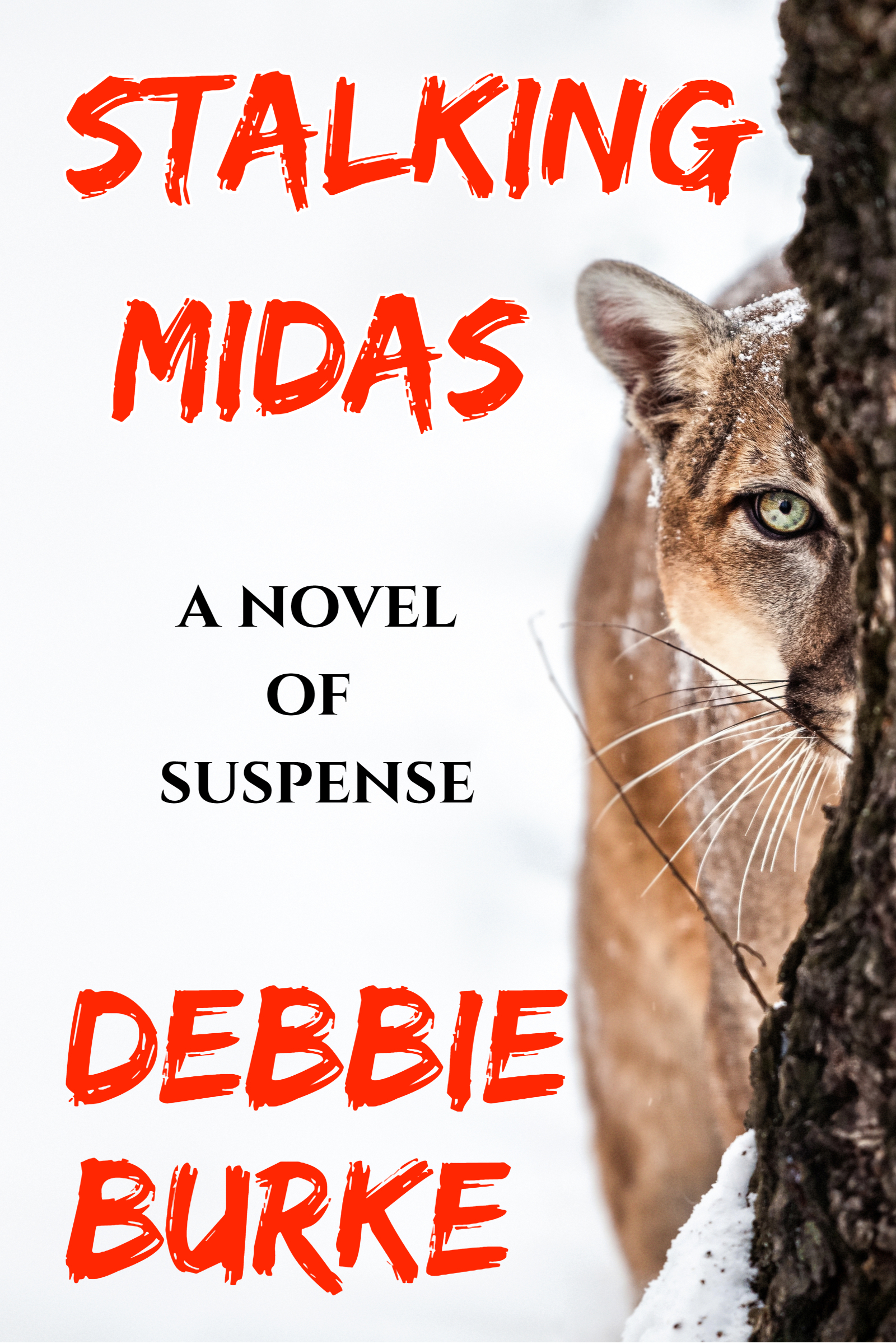
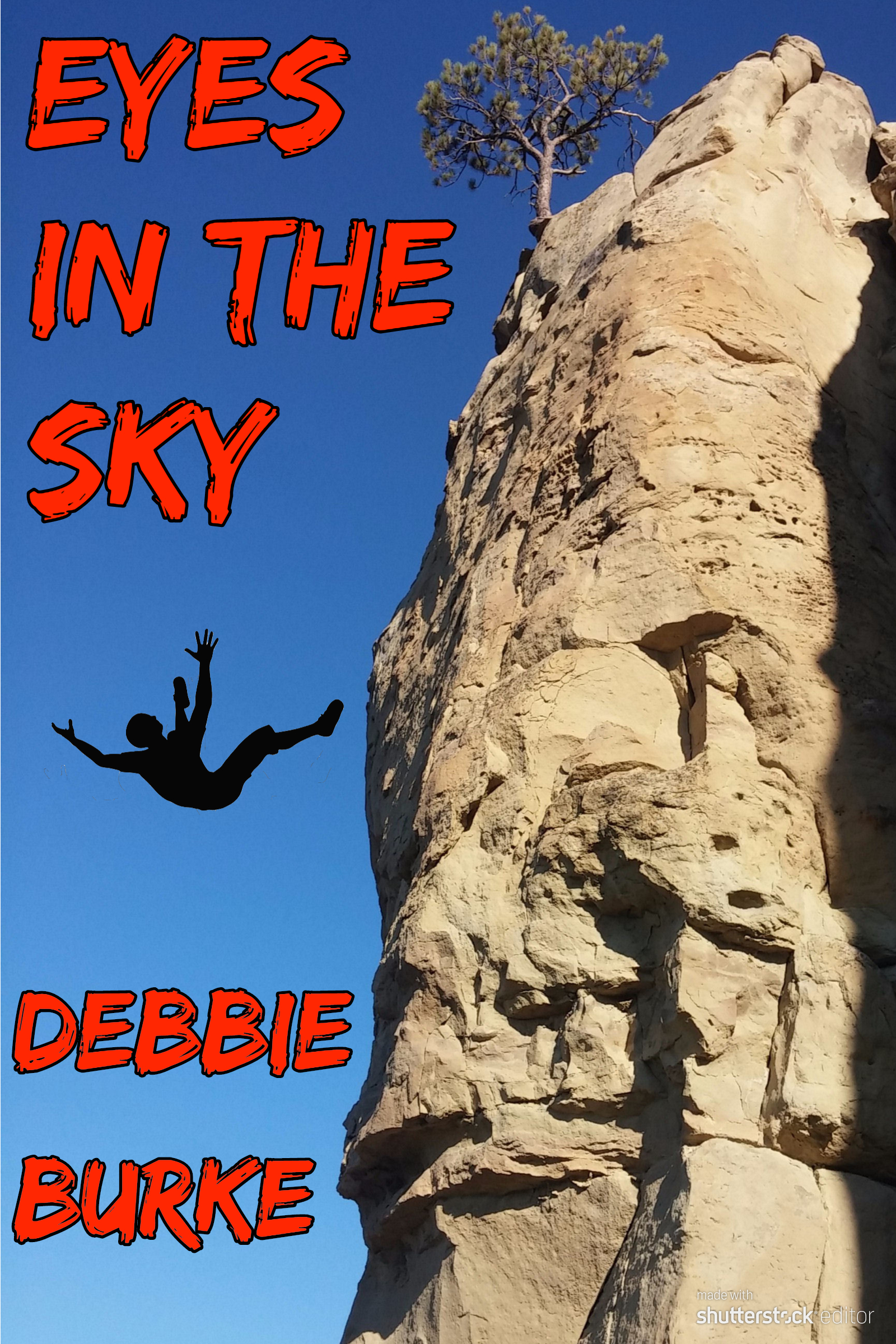
I decided to go indie and published the second book, Stalking Midas, in August, 2019, and the third, Eyes in the Sky, in January, 2020.
Publishing those two books taught me a lot but there were more lessons to be learned while wrestling with the unruly gorilla that was book #4.
Here’s a quick story summary:
Investigator Tawny Lindholm’s plans for a romantic Florida vacation with attorney Tillman Rosenbaum vanish when they’re caught up in Hurricane Irma. Tillman’s beloved high school coach, Smoky Lido, disappears into the storm, along with a priceless baseball card. Is he dead or on the run from a shady sports memorabilia dealer with a murderous grudge? During a desperate search in snake-infested floodwaters, Tawny becomes the bargaining chip in a high-stakes gamble. The winner lives, the loser dies.
Here are the realizations and steps along the twisty paths I followed to find a title and cover:
#1: I can’t do it alone.
The author is too close to the story, too enmeshed with the subplots, relationships, and minute details. Objectivity and distance are close to impossible to achieve.
Fortunately, I’m surrounded by a smart, supportive community of writers. They provide that much-needed objectivity and distance.
First, I asked the gang for title ideas.
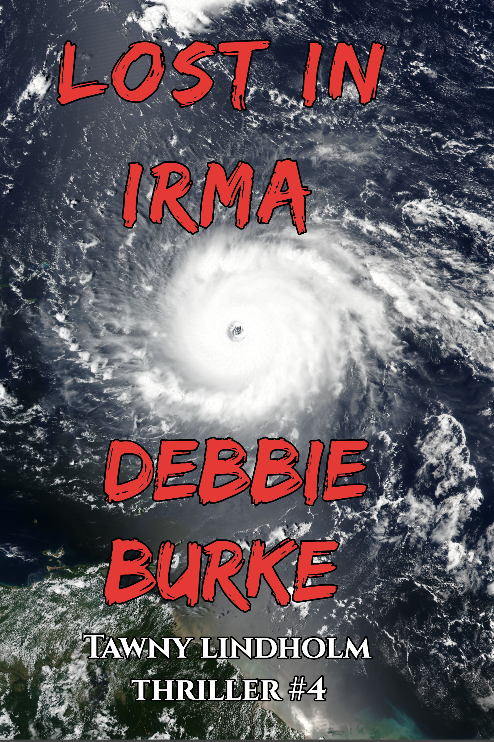
The working title was Lost in Irma, because the story is set in Florida during the 2017 hurricane that knocked out power to millions of people.
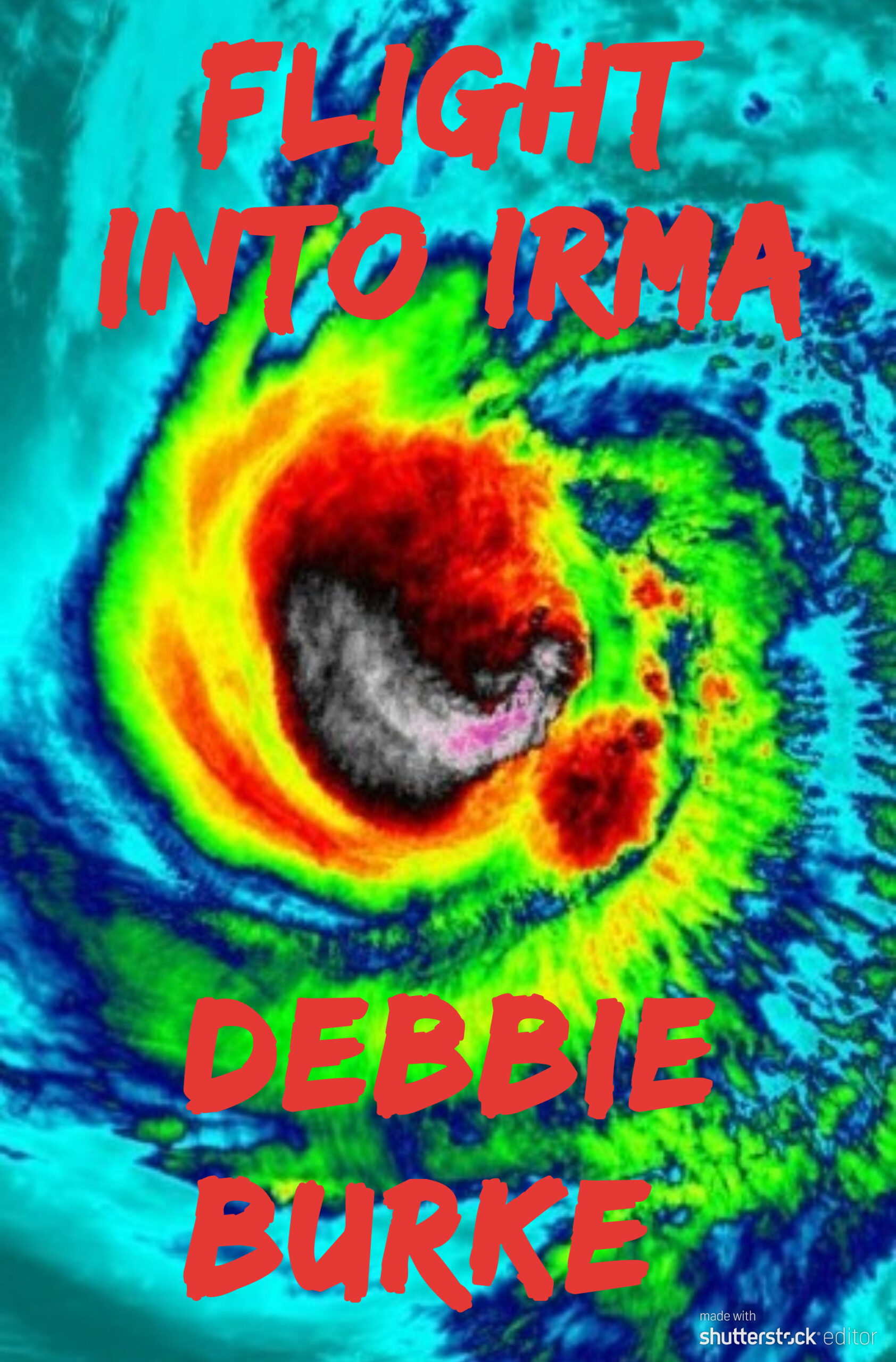
Lost in Irma was lame so I tried variations like Flight into Irma, Escape from Irma. Finally, a member of my critique group pointed out an obvious reason that “Irma” would never work for a thriller—it brings to mind the legendary humorist, Erma Bombeck. Well, duh, why didn’t I realize that? Because I lacked objectivity.
A title needs to convey the genre, main plot, subplots, and themes, all in a few select words. Pretty overwhelming, right? Let’s break the elements down, piece by piece, and see if any of them trigger ideas.
The genre is thriller. The main plot is the search for the missing man, Smoky. Subplots include difficulties caused by the hurricane, including power outages and cell phones that don’t work; gambling addiction; baseball; the troubled relationship between Tawny and Tillman; a teenager trying to teach her rambunctious pup how to be a search dog. The themes are friendship, loyalty and betrayal.
Now, how to combine them into a title?
Another critique buddy, an attorney, specializes in laser focus. She said: “Somehow you should convey there is a mystery to be solved and it happens in the middle of a hurricane.”
#2: Get out of the corner.
A five-day-long power outage underscored much of the story, resulting in these title ideas: The Long Darkness, Flight into Darkness, Time of Darkness.
Sometimes the mind gets stuck, fixated on a single idea, even if it’s a bad idea. I felt like a Roomba, trapped in a corner, bouncing off the same two walls, getting nowhere.
Another critique pal pointed out, while darkness is important to the story, it’s not relevant enough to include in the title.
She kicked my mental Roomba out of that corner and sent me in new directions.
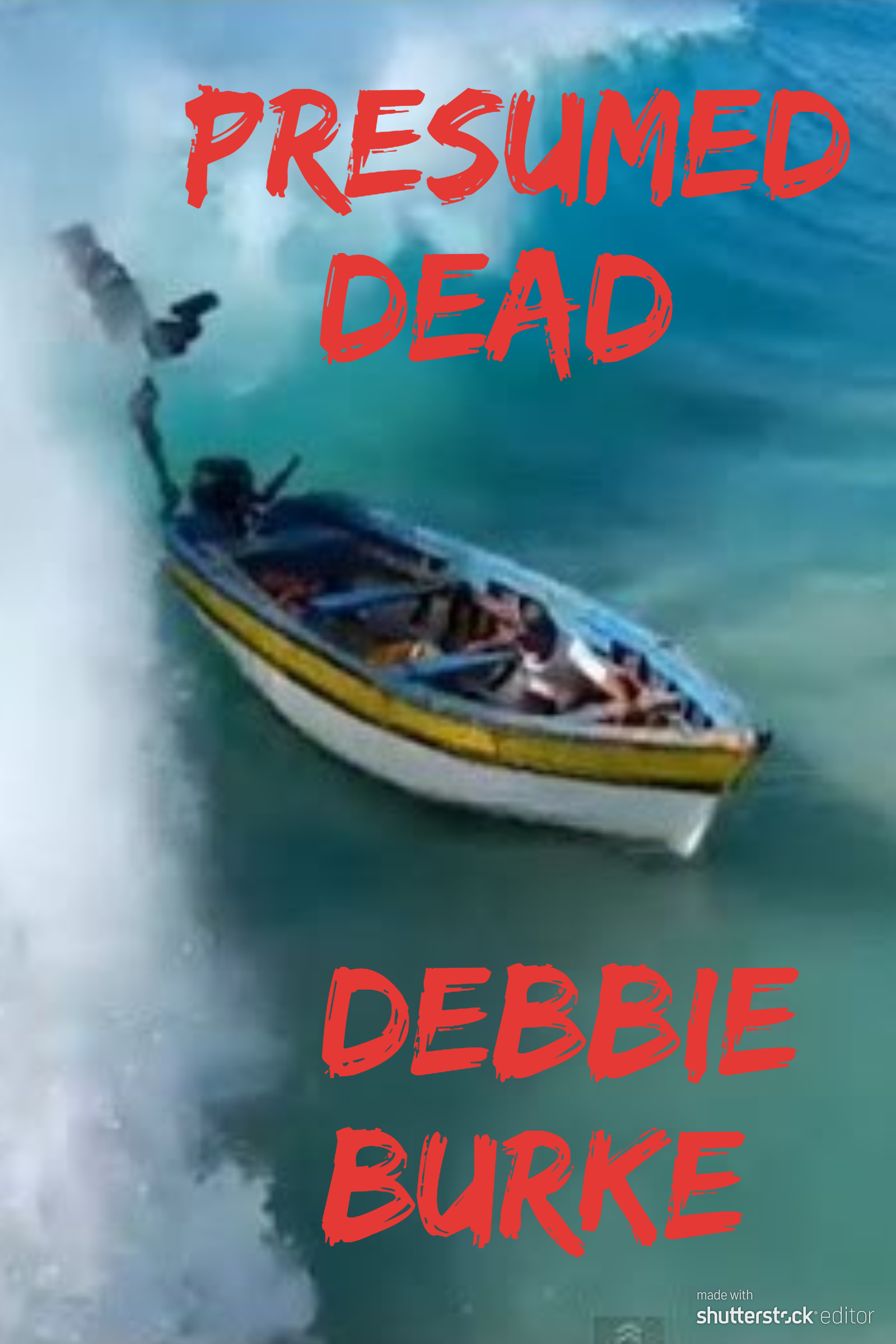
More tries: Presumed Dead, Gamble in Paradise, No Escape. Still not there.
The McGuffin is a valuable stolen baseball card and another suggestion was to use the baseball motif: Foul Pitch, Curveball, Pinch Hitter. Still not there.
Another suggested using pivotal plot events, like the discovery of Smoky’s deserted, wrecked boat and the gruesome evidence the dog finds in the swamp. Those ideas didn’t yield good titles but merited consideration for cover art, described in #5 and #6 below.
#3: Many Brains are Better Than One.
Creativity feeds off imagination. The more imaginations at work, the more creativity thrives. It’s like shaking a bottle of carbonated beverage. Open that cap and watch what bubbles up.
My smart friends stimulated my imagination with their varied ideas. At last, a title bubbled up that says thriller and suggests the root of Smoky’s problems—gambling.
Dead Man’s Bluff
For now, I’m pleased with that unless something better comes along.
~~~
Finding the right cover image is every bit as hard as finding the right title.
Many authors hire a professional designer and that is often the wisest path. My experience with pros has been expensive and unsatisfying but that isn’t always the case. If I find an artist who’s the right match, great. For now, it’s DIY.
#4: The Author Can’t See the Obvious
I searched for images of Hurricane Irma. Here’s an early choice I sent to my critique group:
Several immediately shot back: “That looks like a breast with a nipple.” Just shows how blind an author can be, even when it’s right in front of her nose!
#5: Don’t Be Afraid to Experiment
There’s a lot of trial and error in this creative process. You need to learn what doesn’t work before you can recognize what does. Most experiments aren’t great.
Tried a color version here.
A bright, eye-catching picture but it did nothing to draw reader into the story. It was also too busy and hard to read.
Next, I searched for images with people or objects tied to important plot developments.
After Smoky disappears, Tawny and Tillman find his wrecked boat, indicating he might have drowned while trying to make a getaway by sea. This photo seemed promising.
#6: People are Happy to Help
A subplot involves a Lab pup in training to be a search dog. He eagerly plunges into the swamp to search for the missing Smoky. Although he finds crucial evidence, he also screws it up, adding more complications to the story.
The dog angle became another avenue to explore. A friend put out a call to Search and Rescue (SAR) colleagues for photos of a dog working in water. SAR responded with many great pictures. These good folks were happy to help out a complete stranger. They didn’t even want payment. If I used their photos, their only request was acknowledgement of the SAR group, the dog, and the handler.
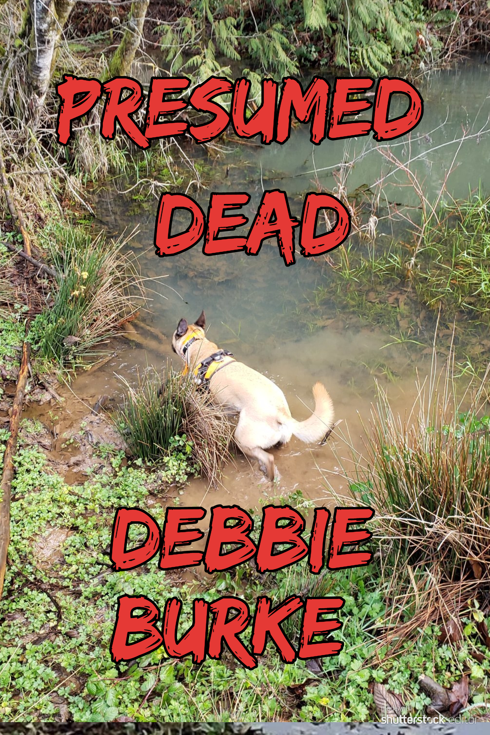
Photo courtesy of Sean Carroll, Clackamas County Sheriff Search and Rescue, OR
Here are a few dog samples:

Photo courtesy of Steve Deutsch, Search One Rescue Team, Lewisville, TX
#7: Don’t Let Your Cover Mislead the Reader
I drafted several covers with dogs and sent them to the group. One woman made the astute observation that having a dog on the cover sent the message that it’s a dog story. She was dead on—while the subplot is important, it isn’t the main focus.
A cover shouldn’t mislead readers. If you raise their expectations for one type of book but it turns out to be another, they rightfully feel cheated.
Fortunately, that same woman sent a hurricane photo that caused bells to ring in my mind. More on that in a minute.
#8: Ask an Artist
Another writer pal is a gifted watercolor artist with an excellent eye. I sent her three samples. She patiently explained what worked and what didn’t and why.
The colorful wave and boat: “An image directly in the center of the frame is not as appealing as one off center; the imbalance creates a sense of movement or dynamics that a centered image does not.”
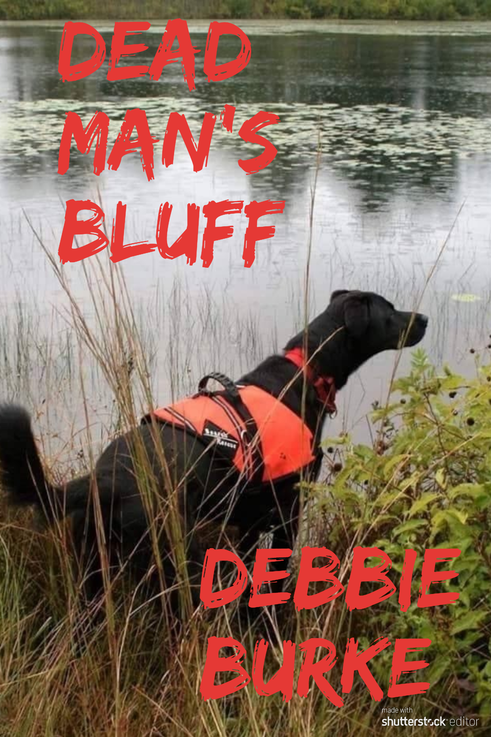
Photo courtesy of Kerrie Garges, Alpha K9 SAR, Bucks County, PA
She liked the offset title of the dog cover. However, the dog wasn’t a good choice as discussed in #7 above.

The windswept beach: “A Left to Right orientation appeals to me better than the R to L orientation on the shore design.”

So, I flipped the photo to a mirror image of the original. Now the palm trees blew to the right. That required cropping a different area of the photo and rearranging the lettering. Yet, one subtle change of orientation made a big difference.
Then I remembered a different artist had made a similar suggestion about my third book, Eyes in the Sky. In the original photo, the cliff was to the left. She suggested flipping the image to put the cliff on the right to make it consistent with the design of the second book, Stalking Midas. Again, the objective outsider’s view looked past the author’s tunnel vision for a better solution.
Artists notice small details like photo orientation that authors may not. That might make the difference between a reader choosing your book or passing it by.
#9: Enlist a Focus Group
Once you have three or four polished contenders for cover finalists, it’s time to attract cold readers. How do you capture the interest of someone browsing in a bookstore (hope they reopen soon!) or scanning thumbnails of covers online?
Find a focus group. But how?
Seek out reading groups on social media. Become active and contribute to discussions in your genre. Then politely ask for their help. Post several sample covers and take a vote. Even better, connect the voting to a drawing for a free book when it’s published.
Locate avid readers among your friends, coworkers, neighbors, acquaintances from the gym, clubs, churches or temples, librarians, your kids’ teachers—anyone who loves to read.
Book clubs have been great supporters of my previous three books and are an ideal focus group. I sent emails to more than forty people with a brief plot summary and three sample covers–the boat, the dog, and the windswept beach–and asked them to vote for their favorite.
Votes came in overwhelmingly for the wind-swept palm trees on the beach—the same photo that had set off bells in my head. Their opinions confirmed my intuition that this hurricane photo captured the right mood and tone that accurately depicted the book.
An added benefit: the book club folks enjoyed being part of the creative process. “I love voting on the choices,” wrote one. Another said, “This is fun.” Several asked to be notified which cover won. I benefited from their valuable feedback and they’re eagerly anticipating the next book in the series. Win-win.
When people play a part in the mysterious, creative process of building a book, they become invested in the outcome.
Interested, engaged readers are treasures to an author.
#10: Embrace New Ideas. At this point, I’m satisfied the title and cover do a good job of conveying the genre, mood, and plot. But better ideas might still come along…maybe even from TKZers’ comments!
During the creative process, an author should remain open to suggestions, especially from readers. You don’t have to take them but always listen.
Control and autonomy are two major benefits of self-publishing. An indie author isn’t locked into anything until s/he hits the “Publish” button.
~~~
This sums up my process through the evolution of title and cover. When Dead Man’s Bluff is published this summer, readers will have the final vote.
The creative process is mysterious and highly individual. What I find helpful, you might find useless. There are no right or wrong ways, only ways that work for you.
Ultimately, it doesn’t matter how you start the evolution as long as you start it.
Get ideas flowing, no matter where they come from. What starts as a trickle may turn into a torrent that carries you to your goal.
~~~
TKZers: What makes a book cover appeal to you?
Do you have a system for choosing titles and/or cover designs?
~~~
To read a sneak preview of Dead Man’s Bluff, visit this link.
Quite the process, Debbie. You’ve pretty much nailed why I normally hire out!
We’re writers. Our skill set probably doesn’t include artistic design or marketing.
This was the process the cover artist and I used for Seeing Red, which was similar to yours, although I already had the title. https://terryodell.com/extras/designing-a-book-cover/
I was luck that he was willing to send as many iterations as we went through. Most don’t.
That being said I’m toying with the idea of doing my own cover for my current WIP, which is set in the British Isles. I took a LOT of pictures while I was there, including one of a pivotal scene in the book.
My Photoshop skills aren’t refined enough for real looking composites, and I wanted to blend two images. Luckily, my son’s a photographer, and since it was Mother’s Day, he agreed to blend the two photos I sent him.
(Note: his first response was “This will be a lot of work.” I told him I didn’t want him to spend a lot of time on it, because the main image was good enough. Within about 20 minutes he sent a sample, with a recognizable quote: “Nobody will think you’re a miracle worker if you tell them how long things actually take.”)
Now, it’s a matter of adding in the text portions, which I think I can do myself. We’ll see.
Terry, how fortunate to have a son who’d willing to help!
Loved his comment: “Nobody will think you’re a miracle worker if you tell them how long things actually take.” What takes him 20 minutes would take you 20 days. IMO, he IS a miracle worker.
He’s a nature photographer, so doesn’t do a lot with Photoshop, so he lets me know it’s an imposition. And threatens to charge me. Hence, bringing it up on Mother’s Day. 😉
It’s true! People think you can just whip out a story or a painting in a few weeks or hours. I got to the point I would say “It took me my whole life to paint that!” Everything I learned over the years went into it.
Diana
Diana, skillful artists like you make it look easy. The beauty may appear effortless but years of study and work went into it.
Writing is the same way.
I appreciate your keen eye!
There are hundreds if not thousands of artists ready, willing and eager to do book covers for writers. Most have extensive portfolios you can browse to see samples of their abilities. This is great. Some are great at natural scenery with buildings and the like while others are better at objects – like a bloody knife and a rose on a more-or-less clear background.
.
It’s good timing that you wrote this post when you did. Just yesterday I watched a video done by a book reviewer (a respected “Booktuber”) talking/complaining about modern covers. They all seem so generic these days. There’s a random attractive actor on the cover, a little off-center, wearing clothing suitable to the setting – a nice suit, a police uniform, or maybe medieval armor… whatever. The titles are huge, bold-face type. And that’s about it. The backgrounds are shady and hard to see… I have to agree with the man. I’m no fan of this style. It is true, however, that these covers are designed to relay subject matter and title clearly to computer users as they scroll through columns of small icons on the Amazon pages.
.
They are also inexpensive to do. These “random model” covers sell for as little as a hundred-fifty bucks. That IS cheap. I got a quote from a good artist in Kansas City to do a cover for one of my books a few years ago – It’s a variation on the nose art seen on bombers during WWII, complete with metallic, riveted background… The quoted cost was $650. Sadly, I had to take a pass.
.
Titles are tough. I have a book in progress where the hero finds the corpse of his wife with the corpse of her lover (a cop) in the trunk of his car (it’s a big 1970’s muscle car). All I have so far is, “Two in the Trunk”. … I’m working on it. 🙂
.
Thank you for a great post. I love to read about others’ experiences with these hassles.
Carl – When I judged the Edgars a few years back, I was shocked at how “generic” the covers were, just as you mentioned. I got so tired of seeing the all caps title and author name. One publisher in particular seemed to be fixated on that template.
Terry, if it worked once, it’ll work a thousand times, right?
🙂
Thanks for sharing your information and experience, Carl. Generic does seem to be the current theme, which is one reason I struck out on my own.
What the author sees in his/her imagination isn’t always clear so it’s difficult to communicate that fuzzy concept to an artist. That’s why chemistry between author and artist is so important. The artist has to read your mind–a tall order!
Two in the Trunk sounds like a great story. Best of luck with it!
Love the wind-swept palm tree image, Deb!
I can manage fiction titles but nonfiction titles… forget about it. They’re my Achilles heel. Thankfully, I have a secret weapon: aka Jordan 😉
Thanks, Sue!
Now that you’ve revealed Jordan’s secret super power, she’s going to be swamped.
Thanks, Debbie. Good experiences to share. It’s amazing what reversing the image to its mirror image did for your hurricane cover.
This may be idiosyncratic, but I respond particularly to covers based on paintings. Sharon Woods Hopkins’s Killerfind grabbed me for that reason. The later books in that series moved away from that style, however.
A lot of speculative-fiction covers blend too many images for my taste. (Not that I read a lot of these genres.) Covers need a certain focus for impact, I think. Crime/thriller/suspense books tend not to make this error.
The covers of so many romances tell me right off the book is not a read for me. One thing that got me to read Forever Right Now by Emma Scott was the cover that was not a cliché romance cover.
I kinda like my Gimp and composition skills, so I’ll probably do my own covers, relying on my wife’s artistic sense where I go wrong.
Eric, idiosyncratic is exactly right. We all have our personal taste and preferences. If a book has a retro noir look out of the 1920s-1950s, I’ll pick it up in a heartbeat.
Designing a cover yourself, even if you don’t use it, is a great lesson in creativity. It gives you more appreciation for the process…as long as you have honest critics (like your wife) to tell you when the experiment is a failure!
Great post, Debbie! I’ll check out the links you provided.
I like an uncluttered book cover. And I like to be able to distinguish at a glance the title, sub, and author name. And if the cover art is “indistinct” instead of clear and blaring, so much the better.
For my three indie books, I worked with a photographer/cover designer. I sent her my ideas and she did the rest. I was completely happy with her work. For the third book, she incorporated a photograph I’d taken for the background. It turned out great.
Titles? For my first three and the next two WIPs, titles came first, before the story was written. But I’m open to changing it after typing “The End”. 🙂
Appreciate it, Deb!
I checked out your cover with the two paths splitting in the forest. What a great metaphor for your theme.
Always interesting to hear other people’s processes. I couldn’t come up with a title *before* I wrote the book if someone held a gun to my head. Our brains all work differently. As long as you’ve found what works best for you, that’s what counts.
I should clarify: I didn’t take the photo of the paths. My part was the light colored section on the top half of the cover. It came from a picture of hard-baked August mud in the field near our home. I thought it looked like what might be seen in a desert. (Oh, yeah! Yakima was a desert before irrigation…) She enlarged it, washed it, etc. Really love how it turned out.
Still a good cover that captures your theme.
Loved the blow-by-blow account, Debbie!
A couple of general and specific suggestions to add (from a 40-year-experienced art director and designer):
1. Also consider using one of the cover review sites. I run one ( https://www.goodreads.com/group/show/167105-book-cover-reviews ) on Goodreads, but there are others.
2. While your final cover version does the job, it could be better. There are certain tricks that could make it pop more. One of the biggest issues I always see is using “blood red” in cover text elements. And it’s usually a problem of “Brightness Contrast.” Here’s a long post I wrote about this that might help:
https://www.goodreads.com/topic/show/13245444-a-touch-of-grey
BTW, I design my own covers, and I LOVE doing it! But then, I also love Marketing, so I know I’m an oddball. What can I say? 😉
Wow, Harald, thanks for the link to your excellent article! I learned a lot. Who knew gray could be so important? Fascinating stuff.
Playing around with covers IS fun, even though I lack your knowledge and experience, so I understand what you mean.
Now, marketing…that’s not fun. Are you available for hire? 🙂
Marketing can be VERY creative (and fun). But no, sorry; not available for others. My Don Draper (“Mad Men”) days are over. 😉
Well, darn, you had my hopes up!
I am not an author but I am a web designer. It should go without saying, but pay your artist and pay or get permission for any art you use. One of my web projects, the customer threw a fit because I changed some of the images he sent me. “Found on Google” is not permission. Fortunately, he wrote a military story and the Department of Defense makes tons of images available for free. On that, so does NASA. If you need a starry night, NASA has them.
You can be amazed what you can get if you ask. Another author’s book has the perfect burning house picture on its web page. I fire department took the shot. An email to the Fire Chief gave me permission to use it.
Excellent points, Alan. Permissions and copyrights can get complicated. But, as you say, it’s surprising how willing some entities are to give permission.
Many sites like Pixabay offer free photos. Even if the photo is free, it’s courteous to credit the photographer, just as the author wants to be credited for what s/he writes. Which reminds me: I neglected to credit the photographer of the windblown palm trees. It’s David Mark from Pixabay.
Thanks, Alan, for adding your perspective as a web designer.
The title on the cover of Eyes in the Sky is easy to read because the red letters are outlined in black. Your new cover is harder to read and looks murky because of the gray background, its title could benefit from a black outline as well. But, it’s a great cover and title.
There’s a group on Goodreads that judges books by their covers. It’s a place book designing authors can go to in order to see what covers different readers like and don’t like.
Thank you, Augustina. I’ll definitely try your suggestion of a black outline. Harald mentioned a cover review site on Goodreads. Is that the same one you’re referring to?
The more eyes the better!
Before photoshop there was the Illustration Artist. A sketch was approved and a painting created for the covers of Time, TV Guide, novel covers, and movie posters. I was influenced by the work of Norman Rockwell and N.C. Wyeth, and then in 1980 I met an illustrator that worked from his home studio, which was an upstairs bedroom until about 11 am then went to the club to play tennis. He used a camera Lucida and reference photos from books and magazines to create the illustrations. After the images were printed for their intended use, he piled them in the attic. I left with several, thrilled to have such wonderful reminders to inspire my painting. Hector Garrido was an American book cover illustrator. He illustrated numerous science fiction, horror and adventure book covers, including all the covers for the Baroness series of pulp novels, and covers for the Destroyer series. He also illustrated romance and gothic novels, and Nancy Drew and Hardy Boys novels. (Wikipedia)
My favorite is the pencil study for the TV series Shogun with Richard Chamberlain for the cover of TV guide. It is not signed. I asked him why he didn’t sign his work. He said, “I know who did it.”
My goodness, Diana, I haven’t heard about a camera Lucida in 50 years! You bring back great memories. What a treasure to have some of his originals.