
If there’s one thing I’ve learned since my first novel was traditionally published in 2007, it’s that a writer needs to be flexible and amenable to change if they want to be successful. My definition of success? I’m still here. Readers still read my stories–often paying for them–and I still write them.
ISABELLA MOON was first published by Ballantine Books, and was/is available in hardcover, paperback, ebook, and audio. It’s about a woman living in hiding from an abusive husband, and she’s contacted by the ghost of a child who went missing two years earlier. Why am I so attached to my first novel? I wonder if I would even think about it much if the ebook revolution hadn’t happened. Without ebooks, I doubt I would have bothered to republish it once the rights reverted to me. Just think of all the books that (often deservedly) are lost to time because they were published in paper–paper that wasn’t acid-free. The existence of non-expiring digital content, combined with easy access to book resellers, means that pretty much any book can now stay alive a long, long time.
But tastes change. Markets change. And there are always potential new readers to attract. I confess I’m often guilty of picking up a book because I’m drawn to its cover. Thus I feel compelled to update the covers of the few books I re-publish myself.
___________
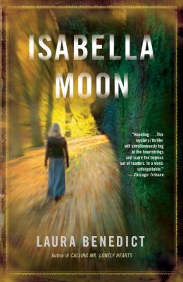
Cover 1, Ballantine: Hardcover (2007)
This is a beautiful cover. If I’d been a more experienced writer, I might have pushed to have it look a bit edgier. It has a mysterious, dreamlike, feminine, rather timeless vibe. Yet the book has several horror elements.

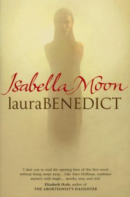
Cover 2: Trade Paperback, Ballantine (2008)
I love the fuzziness of the title, particularly since the book is a ghost story. The size of trade paperbacks appeals to me.
Covers 3 and 4: Hardcover, Trade paper (export edition) William Heinemann, UK (2008)
The yellow color in this photo is a bit deceiving. It’s actually more of a pale cream, with a glimmering, matte sheen to it. It’s truly stunning, and thematically dead-on.
Cover 5: Ebook, Gallowstree Publishing (2011) (My publishing company, freelance designer)
Looking back on this one makes me go Hmmmm. It definitely has more of a horror vibe, and is certainly unsettling. The adult protagonist is obviously in danger.
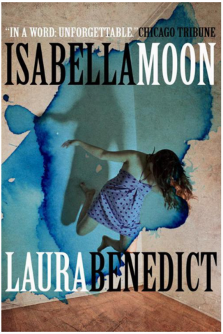
Cover 6: Ebook, Gallowstree Press (2015?), freelance designer
This is the most literal cover: Ghostly font, ghost, photo of moon. Not sure why it’s basically 3 colors. I think it would make a terrific paperback.
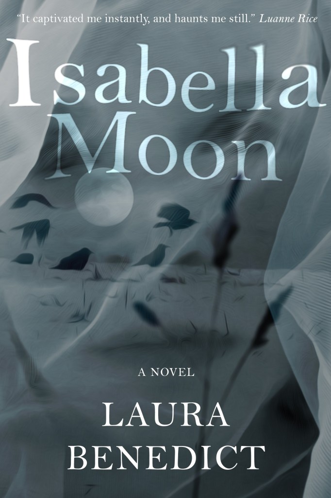
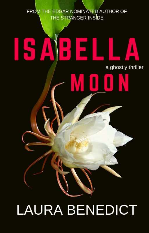
Covers 7 and 8, Gallowstree Press, my designs
I’m going to experiment with two covers for this next update that’s coming in a week or two. One cover has a mystery feel to it, and the other that of a dark thriller. I’m considering adding a horror short story to the edition with the flower cover to differentiate it at the retailers. We’ll see how that works.

Between Vellum, and Canva, and many other helpful sites, it’s shockingly easy to make changes to all of my owned content. And, really, I have little to lose by making those changes. As these last two are for ebooks exclusively, my goal has been to make them great thumbnails. I would love to sell ISABELLA MOON in my own print-on-demand versions, but there are PLENTY of hard and softcover versions available out in the world. No need to add to the world’s post-consumer paper glut.
Why the wide selection of cover styles? ISABELLA MOON is one of those stories that crosses genre boundaries: thriller, crime, gothic, horror, mystery. It’s tough to classify. I’ve always felt that the original cover, though beautiful, put it off on the wrong foot in the market. There’s strong language, sex, and plenty of violence between the covers. The reviews are polarized, so I had to stop reading them.
Of course, I should’ve done all this revamping well before my most recent novel, THE STRANGER INSIDE, was published back in February. There’s lots to do: update the excerpts in the backs of the books. Update the blurbs, and add my most recent four books to the interior bibliography. Oh, and update my author photo. Though I wouldn’t mind being eternally forty-five.
Note: The images in the two latest covers came from Istock. I will have to purchase extended licenses to use them as part of salable content.
TKZers–tell me all your cover successes and woes. And ask me anything!
That’s a lot of covers! I’ve revamped covers in two of my series to better (I hope) reflect the genre. Was getting too many complaints that there was … gasp … a romance and even … sex … in the books because the covers didn’t hint at the genre, which is romantic suspense. Guess they weren’t reading the book descriptions. Also, I wanted to make sure they were connected to my “brand” something the original publisher never did.
For my stand alone short story collection, Seeing Red, my designer and I worked through a lot of iterations. If you’re interested in that process, it’s here: https://terryodell.com/extras/designing-a-book-cover/
Also, I’ve found that by using Draft2Digital for the ebooks, I can use their “More by the Author” feature and they automatically keep my backlist titles up to date, across any books I’ve published with them, all with universal book links. Saves a bunch of work. It means I can (should I be so inclined) download newer versions for Kobo and Nook and replace them on those sites. I rarely have that kind of energy, though. But I could.
Book descriptions are so important! A cover is a shorthand, but can be easily misinterpreted. I had exactly the same problem with my Bliss House novels as well.
I’ll check out Draft2Digital. Interesting that it keeps backlist titles and links up to date.
Love the evolution on your SEEING RED cover–go look everyone!
When my wife’s book was being published, the proposed cover was, in her judgment, horrible, giving a totally wrong vibe about the book. Half a dozen aesthetically-aware people agreed. It had a dark orange and brown background of roughly horizontal swatches blending into each other. The space was filled with text in at least five different type faces. In the end, the publisher went with the cover that my wife designed, incorporating a piece of her artwork. http://www.spiritualconnectionindailylife.com
Wow. That’s a beautiful cover, Eric. It’s light and hopeful–exactly what one would be attracted to in a book with such a subject.
I love the very last version the best with the black background and the stark water lily. It hints at the dark, ghostly mystery inside. It’s an enjoyable read, and adding a short story bonus would be like a cherry on top.:-)
Thank you, dear Priscilla. I better get to writing that story!
Fascinating overview of the cover evolution for Isabella Moon. That’s a lot of covers!
For my first historical novel about the birth of NYC in the 17th century, it was the cover image that actually inspired me to write the story! (I know, kinda backwards, but there you have it)
The image—a stunning computer illustration of what Manhattan would have looked like when Henry Hudson sailed in on September 12, 1609—mesmerized me, and I built my story around it.
Here’s the final version at the top of this page:
http://haraldjohnson.com/books/
… and if you scroll down a bit, you’ll see how I tweaked the color styling (in Photoshop) for the four novellas that were released first. Same image, different treatments.
What an effective way to show unified stories with the same cover and different dates. Great idea, Harald!
Thanks, Debbie. I’ve always been intrigued by the simplicity of date titles (2001, 1984, 11/22/63) so I thought I’d explore that a little.
Really interesting progression. Thanks for sharing this, Laura. FWIW, #2 is my favorite.
Pingback: Friday Finds – Staci Troilo
Pingback: Five Links 8/23/19 Loleta Abi | Loleta Abi Author & Book Blogger