“A book cover is a distillation. It is a haiku of the story.” — Chip Kidd, Random House cover designer
By PJ Parrish
Welcome back, crime dogs. It’s the new year! Out with the old, in with the new!
So today, as you think about how you might want to improve yourself this year — botox? go blond? organize the sock drawer? — maybe you should take a moment to re-look your book branding.
Oh dear…Just hours into 2019 and I’ve lost some of you already. Branding…ugh. I can barely think about what’s going on in chapter 12 let alone worry about how I am going to make splash (or even a ripple) in the ocean of books that will be published this year. Let’s get the bad news out of the way first:
That chart shows the number of self-published books from 2008 through just 2017. I know, I know. Discouraging. So how do you increase your chances of getting noticed and maybe even making a few shekels? Let’s restate the obvious:
- Be a bestselling writer already
- Get a James Patterson co-author gig
- Get lucky.
- Write a really good book
- Do everything in your power to give it a good launch.
The only two you have any control over are 4 and 5. So let’s start there. Let’s also not go into promotion and marketing right now because that hydra-headed monster is too much for me to handle here. And besides, it depresses the hell out of me, and my only new year’s resolution this year is to try to focus on positive stuff because the negative stuff will find me at every turn.
Let’s talk, instead, about one of my favorite subjects — great covers. This is foremost in my writer brain in this new year because my sister Kelly and I are hard at work getting our back list titles ready to post. Our oldest came out 18 years ago (geez…) so, it’s time for a make-over. Besides, when you get your rights back and want to reissue your books, you legally can’t use the same covers your old publisher did. Which, as many of you poor souls know, can turn out to be a good thing. More on that later…
How important are covers? Industry folks believe a cover is the single most important thing in determining a book’s initial chance for success. A great cover makes a book stand out and thus easier to sell. For you the author, it is your only chance at a first impression. It’s like your own face, capable of conveying emotion, inner feelings, mood — what’s inside!
So, how do you make a great first impression?
If you are traditionally published, you have little or no control over this. Publishers have teams of marketing folks and artistic types that agonize over this (or in some sad cases, don’t). I’ve worked with Big Six publishers, small presses, Amazon’s mystery imprint Thomas & Mercer, plus many international imprints. In 30-plus years publishing romance, mysteries and thrillers, I’ve had some terrific covers and some howling dogs.
(See image at left…arf! arf!) My involvement in the cover process has ranged from no input, cover consultation written in my contract, and being asked to fill out an extensive questionaire about what I thought my cover should convey (by Thomas & Mercer, who also asked us to send photos we liked and allowed us to chose between two final covers).
But what about those of you who are self-publishing? That’s why I am writing this today, because, as I said, I am now a publisher myself and Kelly and I have been agonizing over this.
Here are some qualities of good covers, suggested by the site Trending/Packaging, with a few comments from me in red italics.
- It needs a good title/ subtitle. Which is why I rail so often in my First Page critiques about innocuous or trite titles.
- It must draw the potential reader’s attention towards the book. Like a great billboard does as you sped by in your car.
- It should communicate with the reader on an emotional level. So important! Generic doesn’t cut it.
- It must be unique. All books are different from each other, similarly, every book cover should also be unique to make it different from other covers. Easier said than done.
- It should look professional. Well, duh. But just go look at some of the free offerings on Amazon to see how many fail at this. Or this site, subtitled Just Because You CAN Design Your Own Cover Doesn’t Mean You Should.
- It should clearly give an idea of the category of the book whether it is a horror story or a love story etc. What is your tone? Dark, lighthearted, noir, romantic?
- It should communicate the message about the quality of the book. There is a huge difference between the covers of different qualities of books. Again, click here for what not to do.
- It should tell the reader what your genre or sub-genre is — fiction, non-fiction, biography, romance, thriller, etc. Readers want to know what kind of story they are getting and don’t like to be confused.
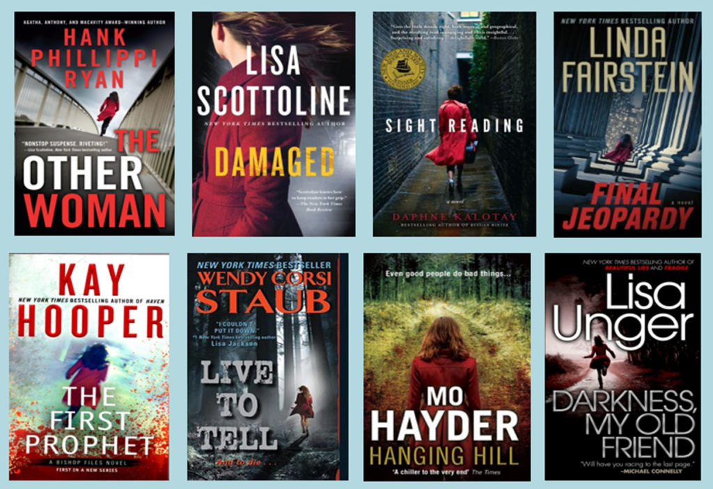
To be sure, publishers tend to be lemming-like when it comes to cover design. Hey, if basic black worked for Gone Girl, why not all its sisters? Liane Moriarity’s Little Big Lies unleashed an explosion of lollipop covers. And this trend seems evergreen — the imperiled girl/woman in the red coat:
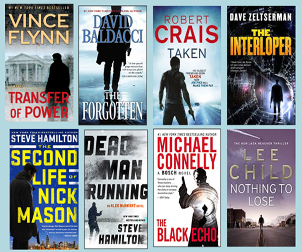
As this is a favorite theme among man books — the shadowy guy with the gun.
Please note I show these not as any reflection of the quality of the books. I know many of these folks and they are talented all. I have read many of these books. I’d guess few of these writers get heavily involved in their cover design. Just showing that publishers themselves tend to run in packs. (Oh…I will send a free book to the first person who can tell me why the Lee Child book is somewhat out of place here).
Speaking of trends, a while back, I wrote a post about what was hot in cover design in 2018. Click here to see examples but to sum up:
- Bold typography
- Minimalist covers
- Hand-drawn covers
- Seventies and eighties designs
- Millennial Pink
- Collages
- Authentic photography
- Upscale finishes
I think we can all breath a sigh of relief that “millennial pink” is probably passe by now. The others, I believe, still stand. I see them holding true every time I pass through a bookstore or browse Amazon. But I don’t think we crime dogs should get too hung up on this. What I think we should pay attention to is:
- Professionalism
- Consistency of brand
- Messaging
Professsionalism means you can’t get away with a lousy, cheap-looking cover. Because it yells in neon to a potential reader “I am an amateur!” This applies especially if you are just starting out. Like they used to tell us in “women’s magazines” — dress for the job you want, not the one you have. Don’t design your own cover unless you have solid graphic background and even then — GET INPUT! Would you edit your own story? No…you get beta-readers, you hire copy editors. (If you do edit your own books, you’re a fool). You might have to hire a pro to do this. There are lots of good ones out there. Please don’t skimp on this. Please.
Consistency of Brand means your books have to look alike. I don’t mean literally, but they have to all be of a kind so potential readers can immediately sense a unified brand. All good authors do this. And periodically, they go back in and re-design their older books en masse to give them face lifts. Time for an object lesson….
My friend Neil Plakcy (a member of my old critique group) has been publishing his Golden Retriever mystery series for about ten years now. His books are a lot of fun (the dog helps solve the crime), light in tone, but also deal with some serious issues. (his hero did prison time for computer crimes.) Recently, Neil decided he needed a make-over. The first line is before, the second line is after. Click to see enlarged.
What was wrong with the first ones? Inconsistency in type-faces. Type too small. The main important image (the dog!) was usually too small and static (the dog is just sitting or standing around mainly). No one compelling image for the eye to focus on. The pictures didn’t capture the books’ playful tone. Dull colors. And hard to find Neil’s name!
What is right with the second ones? The type is consistent and DOG is set bigger and in contrasting color to drive home the content in a glance. The subtitle “A Golden Retriever Mystery” is always the same size and in the same place. Neil’s name is consistent and authoritative. There is negative space for blurbs. And the dogs are so cute they make you want to adopt them. These covers look designed, not slapped together.
Disclaimer time: My sister Kelly designed the new covers. She does this as a side business and this is not an infomercial to get her work because I don’t want her attention on anything else but our stuff for now. But she and I also are redesigning our own back list covers. And, I gotta tell you, it’s not been easy. 
Our departure point was our newest book, THE DAMAGE DONE. It has a very distinctive cover. And we decided we wanted all our previous books — which had been published by three different companies — to be “branded” with the same look.
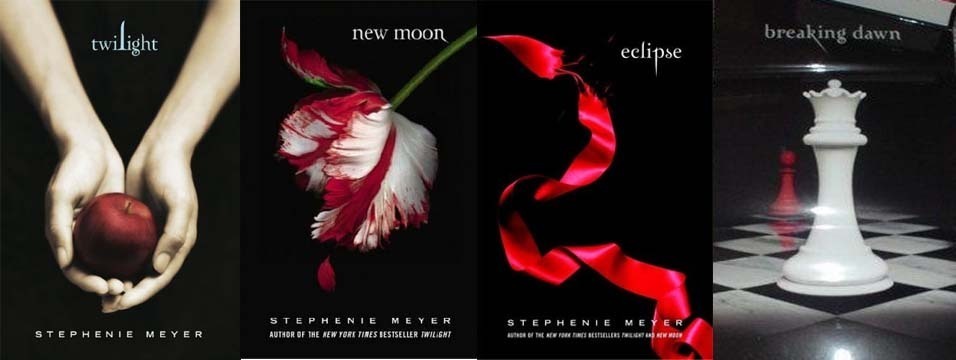
I was always impressed with the covers of Stephanie Meyers Twilight series. Stark black backgrounds each with one strong image and interesting type. They were beautiful, simple, revolutionary at the time and still copied to this day. I suspect they were in my back-brain when we started redesigning our old books. These books were about vampires yet the covers had a dark elegance. The tone was spot-on.
Our first decision was tone. Our Louis Kincaid books are PI/police procedurals, rather dark in tone. We didn’t want to look too “thriller” with screaming type. We wanted each book to have a person on it because we think readers relate to books with human beings rather than say, a static photo of the Capital building or a rundown farmhouse. This is just our taste. Yours is different, so you must figure out what TYPE OF GRAPHIC IMAGE best conveys your story. We decided to go with black backgrounds and red title type. I studied advertising design in college and red and yellow on dark background is the most eye-grabbing combo. Red conveys power and immediacy. (Blue conveys trust; orange is hip and fun; purple signals prestige and elegance). Black is a powerful neutral but adds drama when paired with the right contrasting color. I think this is why Katherine Hepburn liked to wear red scarves and Nancy Reagan wore red. (She was barely 5-foot-4 and claimed it made her feel more powerful. I get that…)
Second, we had to find the right images. I can’t count the hours Kelly and I paged through the stock photo sites looking — praying — to find that one great photograph. And we paid for them — ranging from a splurge of $375 for a Getty Image photo to $35-$70 from such sites as iStock, Stutterstock, Deposit Photo, Dreamstime. All these latter are very reasonable with clear licensing guidelines. You get what you pay for. Invest wisely.
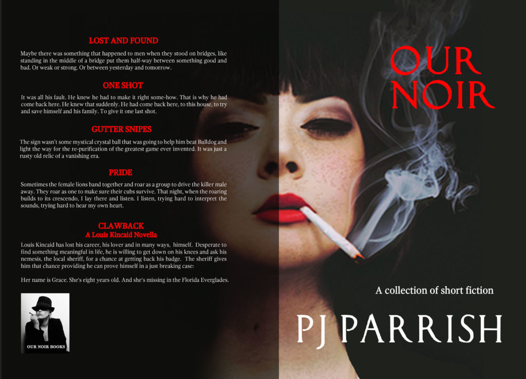
Big caveat: You have to look beyond the original photo sometimes. Sometimes, a creative cropping can make it more powerful. Or you play around with it, lightening, darkening etc. This is why you need design help because a successful cover is often made in tweaking the details. Here’s an example: We are also putting out a collection of our short stories. Here is the photo we bought for the cover. Pretty cool looking dame, huh? Just as is, it could have worked. But…
But we wanted an off-kilter, more mysterious feel and needed some negative space for type. And sometimes, a glimpse of stocking (or a woman’s face) can be much more shocking. So here is what we did with it:
We continued our lady’s face around the spine and onto the back for effect. Here’s the final full cover, spine and back art.
If you work with a good designer, you and she can tweak things until you get what you want.
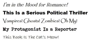
Third, we were very particular about the type we wanted. Like colors, typefaces have their own psychological effect. Look at the different moods you can create just from basic Word software:
I love typefaces. But I fell really hard for Luca Pacioli Rough. It was used in the credits for House of Cards. It’s elegant but edgy. (which is what we were going for overall). Kelly found it and downloaded it free. (Some fonts are restricted, however).
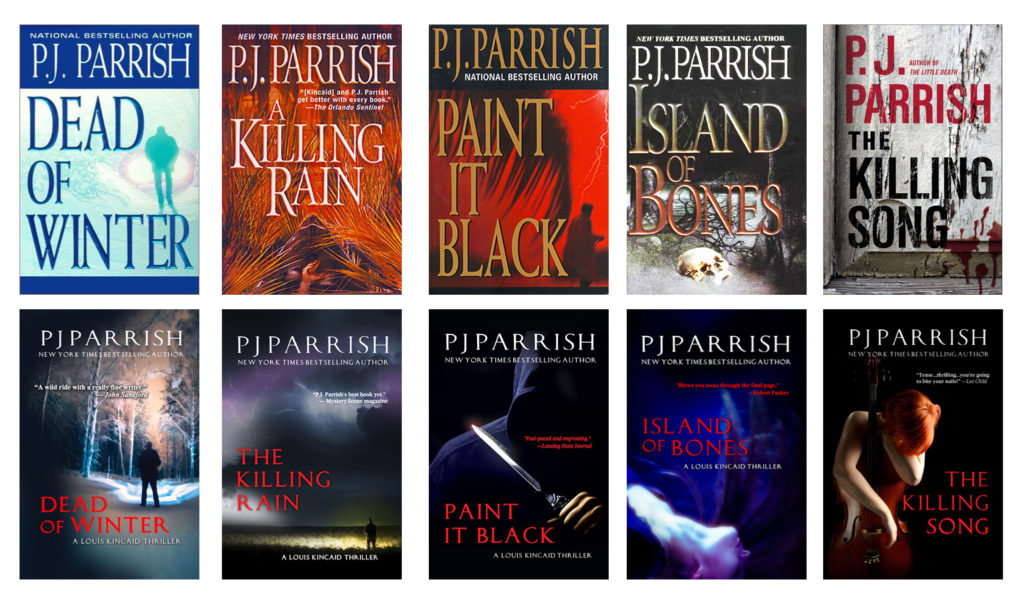
Okay, time for another object lesson. On the top row are some of our books as they were put out by the original publishers years ago. The bottom row are our new designs, all made to meet our three criteria of professionalism, consistency of brand and messaging. Click to enlarge.
All the new covers are consistent in tone. They all use one strong graphic element and same fonts. Notice, in particular, THE KILLING SONG. This is one of our stand alones and we always thought the original cover was weak. Yes, the letters are bold and there’s some dripping blood on what looks like a weathered farm house or something. But the story takes place mainly in Paris and is about a sophisticated cellist who just happened to have a habit of killing woman and leaving bizarre musical clues. The original cover missed the mark on tone and on conveying anything about setting or story. Music was the main point. Somebody at our publishing house had a tin ear.
If you’ll bear with me, let me give you one more example from our own collection. Call it the Evolution of a Cover. Our tenth Louis Kincaid book was called The Little Death.
At left is the original cover: I defy you to tell me what it is about or where it takes place. It appears that some kind of plant is burning, but what does that mean? What the heck is this book about? Well, the story takes place in Palm Beach society. It is about a clique of rich women who take young male lovers then things go wrong and they must “dispose” of them. The title is a French idiom, “La Petite Mort,” for orgasm. Our French publisher came a lot closer to getting the point. All his covers for our books were well-branded, featuring the same typefaces, and one strong graphic image against black backgrounds. In this case, it was an orchid — which is a major clue in the book and the means by which Louis finally cracks the case. It also looks sort of sexy. 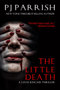
At left, is what we have come up with so far. We are still working on this cover — it was really hard to find the right image — but here is what we started with. We are tweaking this image, however, because we think it is a little too, forgive the pun, in your face. We might take out the dripping blood. We might go with something else entirely. But at least it won’t be a burning bush…
Whew…boy, did I run at the mouth today. Must have been holding all this in during the holiday hiatus. Anywho, that’s it for Cover Art 101 today. I could rail on this subject for hours. But I’d rather hear what you all think — as readers and writers. What turns you on, what turns you off? Can you truly judge a book by its cover?







Happy New Year backatha’ll~ and I hope everyone had an awesome Christmas ~ I’ve missed this part of my pre-commute morning routine.
?
Like you, I love typefaces, which can be a large part of my day-job, and your discussion on what makes a consistent and strong series of covers has some applications for me there as well.
Looking forward to this new year with a similar resolution to focus on the positive and up-side of things.
Oh, and the Lee Child cover is the only one with “shadow man” not brandishing a weapon(?).
That was my thought, George, but I couldn’t enlarge the image enough to be sure.
You win a book George! Reacher carries a toothbrush but no gun. I’ve used this example in PPoint workshops and it’s surprising how many readers (even of Lee Child) miss this!
Email me your address through the site here if you really want a book. 🙂
Do I really want book? Books and (most) music are all I ever really want (makes Christmas and birthdays easy, though I have several ugly ties not withstanding). ?
Let me cogitate on your generous offer, as I don’t want to take advantage of your kindness…
Happy New Year, Kris.
This is (as always) great information and advice. Having judged the 2018 Edgars, the similarity of covers was not only obvious but annoying.
My former publisher (apparently) made no effort to connect the three series books I had with them. When I got the e-rights, I hired a designer to try to unify them with fonts, but I was afraid to change the cover images for fear readers would get confused. When the publisher dropped the imprint, I went on with the series myself and when my cover designer moved on, I had to find a new designer. After too many reviews for the first three books stated they didn’t like the romance (don’t they read descriptions?) we decided to redo those first covers so they all “matched” and put a hunk on the cover to let readers know what they were getting. I blogged about it myself (but not as extensively as your post) to show the evolution of those covers, at https://terryodell.com/author-branding-part-2-cover-art/
Just went and looked at your blog. (So should anyone interested in this subject.) I think it is interesting that you stressed your “brand word” DANGER in the same way my friend Neil did with the word DOG. I like the continuity of those covers.
It truly amazed in working with large publishers that they made little effort (in my case) to find a unified look. Some of the covers I had were gorgeous but others looked like they gave up. Sigh…
Great post on one of my favorite topics (I’m also an art director/designer, create my own covers, and run a book cover reviews group).
May I make a suggestion on your redos? Looking at that before-and-after grid with the red-haired cellist (The Killing Song): the main titles don’t have enough strength. That thumbnail size is what many people will see on Amazon (look at your Also Boughts) and are barely readable. If Luca Pacioli Rough doesn’t have heavier weight options (looks like it doesn’t), then I’d suggest upping the main title size maybe 125-150%. Just a suggestion. No charge. 🙂 Happy New Year!
Thanks Harald. We are, indeed, reconsidering the font. It looks great on the physical books (which are trade paperback sized). But doesn’t hold up well for thumbnails on line (Amazon). We might just do two separate designs for the two different formats. I was going to do a whole section on how you have to be careful on “cover” design for your Amazon listings due to the diminished sized but ran out of time and space.
Check is in the mail…. 🙂
Happy New Year to all.
Love your new covers and your advice is excellent. For those of us who do venture into cover design, a great source of information is The Book Designer. Each month they evaluate a large number of submitted covers .
Here https://www.thebookdesigner.com
Thanks Brian. I should have mentioned Book Designer. Great source for inspiration and ideas.
Hurray!! You’re back!
Been sorely missing my regular fix of Killzone over the holidays. …
Thanks for the post, PJ – not quite to the design stage yet myself but always love an enticing cover.
Happy New Year! ?
Yeah, it’s nice to be back. Miss youse guys.
Happy New Year!!! I just went through this when I moved my Mayhem Series to the publisher who has my Grafton County Series. What a difference it’s made. Book 2, Blessed Mayhem, was always being confused with Book 1 at book signings and, apparently, also online. I couldn’t be happier with the new look. I even have readers who want to re-buy it just to have the new cover. As you said in your post, consistency is key with branding, which was one of the main reasons I decided to move the series.
Your new covers rock! Thanks for the great advice, too. I’ll be working with my cover designer and publisher (who encourages input) for Book 3 of Mayhem Series in a couple weeks, so your timing couldn’t be more perfect.
Hope you had a nice Christmas!
I always smile when readers come up at signings or somewhere and say, I really loved your book…you know, the one with the blue footprints. Or the one with the skull on it. I think while readers often can’t recall titles they remember colors or images. Good luck with the make-overs. Right now, I am copy-editing our book set in France and man, what a pain in the butt since I have to double-check every single French accent mark and then figure out how to find them in Word. I have become intimately involved with Alt+130 which gives you the accent acute. 😛
One glaring problem I’ve noticed that you didn’t mention is the body language of the cover models. The supposed kickbutt heroine with passive body language is the worst offender. The most cringeworthy is a hetrosexual romance hero in a gay guy posture. (It involves the placement of the shoulders.) I’ve seen that error a stunning amount of times.
Wow, great point. Never considered that, but you are right, especially as it applies to romance or romantic suspense. My friend Neil, whose covers I showed, also does a gay series and he is hyper aware of the body language of the models he uses on his covers. He has a gay FBI agent and his publisher came up with a really terrific cover image that showed somewhat of a “shadowy guy with gun” image that was appropriate to Neil’s character. And yeah, I really dislike covers that show women characters that imply passivity.