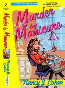
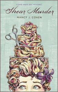
Series branding can be just as important as author branding. What’s the difference? Author branding tells who you are and what kind of stories you write. For example, my works blend elements of murder, mystery, romance, and humor. Readers know they’re in for an entertaining yet suspenseful ride with a satisfying ending. I also write stories set in Florida, and this tropical flavor adds a layer of depth to my work.
Currently, I’m working to revise and reissue my earlier mystery titles. I hired a new cover designer and liked her idea of putting a collage together of photographic images. Similar to an art sheet from a publisher, I filled her in on what might make an appropriate scene and what elements it might include. I looked at the images she subsequently sent me and picked ones that seemed perfect.
All went well until she put them together in a cover mockup. My stomach sank. It didn’t work for me. The images were fine. So were the colors and title placement. But the whole didn’t speak to me as a cozy reader. Where was the humor element? The fun factor that would make me smile and want to buy this book, like these covers below?
And so I did a search on Amazon for “cozy mysteries.” The overwhelming majority of them were illustrations, not photographs. I’d given this designer a list of covers that appealed to me, but she didn’t seem to “get” the genre. My original cover artist, who’d had to bow out for personal reasons, had sent me a mockup of a cover that I’d really liked. Looking at them side-by-side, I had a bad feeling about the photo-based imagery. It wasn’t right for the genre.
Even if I rebranded myself by having all my reissued titles have similar designs, would these more realistic covers attract cozy readers? I didn’t think so. It certainly wouldn’t appeal to me. As a cozy reader, I look for a certain style. Normally, you can identify a cozy just by looking at the cover. And so I regretfully parted ways with designer number two. I approached my original artist to see if she was available again, and to my joy she said yes. We’re back to fixing the details on the original cover, and I feel much happier about the process.
What is the lesson learned? It’s not only about your author brand. It’s also about reader expectations. Readers can tell from the cover what type of story to expect. Go for a change if you want to broaden your readership. But if you want genre appeal, stick to the tried and true. Flowers never did it for me as a romance reader. I still like the old-fashioned clinch covers. Remember the old gothics, with a woman in a gown running away from a spooky mansion? You could tell at a glimpse what genre it represented. So yes, your cozy or thriller cover at a glance might resemble others in the genre, but that’s what readers want and expect.
Whichever route you go, plan for series continuity via the same font, author name and title location, series logo, design style and color statement (i.e. pastels or bold and bright).
Does reader expectation figure into your cover art or does this aspect not concern you?


Heck yes! People judge books by their covers, especially ebooks. One lady remarked on a forum that she browses amazon and opens tabs to everything with a good cover. Then she goes back through and decides whether to buy them.
Series branding is also important. And they look nice on the shelf, too!
You are right. This is why one should view a potential cover from a distance, to see if it’ll show up as a thumbnail image online.
Most photo manipulation software lets you shrink or enlarge images, so you can see it on your computer the way it would show up on the book sites rather than having to step away. Or, you can use the ctrl – function on your keyboard that should shrink things. Thumbnail images are critical.
Terry, I think you are more adept at this stuff than I am. I still can’t even figure out how to copy a snippet off my screen.
I do have Photoshop, although I can’t do much more with it than change image sizes. I found (not long ago) a button that says Print Screen, and when I push it, it saves the image in a Dropbox folder. It did this all without me knowing anything about it. Then, I can crop the image in Photoshop. I won’t tell you how long it took me to figure out how to draw the “circle” around part of the picture in my blog post today. Far, far, too long. You’d have written a chapter, I’m sure!
I’ll stick to hiring people to do image manipulation for me. Too many other things to learn.
Genre book covers are iconic. Most of us who read can glance at a cover and tell the kind of book it is.
Sadly, some book cover artists and small publishers just don’t get this.
I know I’ve had more than one fight to make my cover fit the right icons.
Yes, as authors, we need to be aware of these factors and fight for them.
Out of curiosity, what were the financial consequences of “parting ways” with the artist who had already submitted work to you?
I paid her for her time. It was only fair.
I think you get a gut instinct on what covers work to showcase your book and what don’t. I don’t tend to think in terms of ‘genre appropriate’ or ‘branding’ per se but I do know what looks like ‘my kind of book’ from the cover alone. I love the artist who created covers for my Ursula Marlow paperbacks – Scott McKowen – they had just the right ‘feel’ for me. You’ve got me thinking though about the whole ‘brand’ idea for covers now!
Yes, a lot of it is a gut feeling of what works and what doesn’t. You have to trust instinct. If it works for you, hopefully it’ll work for your readers, too.
As a voracious romance reader, I depend on covers–second to reviews–in choosing my next read.
I hate sappy, predictable romances with a crap ton on I love yous, and I can tell by the covers if a book is going to be sappy. They just look, well, sappy.
I like unconventional romance reads, and these covers have a completely different vibe, different fonts, bolder images, fierce. I can just look at a certain cover and know it’s my kind of read.
So, yes, genre covers are critically important.
As for designers not “getting it”, I’ve been through that. It is what drove me to start designing my own book covers. I hired a designer for one of my books, gave him an idea of what I wanted, even showed him images, along with other covers that I liked, and…holy wow, I had a headache going back and forth with that man. He just wasn’t getting it! Until I grew frustrated and settled for a cover I didn’t like, called it a loss, then downloaded Gimp, familiarized myself with it, and started making my own covers.
In my genre, romance, a lot of the authors are designing their own covers. Cover designers are getting more and more expensive as the indie world expands, so if I can download a FREE software and practice designing my own covers, teasers, banners, why not?
You are fortunate that you can design your own covers. I don’t have that gift, but fortunately, I love my current designer. She almost reads my mind and seems to nail the “look” without my having to say much of anything. Once we’re done with this first backlist title, I’ll blog about the particular experience of working with her and how we tweaked the cover. She already did “Writing the Cozy Mystery” for me.