Photo courtesy Natalia Y on unsplash.com
Happy New Year! I hope that your holiday was as good as mine. I learned something which may have some major repercussions for me going forward.
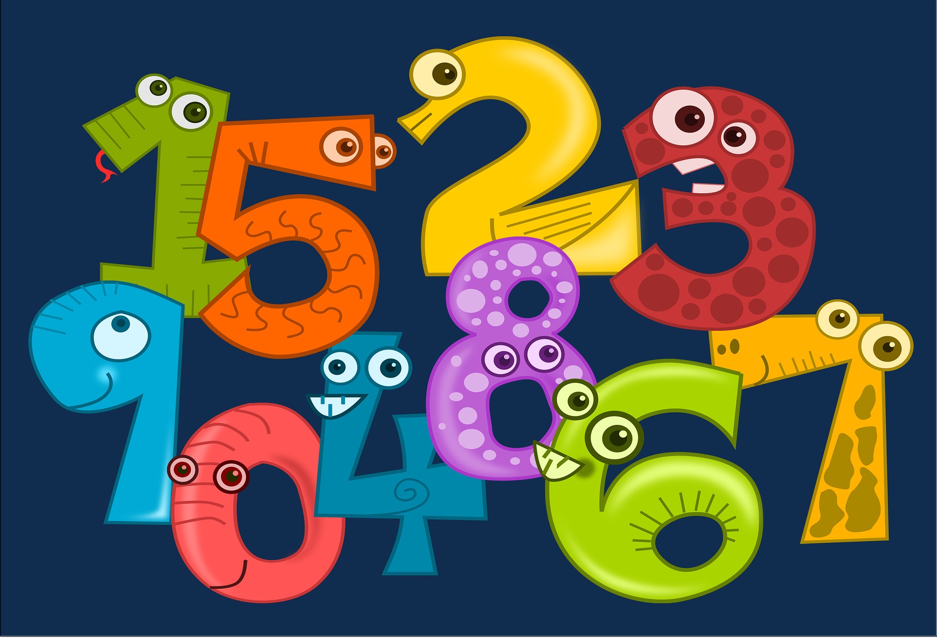
I am not sure how what follows originally came up for discussion. The source, however, was my twelve-year-old granddaughter. She talks quite a bit about some things and not at all about others, with the border between the two constantly shifting and changing. Sometimes it is hard for me to keep up, which is okay. It gives her the freedom to chatter away and me the impetus to keep trying to figure it out. So it is that during one day of her Christmas vacation she was at one moment talking about a manga character and the next was talking about something she called “comic sans.” I assumed at first that she was referring to comic book character that she particularly revered. As she continued for a bit longer, however, I realized that she was referring to a type font.
We each and all have a favorite font. Actually, that’s wrong. We each and all have a font that we use by default. Mine, since Jesus was in short pants, has been the boring and predictable but nonetheless popular Times New Roman. Many prefer Arial. It’s not something we usually even think about, particularly when reading. A great number of books make a point of referencing, usually on a page at the back, the font in which the book is printed and providing a three or four sentence summary of its history. To wit:
This book was printed using the Beelzebub font designed by a group of renegade Tantric monks in the early 18th Century. It was once popular but fell out of favor due to the spread of a superstition that the Universe would end upon the setting of the one-billionth charact
I in any event never really paid much attention to the topic other than to occasionally check out the pull-down menu on whatever word processing software I am using and to marvel for a moment at all of the choices. I realize that my choice of Times New Roman is similar to walking into Baskin-Robbins, checking out the thirty-one flavors of the month, and choosing vanilla. Most editors and the like prefer Ariel or Times New Roman, however, so it’s a safe bet. Only…only…there seems to be a bit of discussion among the younger set regarding “Comic Sans MS.” or “Comic Sans” for short. It was originally developed as a typeface for comic book narration and word balloons in 1994. A short, light-hearted video about it with a sample can be found here: https://www.youtube.com/watch?v=34fOZgy4TqI One doesn’t use it for formal documents such as a will, a contract, or an all-important postgraduate thesis. But. But. The discussion taking place among the young ones concerns the use of Comic Sans as a creative tool. Proponents say that there is something about it that aides the creative process, one that seems to cause words to flow almost unbidden from brain to fingers and beyond. Opponents (my younger daughter, among them) say it doesn’t do any such thing and looks like crap besides.

Photo courtesy Raphael Schaller on unsplash.com
I checked Google Drive to see if I had Comic Sans as a choice and sure enough, there it was, theretofore unnoticed in the menu. It looked godawful though somehow familiar. The familiarity should not have been a surprise, given that it mimics the text that was popular in comic books, which I read by the boxfuls for decades. I opened up a new document and started writing with it. Two hours later I was still writing, stopping only after being entreated to make a pizza run. I was, as they say, in the zone. I found that for the first time in my life I actually preferred writing to reading. The words simply seem to flow, just like the kiddies say with Comic Sans than with Times New Roman or anything else I have used. God forbid that I would submit anything in Comic Sans unless it was specifically called for, but it is certainly easy enough to convert into another format for a submission or final copy.
Check it out, particularly if you are having problems, as we all sometimes do, with getting things going in the grammar mine. I can’t really explain why it works for me and apparently for others, but work it does. I find that writing with purpose is often a struggle — as with many things (but not all) it’s a lot more fun to want to do it than have to do it — but the line has been blurred. I’ve been writing and writing quite a bit, each and every day, since I have made the change. If you would, please check out the typeface — I’m having a PICNIC (Problem In Chair Not In Computer) problem so I can’t duplicate Comic Sans here — and please tell us what you think.
Photo courtesy Ilnur Kalimullin on unsplash.com
I have to mention something else. I think it is terrific that young people, or at least a segment of them, even give a flying fig about a font, what helps them write, and what makes them better writers. My generation at that age really didn’t care or even think about fonts. We only thought about the print being large or small. We knew there was a difference in fonts among newspapers, books, comics, and instructions but we didn’t remark on it or give a flying fig. Younger folks do and they’re talking about it and other elements on their way to writing the best stories that they can. They are not just writing. They are reading, which is encouraging, or should be, for all of us.