By PJ Parrish
Cover design is taking up space in my brain lately. Partly because our upcoming Louis Kincaid thriller THE DAMAGE DONE (July this year) is in production right now. But also because I am gearing up for my annual duty as Edgar banquet chair.
The Edgar gig involves me putting together a Powerpoint presentation that we run throughout the banquet, with the biggest part given over to displaying all the covers of the nominees as they are announced from the stage. I decided to introduce this to the Edgars in my first year because I remember, as a nominee, how thrilling it was to just BE there. But there’s a real thrill to seeing your actual book — oh, about three-feet high — flashed up on a Jumbotron screen in the grand ballroom of New York City’s Grand Hyatt, filled with agents, editors and fellow writers. Here’s two samples from my Powerpoint from last year’s banquet. (Click to enlarge):
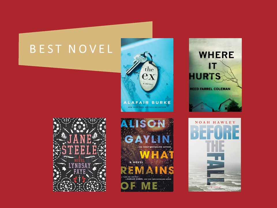
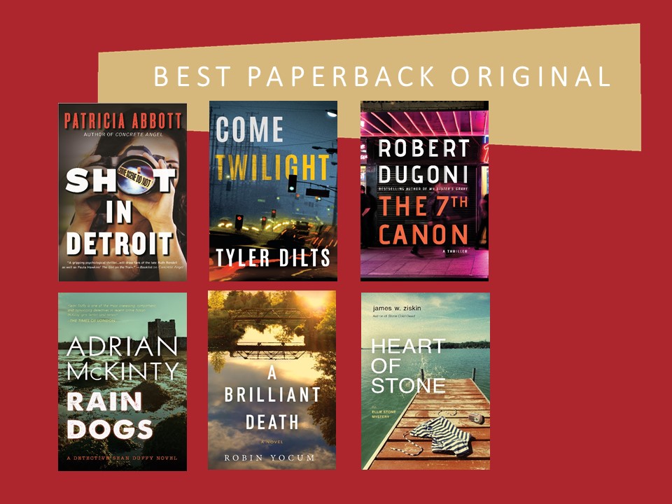 Sitting in the back of the room at my laptop controls, I never fail to be amazed by the beauty of some of the nominee covers. It’s fun to compare and contrast the styles. And I never fail to think about how a great cover — or a bad one — can affect a book’s chance to make a good first impression.
A while back, I did a long post about covers in which I cited a survey about what factors made a potential reader pick up a book. Guess what was no. 1? You betcha — cover design.
So when my sister Kelly sent me an article the other day about newest trends in book cover designs, I knew I had to pass it along to you. The article talks about all kinds of books, but maybe there’s some take-aways for us crime dogs as we self-publish or dicker with our editors. But first, let’s take a trip in the Way Back Machine…
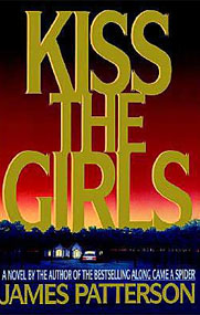
Remember when having huge raised foil letters was a must, a la any book by Patterson? Well, apparently that is yesterday’s news.

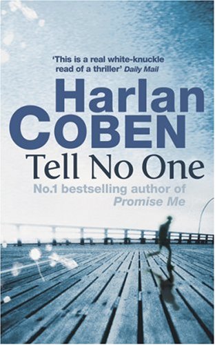
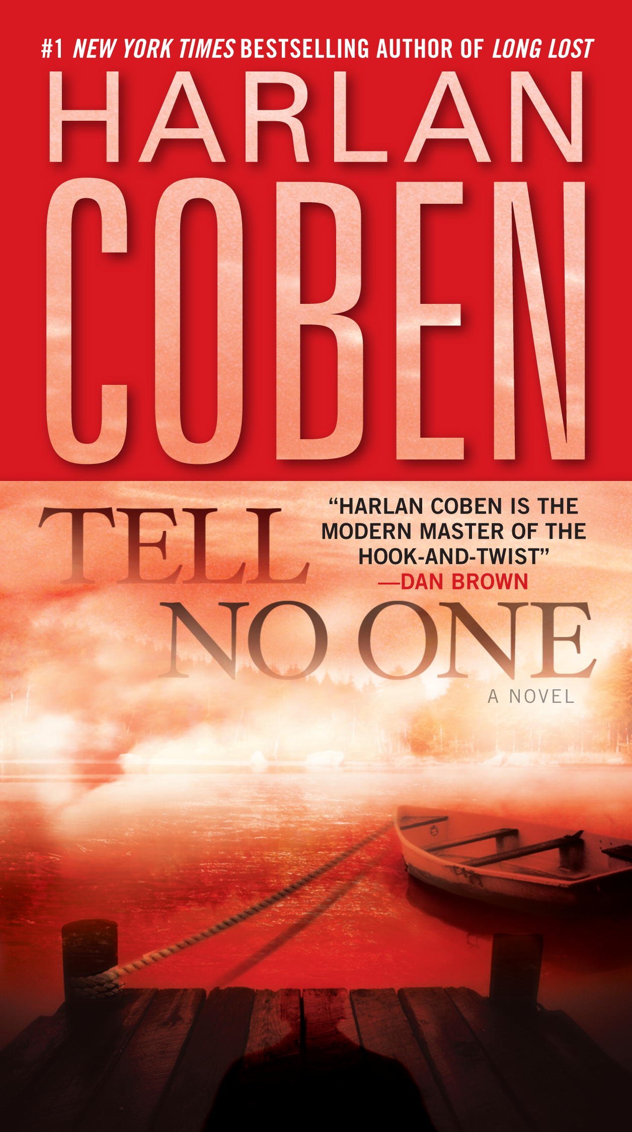
Remember when neon was the way to go, a la Harlan Coben’s breakout book Tell No One? It’s not enough these days….

And remember when all the girls wore basic black? It’s been done so much that it’s no longer the way to separate yourself from the pack. But apparently, I didn’t get the message…more on that in a moment.
Here, according to Lindsey Vontz of 99Designs, is what’s hot. (Click HERE for whole article.) And for fun, I took a look at this year’s Edgar nominees to see if I could find any parallels in our little genre.
Bold Typography
A hyper-trendoid thing is to have your cover dominated by the type, usually incorporating what Vontz calls “organic elements” like brush strokes rather than traditional clean fonts. This has been going on for years — Jonathan Safran Foer has made it a trademark — but it’s showing up everywhere now.
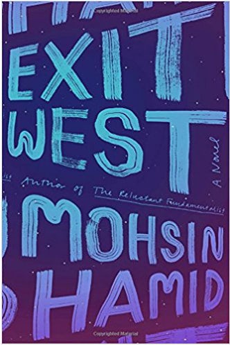
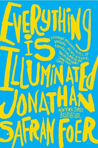
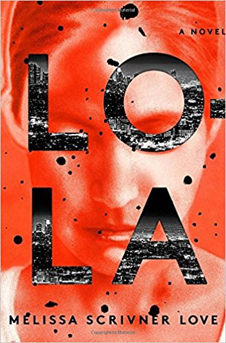
And voila! Here’s an Edgar nominee in this year’s Best First Novel category, Lola by Melissa Scrivner Love:
 Keeping It Simple
Many cover designers now are going for a minimalist approach, using one graphic element with a lot of white space. In the example below, the absence of two letters draws in the reader’s curiosity, the designer says.
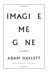
My sister Kelly, who still works parttime at Horizon Books in Traverse City, Michigan, says she remembers seeing this book come in and how it stuck in her mind and made her think how the missing letters telegraphed the book’s content.
Here’s The Hate U Give by Angie Thomas, a nominee for Best Young Adult Edgar. I love this cover, but then I was always a sucker for negative space in art class.

Hand-Drawn Covers
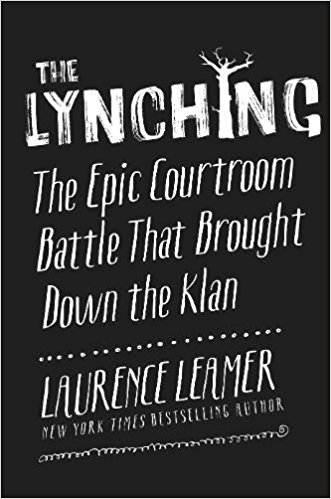
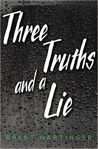
These have been popular for a couple years but the trend will continue, the article’s author says. Mostly, this has been the realm of more “feminine” books, the covers featuring a lot of florals and such. But there’s a trend toward more “masculine” design in hand-drawn covers, like the one below:
 I’ve seen this style pop up in the Edgars in recent years but this year, alas, no examples. But here are a couple from past nominees that I remember, the first in Best True Crime, the second in Best Young Adult:
Throwback Styles
Just when you thought it was safe to stop being nostalgic for the Sixties or, God forbid, the Seventies, new trends in book covers are reminding us that our past is never far enough behind us. Funky ’70s typography and colors straight out of plastic flower decals are the hot new things. Check these new novels out. Sex and Rage is a reissue of a 1979 novel, but Goodbye Vitamin is a slacker family drama that got rave reviews. Somewhere, Jacqueline Susann is laughing her butt off. And Philip Roth is thinking he retired just in time…
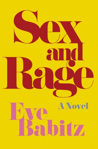
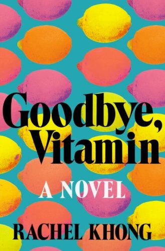
I couldn’t find any of this in the Edgar nominees. But I have noticed that in the Young Adult and Best Juvenile categories in past years, bright citrus colors and a touch of whimsy seem to be popular.
All Things Pink
Remember the musical number in Funny Face “Think Pink?” Apparently, it’s showing up on book cover design. Ah, but not any old bubblegum pink. It has to be — wait for this! — Millennial Pink. This means it has to be muted and dusty, which, come to think of it, is sort of how I see my millennial nephew. Here’s some examples:
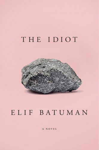
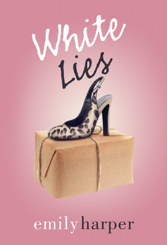
Lo and behold, look what I found in the Edgar’s Best First Novel category this year:
 Collage It Up
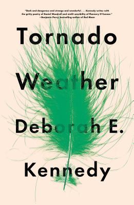
This dredged up another memory for me from my college art classes. I was terrible at anything three-dimensional but I do remember getting kudos for a collage I did. Maybe I’m just good at throwing stuff together and seeing what sticks. As for covers, I’ve always kind of like collages, but like juggling with chain-saws, this is not for amateurs designing their own covers.
 The closest I came to this among the Edgar nominees was this striking cover which superimposes what appears to be elevator down buttons over a man’s face. This is Jason Reynold’s Young Adult nominee Long Way Down.
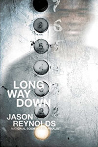 Photo-Heavy Covers

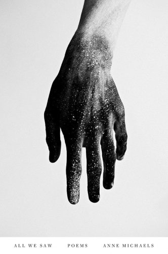
Photo images have been a mainstay of mystery and thriller covers for as long as I can remember. Self-published authors know all the ins and outs of finding stock images. And you can find just about anything you need to express your story in Getty Images. (Just type “Lonely woman on beach” in their search bar and for $395 you’ve got your cover.) But the trend now is to go beyond the literal stock image (silhouetted man running in dark alley = international thriller) and to find one really compelling, more artistic, image that might convey the tone or theme of the book instead. Here’s an example for a book of poetry:
And here’s a striking cover from one of this year’s Edgar nominees in Best Paperback Original, Penance by Kanae Minato:

Now, for an object lesson. I’d like to show you what my sister Kelly and I have been up to. In recent years, we’ve been getting the rights back to our backlist titles in our Louis Kincaid series and have self-published several of them. And since you can’t legally use the original covers, we’ve had to come up with our own. We knew we had to have a consistent look for all the books — same type fonts, same general look. But we struggled to find a singular style that we thought captured the series’s tone (hard-boiled police procedural/private eye). Plus, we aren’t rich. We didn’t have a lot of money to blow on designers or artwork. This is what we came up with (except for PAINT IT BLACK, which was done by Kensington Books and was always one of our favorites). You can click on the line-up to enlarge.
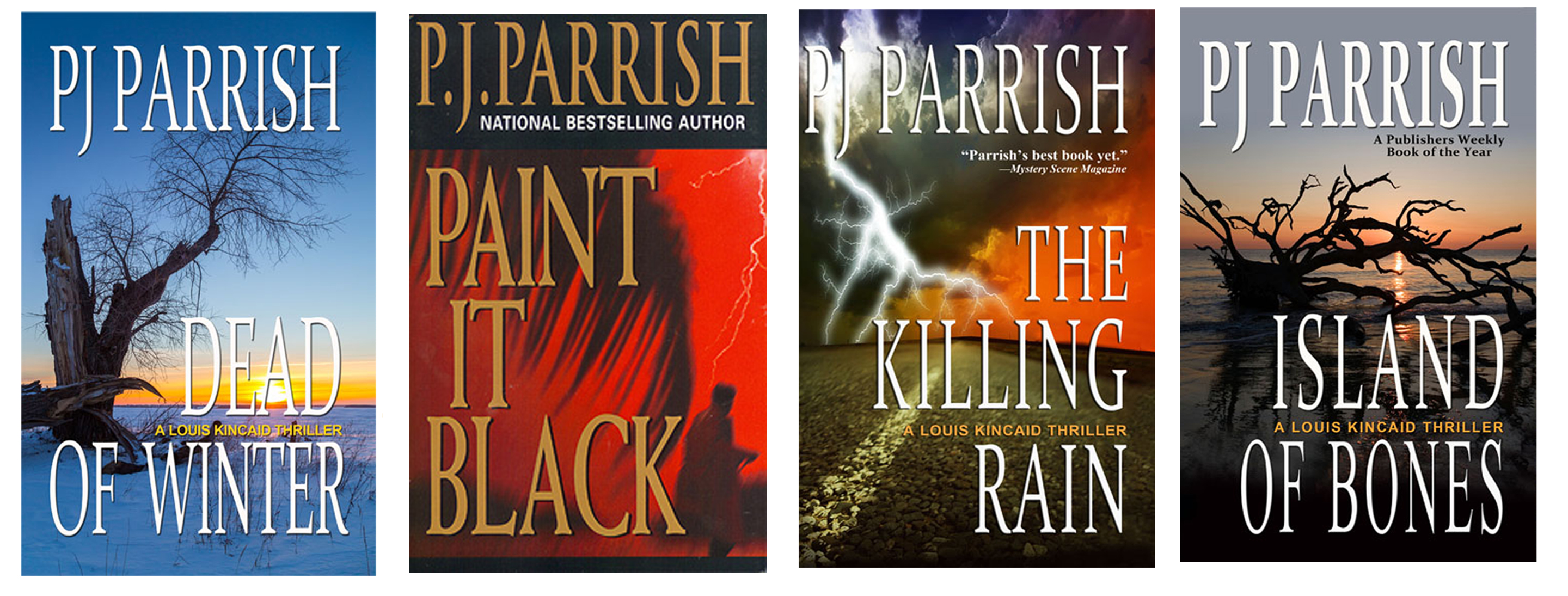
But we were never really happy with what we came to call our “dead tree” books. A moody landscape just didn’t convey our books’s tone. And they look a little dated now. I lobbied for something darker, and I really wanted to go with strong photos with humans in them to convey a sense of the books’s dark tones. And I wanted more negative space in the design to give the type and images room to breath. We also wanted it to match the upcoming cover design for our July 2018 release THE DAMAGE DONE. After weeks of searching for the right photos and playing with fonts, this is what we came up with. (Click to enlarge):
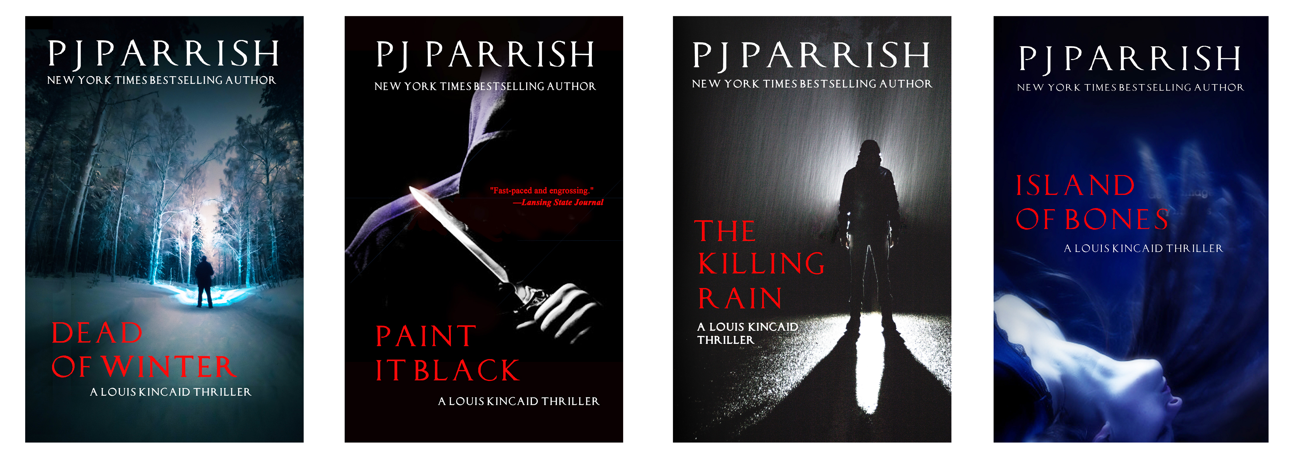 Yeah, yeah…I know. They’re black. So’s my wardrobe and my writer’s heart. As Jessica Rabbit says, I can’t help it, I’m just drawn that way.
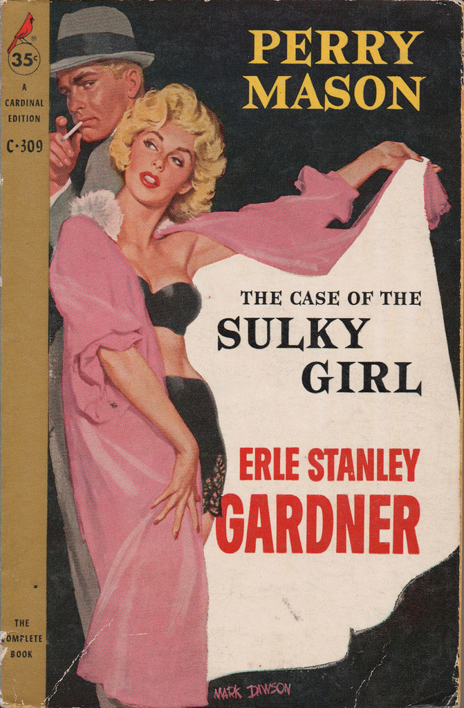
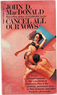
So what say you? Do any of these trends float your boat? Can you see your new serial killer book wearing pink? Hey, it worked for John D. MacDonald and Erle Stanley Gardner. Share your trials and triumphs about cover.
Postscript: James’s comment below about Harlan Coben’s Tell No One got me curious so I Googled the cover to see if other designs came up. Publishers usually repackage for paperback and foreign publishers put their own spin on things. Here’s a couple more versions of Tell No One, including a “dead tree” version!