Cover Story

By Debbie Burke

@burke_writer


Recently, Jim Bell wrote about baseball legend Honus Wagner, a shortstop in the early 20th century, and one of the first inductees into the Baseball Hall of Fame.

Here’s a story for Valentine’s Day about how Honus played matchmaker between me and my wonderful cover artist, Brian Hoffman, right here at The Kill Zone.

I still get chills when I remember how Brian and I “met”.

In 2017, the first novel (Instrument of the Devil) in my Tawny Lindholm Thriller series was traditionally published. They provided a cover that was predominantly lizard green, not my favorite color. But they paid me, so I went along with it.

Original cover


Six months later, they closed their doors, leaving me orphaned. The second book in the series was ready to publish and a third was in the works. After considering options, I decided to self-publish the subsequent books.

But self-publishing meant providing my own covers.

A professional design company did several cover drafts but I didn’t like any of them. Being a DIYer, I tried creating covers myself and wrote a post for TKZ about the process.


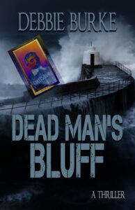
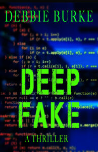
At that time, the fourth book Dead Man’s Bluff was close to publication but had not yet been released. No one except my critique group and editor had read it.

After that post, I received a gracious email from TKZ regular, Brian Hoffman. He said he enjoyed my posts and had learned a lot from them. Then he added he hoped he wasn’t offending me but “Your cover for Dead Man’s Bluff looks amateurish.  I’ve made one you might like better.  It is my gift to you for all the help your columns have been to me.”

He attached this cover:

Wow, just wow!

Since the book had not yet been published, Brian had no way of knowing the McGuffin in the plot was the Honus Wagner 1909 baseball card. Yet, there on his cover was that very card!

Chills ran through me. The theme from The Twilight Zone played in my mind.

How had this complete stranger perfectly captured the essence of my story about a Florida hurricane and a stolen baseball card?

I immediately wrote back to Brian, with profuse thanks, saying of course he hadn’t offended me, far from it. He’d blown me away with the beautiful cover and his generosity.

Believing he was a professional who designed covers for a living, I asked him for a bid to redo all my books.

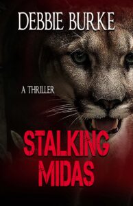
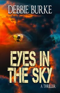
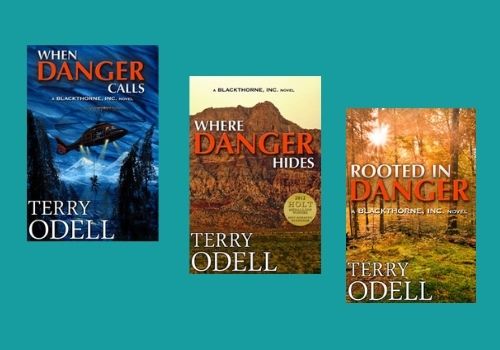
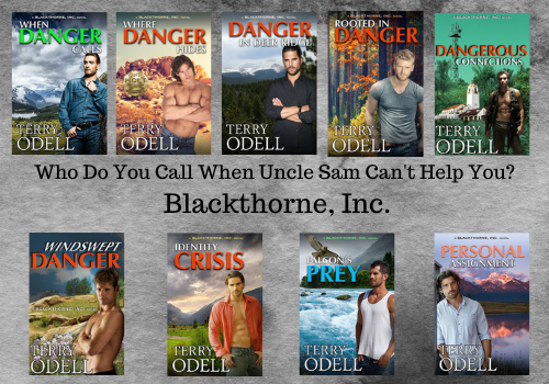
Bing, bang, boom. More emails arrived from him, each containing another great cover. They displayed a consistent style for the series that fitted the thriller/suspense genre. I was thrilled.

How much do I owe you? I wrote back.

Nothing. I enjoy doing them.

No way could I take his work without paying him.

If he wouldn’t give me an amount, I figured I’d send him a check for a fair market price. What’s your address?

 No answer.

After more back and forth emails—me offering to pay, him declining—we finally came to an agreement.

The Book of Ecclesiastes says: Cast thy bread upon the waters, for you shall find it after many days…

Brian and I continue to enjoy a great working relationship. I send him a synopsis of each new story. He sends several sample designs. We yak back and forth to fine-tune and decide on a final version. Here is his work:
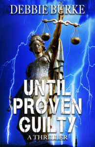
Thank you, Brian!

Being member of TKZ’s community yields many rewards, both expected and unexpected.

Happy Valentine’s Day to TKZ’s family and friends from all over the globe who enrich my life as a writer and a human being.

~~~

TKZers: Have you ever received a gift you never anticipated? Have you ever given a gift the recipient didn’t expect?

~~~


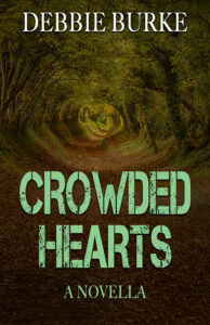
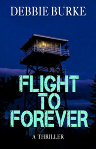
Here’s a sneak peek at Brian’s cover for my upcoming thriller Deep Fake.

You can’t believe your eyes.

Sign up here at my website and I’ll let you know when Deep Fake is released.

Branding. It’s Not Just for Cows.

Branding. It’s Not Just for Cows.
Terry Odell

Author BrandingWhat is author branding? When I attended a SleuthFest conference, one of the invited guests was Neil Nyren, a top gun at Penguin Putnam. I did a workshop on Point of View, and served on several panels. My latest releases that year were my three Triple-D Ranch books, and when I was “working” I wore my cowboy boots and hat. (I live in Colorado: the boots are my dress shoes, and the hats are common attire.)

The next day, I wasn’t on any panels, and I’d left my hat in the room. I strolled across the lobby, and Mr. Nyren called out, “Terry. Where’s your hat?” (First shock was that he knew my name, because I was too far away for him to read my nametag.) I said it was in my room, because I wasn’t on any panels, and he said, “It’s your brand. Wear it.”

Needless to say, when a top gun at a major publishing house gives you advice, you take it. So, I went upstairs, got my hat, and wore it through the rest of the conference. Side perk—saves time and trouble messing with your hair.

Author branding can be how an author dresses. But that’s not all, especially now that we’re not getting out and about much.

Used to be, you looked at books in a bookstore window, on special displays, or on the shelves, where the ones placed face out could catch your eye. If you were looking at spines, perhaps a title caught your eye, or the name of a familiar author. If the cover enticed, you’d move to the back cover copy, or the jacket flap copy, and then maybe flip through the book. But, odds are, it was the cover that started the process.

Now, even though many book purchases are made from on-line bookstores, the cover is still vital, because books have an everlasting shelf life. Even “old” books are new to many readers. And the cover is just as important, if not more so, than in the brick and mortar stores.

If your publisher creates your cover, you probably have very little input on covers. For most traditional publishers, their stand is usually, “Did we spell your name right? Is the title right?” Beyond that, you learn to live with it.

But if you’ve got rights back, or are creating an original title to publish yourself, you have to understand the importance of good, professional-looking cover art.

I published three books in a romantic suspense series for a traditional publisher that sold primarily to libraries. Although they employed an art department, the tended to look at each book as an island unto itself. This is what they did for my three books with them:

Author BrandingAlthough there’s nothing “bad” about any of the covers, there’s no continuity. No author branding. Nothing that says ‘This is a Blackthorne, Inc. book by Terry Odell.’ And with all the competition out there, you need that author branding.

As digital rights for each book became available to me, and as I continued the series as an indie author, I hired a cover artist to try to make them look more connected, while keeping the same overall design. (And, it never hurts to get an award noted on the cover.)

Author BrandingAn issue I discovered came after Amazon added an “Action Adventure” category under the romance umbrella. I was picking up readers who were unaware they were getting a romantic suspense, and they were leaving reviews saying they didn’t approve of the sex. Romance readers not only don’t mind, most expect it. Thus, it’s important that the cover reflect the genre.

Even though these were romantic suspense books, I wasn’t a romance reader, and didn’t care for covers with couples embracing, or, as was popular at the time, the “floating heads.” (See Where Danger Hides in the first iteration.) I had my cover artist get rid of that right away.

It’s a hard lesson, but authors need to learn that a book cover is a marketing decision, and requires an entirely different skill set from writing. Finding that perfect scene to depict on the cover isn’t necessarily a wise move.

So, even though I had my cover artist redesign my first three Blackthorne books to connect all of them, and do an original cover for the 4th, it wasn’t until I wrote book 5 that I accepted  the reality that a “hunk” on the cover was more indicative of a romance, plus, research showed that readers liked to connect with a “character” so I followed that for subsequent books.

After all, the cover needs to clue the reader in to the genre of the book, and based on reviews, a lot of people weren’t expecting the romance–and they were vocal about it. (They could have read the book description, but we won’t go there!)

My concern before changing any covers, which is why I delayed the process as long as I did, was I didn’t want readers to think I’d put out a new book and then be upset when they found out they’d already bought it. However, for the sake of author branding, I decided it was time to take the plunge, and I would add a note to the book descriptions of all the titles with revised covers that it was simply a new cover, not a new book.

Decision made, I asked Kim Killion of The Killion Group to bring things up to speed, and she revamped the first four in the series to bring them up to speed with the last four. I wanted the romance angle more up front, and for the books to say “series.”

Author BrandingAny authors whose branding resonates with you? What’s your brand?

**After Debbie’s great post about character interviews yesterday, I thought I’d share a couple of auditions I did with my characters for their roles in When Danger Calls. It was a freebie for newsletter subscribers a while back. If you’re interested, you can find it here.


Terry Odell is an award-winning author of Mystery and Romantic Suspense, although she prefers to think of them all as “Mysteries with Relationships.” Follow her on Facebook and Twitter.

Deadly OPtions e-Reader
Are Gordon’s Days in Mapleton Numbered?

Now available for pre-order. Deadly Options, a Mapleton Mystery/Pine Hills Police crossover.

Cover Art Angst

Of all the difficulties associated with producing a book one of the most vexatious (for me at least) is the issue of cover art. In traditional publishing, many authors typically don’t have a great deal of say in the cover of their book, and when going indie, the issue of cover art can be fraught with design as well as cost issues. Also, the impact of a book cover cannot be understated. It matters. It’s what draws a reader to pick up or click on your novel. For me, a great eye-catching cover is irresistible. I’ve picked up many a book solely because of the cover (mind you, I’ve put many of those books back down again  the first page or blurb was ho-hum).

My own experience with book covers, however, has been mixed – with less-than ideal cover art for my first novel in hardback:

Followed by three wonderful covers for my paperbacks (all involving the same artist and model).


I think what made all the difference was that the paperback covers truly reflected the tone, mood and genre of my novels – with the right  blend of historical details, female characterization and intrigue. Now, as I contemplate the possibility of getting my rights back and possibly repackaging/re-releasing these books, I’ve started to think more about the issue of cover art and what makes a book cover great…I hesitate, though – mainly out of fear that I might chose badly. As Bookbub points out, a bad cover can have a negative impact on book sales. Hence I sometimes get that ‘deer in headlights’ look when it comes to book covers.

There are some informative blog posts providing advice when it comes to designing cover art. Jane Friedman has had some interesting guest posts on her blog on this issue (see for example 5 steps to great cover art and getting the right fit).  At the end of the day, all the advice seems to boil down to making sure the cover fits your book and attracts your target readers (something that feels easier said than done!).

When I look at my own book shelves, a few (mainly YA) book covers stand out. There’s the original Twilight series covers which (at the time at least) stood out as unique.

Then there’s the Scythe series by Neal Shusterman – these covers are gorgeous.

When it comes to mysteries I love the covers for James R Benn’s Billy Boyle series:

But a beautiful cover is only on element of the equation – it must also appropriately reflect the type of novel you’ve written and appeal to readers of that genre. If there’s a disconnect between the cover and the content then beauty alone won’t work. When I look at some of the list of beautiful book covers (such as Buzzfeed’s compilation for 2017, which can be found here) many of them, while certainly aesthetically appealing, wouldn’t necessarily make me want to pick up and read the book.

So what are your favorite book covers? What do you look for when seeking cover art for your own novels? What’s your experience been with cover art (either as a traditionally published or indie author) and what advice would you offer to someone thinking about repackaging their books with new cover art??