
Branding. It’s Not Just for Cows.
Terry Odell
 What is author branding? When I attended a SleuthFest conference, one of the invited guests was Neil Nyren, a top gun at Penguin Putnam. I did a workshop on Point of View, and served on several panels. My latest releases that year were my three Triple-D Ranch books, and when I was “working” I wore my cowboy boots and hat. (I live in Colorado: the boots are my dress shoes, and the hats are common attire.)
The next day, I wasn’t on any panels, and I’d left my hat in the room. I strolled across the lobby, and Mr. Nyren called out, “Terry. Where’s your hat?” (First shock was that he knew my name, because I was too far away for him to read my nametag.) I said it was in my room, because I wasn’t on any panels, and he said, “It’s your brand. Wear it.”
Needless to say, when a top gun at a major publishing house gives you advice, you take it. So, I went upstairs, got my hat, and wore it through the rest of the conference. Side perk—saves time and trouble messing with your hair.
Author branding can be how an author dresses. But that’s not all, especially now that we’re not getting out and about much.
Used to be, you looked at books in a bookstore window, on special displays, or on the shelves, where the ones placed face out could catch your eye. If you were looking at spines, perhaps a title caught your eye, or the name of a familiar author. If the cover enticed, you’d move to the back cover copy, or the jacket flap copy, and then maybe flip through the book. But, odds are, it was the cover that started the process.
Now, even though many book purchases are made from on-line bookstores, the cover is still vital, because books have an everlasting shelf life. Even “old” books are new to many readers. And the cover is just as important, if not more so, than in the brick and mortar stores.
If your publisher creates your cover, you probably have very little input on covers. For most traditional publishers, their stand is usually, “Did we spell your name right? Is the title right?” Beyond that, you learn to live with it.
But if you’ve got rights back, or are creating an original title to publish yourself, you have to understand the importance of good, professional-looking cover art.
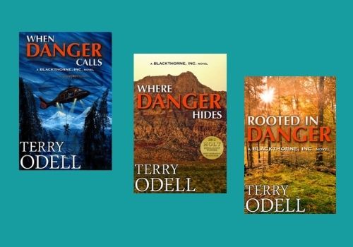
I published three books in a romantic suspense series for a traditional publisher that sold primarily to libraries. Although they employed an art department, the tended to look at each book as an island unto itself. This is what they did for my three books with them:
 Although there’s nothing “bad” about any of the covers, there’s no continuity. No author branding. Nothing that says ‘This is a Blackthorne, Inc. book by Terry Odell.’ And with all the competition out there, you need that author branding.
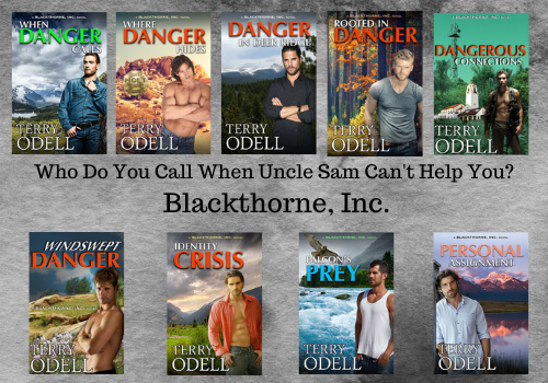
As digital rights for each book became available to me, and as I continued the series as an indie author, I hired a cover artist to try to make them look more connected, while keeping the same overall design. (And, it never hurts to get an award noted on the cover.)
 An issue I discovered came after Amazon added an “Action Adventure” category under the romance umbrella. I was picking up readers who were unaware they were getting a romantic suspense, and they were leaving reviews saying they didn’t approve of the sex. Romance readers not only don’t mind, most expect it. Thus, it’s important that the cover reflect the genre.
Even though these were romantic suspense books, I wasn’t a romance reader, and didn’t care for covers with couples embracing, or, as was popular at the time, the “floating heads.” (See Where Danger Hides in the first iteration.) I had my cover artist get rid of that right away.
It’s a hard lesson, but authors need to learn that a book cover is a marketing decision, and requires an entirely different skill set from writing. Finding that perfect scene to depict on the cover isn’t necessarily a wise move.
So, even though I had my cover artist redesign my first three Blackthorne books to connect all of them, and do an original cover for the 4th, it wasn’t until I wrote book 5 that I accepted the reality that a “hunk” on the cover was more indicative of a romance, plus, research showed that readers liked to connect with a “character” so I followed that for subsequent books.
After all, the cover needs to clue the reader in to the genre of the book, and based on reviews, a lot of people weren’t expecting the romance–and they were vocal about it. (They could have read the book description, but we won’t go there!)
My concern before changing any covers, which is why I delayed the process as long as I did, was I didn’t want readers to think I’d put out a new book and then be upset when they found out they’d already bought it. However, for the sake of author branding, I decided it was time to take the plunge, and I would add a note to the book descriptions of all the titles with revised covers that it was simply a new cover, not a new book.
Decision made, I asked Kim Killion of The Killion Group to bring things up to speed, and she revamped the first four in the series to bring them up to speed with the last four. I wanted the romance angle more up front, and for the books to say “series.”
 Any authors whose branding resonates with you? What’s your brand?
**After Debbie’s great post about character interviews yesterday, I thought I’d share a couple of auditions I did with my characters for their roles in When Danger Calls. It was a freebie for newsletter subscribers a while back. If you’re interested, you can find it here.
Terry Odell is an award-winning author of Mystery and Romantic Suspense, although she prefers to think of them all as “Mysteries with Relationships.” Follow her on Facebook and Twitter.

Are Gordon’s Days in Mapleton Numbered?
Now available for pre-order. Deadly Options, a Mapleton Mystery/Pine Hills Police crossover.