
Branding. It’s Not Just for Cows.
Terry Odell
 What is author branding? When I attended a SleuthFest conference, one of the invited guests was Neil Nyren, a top gun at Penguin Putnam. I did a workshop on Point of View, and served on several panels. My latest releases that year were my three Triple-D Ranch books, and when I was “working” I wore my cowboy boots and hat. (I live in Colorado: the boots are my dress shoes, and the hats are common attire.)
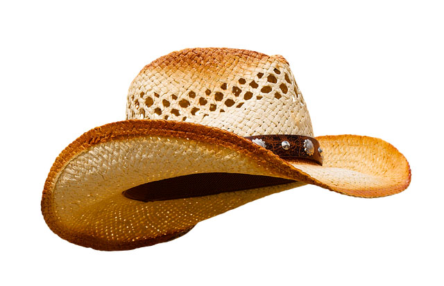
The next day, I wasn’t on any panels, and I’d left my hat in the room. I strolled across the lobby, and Mr. Nyren called out, “Terry. Where’s your hat?” (First shock was that he knew my name, because I was too far away for him to read my nametag.) I said it was in my room, because I wasn’t on any panels, and he said, “It’s your brand. Wear it.”
Needless to say, when a top gun at a major publishing house gives you advice, you take it. So, I went upstairs, got my hat, and wore it through the rest of the conference. Side perk—saves time and trouble messing with your hair.
Author branding can be how an author dresses. But that’s not all, especially now that we’re not getting out and about much.
Used to be, you looked at books in a bookstore window, on special displays, or on the shelves, where the ones placed face out could catch your eye. If you were looking at spines, perhaps a title caught your eye, or the name of a familiar author. If the cover enticed, you’d move to the back cover copy, or the jacket flap copy, and then maybe flip through the book. But, odds are, it was the cover that started the process.
Now, even though many book purchases are made from on-line bookstores, the cover is still vital, because books have an everlasting shelf life. Even “old” books are new to many readers. And the cover is just as important, if not more so, than in the brick and mortar stores.
If your publisher creates your cover, you probably have very little input on covers. For most traditional publishers, their stand is usually, “Did we spell your name right? Is the title right?” Beyond that, you learn to live with it.
But if you’ve got rights back, or are creating an original title to publish yourself, you have to understand the importance of good, professional-looking cover art.
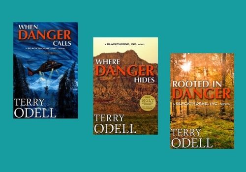
I published three books in a romantic suspense series for a traditional publisher that sold primarily to libraries. Although they employed an art department, the tended to look at each book as an island unto itself. This is what they did for my three books with them:
 Although there’s nothing “bad” about any of the covers, there’s no continuity. No author branding. Nothing that says ‘This is a Blackthorne, Inc. book by Terry Odell.’ And with all the competition out there, you need that author branding.
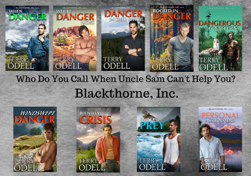
As digital rights for each book became available to me, and as I continued the series as an indie author, I hired a cover artist to try to make them look more connected, while keeping the same overall design. (And, it never hurts to get an award noted on the cover.)
 An issue I discovered came after Amazon added an “Action Adventure” category under the romance umbrella. I was picking up readers who were unaware they were getting a romantic suspense, and they were leaving reviews saying they didn’t approve of the sex. Romance readers not only don’t mind, most expect it. Thus, it’s important that the cover reflect the genre.
Even though these were romantic suspense books, I wasn’t a romance reader, and didn’t care for covers with couples embracing, or, as was popular at the time, the “floating heads.” (See Where Danger Hides in the first iteration.) I had my cover artist get rid of that right away.
It’s a hard lesson, but authors need to learn that a book cover is a marketing decision, and requires an entirely different skill set from writing. Finding that perfect scene to depict on the cover isn’t necessarily a wise move.
So, even though I had my cover artist redesign my first three Blackthorne books to connect all of them, and do an original cover for the 4th, it wasn’t until I wrote book 5 that I accepted the reality that a “hunk” on the cover was more indicative of a romance, plus, research showed that readers liked to connect with a “character” so I followed that for subsequent books.
After all, the cover needs to clue the reader in to the genre of the book, and based on reviews, a lot of people weren’t expecting the romance–and they were vocal about it. (They could have read the book description, but we won’t go there!)
My concern before changing any covers, which is why I delayed the process as long as I did, was I didn’t want readers to think I’d put out a new book and then be upset when they found out they’d already bought it. However, for the sake of author branding, I decided it was time to take the plunge, and I would add a note to the book descriptions of all the titles with revised covers that it was simply a new cover, not a new book.
Decision made, I asked Kim Killion of The Killion Group to bring things up to speed, and she revamped the first four in the series to bring them up to speed with the last four. I wanted the romance angle more up front, and for the books to say “series.”
 Any authors whose branding resonates with you? What’s your brand?
**After Debbie’s great post about character interviews yesterday, I thought I’d share a couple of auditions I did with my characters for their roles in When Danger Calls. It was a freebie for newsletter subscribers a while back. If you’re interested, you can find it here.
Terry Odell is an award-winning author of Mystery and Romantic Suspense, although she prefers to think of them all as “Mysteries with Relationships.” Follow her on Facebook and Twitter.

Are Gordon’s Days in Mapleton Numbered?
Now available for pre-order. Deadly Options, a Mapleton Mystery/Pine Hills Police crossover.
“Branding. It’s not just for cows.” I love it. And so true.
Branding is important with just about everything. It creates expectations with respect to what you do and what you don’t. Pennzoil or Proctor & Gamble won’t be marketing a new candy under those brands anytime soon. You might say in modern parlance that it’s important when selling something to stay in your lane and mark it.
Thanks for sharing your knowledge and for the great conference story, Terry!
Thanks, Joe, and you’re welcome.
And I wonder … do you get up early or stay up late to read and comment on TKZ blogs!
The new covers look great, Terry. I recently had a similar conversation with my publisher. Thankfully, they encourage input. My usual cover artist doesn’t work there anymore, which bummed me out. She’s done all my thriller covers. The new-to-me cover designer is super talented as well. I’m sure it wasn’t easy to fill the shoes of her predecessor and blend my new release into the existing series, but she did great. And I just heard she signed with Netflix to redo the cover for Bridgerton.
I will say I’ve been much happier with the covers I’ve hired out myself than anything my publishers came up with. Congrats to your current designer. Anything Bridgerton is a win. Which brings up another topic about adding diversity to existing works when they’re adapted for the screen. CJ Box’s Big Sky also comes to mind. Another topic for another day.
Thanks, Terry, for a great post. Lots of good info. I’ve known for a long time that I need to redo the cover to the first book in my fantasy series–it was designed by a local school’s art/design department–but have not yet done that. Your post today tells me that it is time. Thanks for the impetus.
Happy to get out the cattle prod, Steve.
“Branding. It’s Not Just for Cows.” Since my heart belongs to the 1800’s, you snagged me right from the blog post title. 😎
You bring up so many good points in this post and it’s one I’ll refer back to both for the discussion and the visual examples. I was just having a conversation with a friend about a short book series we’re embarking on and the need to NOT think just in terms of individual books but the books as a series in look and form. I love e-browsing and seeing book series with a consistent look. It’s cool!
I haven’t spent enough time thinking about branding (not exactly the fun part of the writing life) but I do need to put some thought into it, not only for work I will write with someone else, but for what I write on my own.
As a reader, whom as you mentioned is now mostly virtually shopping for books, most of my assessment of a potential book is from the cover (and yes, I do read the back cover blurb wherever possible). As one of approximately 3 people in the known universe who wants to read historical fiction that is NOT romance, I filter out many titles by the cover. And yes, the cover and the blurb should be honest about the contents. Thankfully it happens rarely, but I sometimes come across covers or blurbs that are misleading. Zero chance I would ever read such an author again.
Not only do we need to know our brand and be consistent, it’s about respecting people’s time. Ours and everyone else’s. A reader is making a quick judgement of a cover in a few seconds and we have to learn to make it count.
Thanks so much, BK. One thing I didn’t mention in my post about covers–since it was focusing on the branding–is that the cover has to look good and be legible in thumbnail size, because that’s what most people are seeing. I don’t put author quotes/blurbs on my covers because 94.3% of the time, they’ll look like blurry squiggles.
Print’s another story. If you’re hiring a cover artist, you can have the covers for the various formats be slightly different.
Terry, when you mentioned the idea yesterday of job interviews for characters, that intrigued me. After reading Frankie’s and Ryan’s interviews, I’m hooked! What a terrific concept that also helps pantsers b/c you show how plotting can arise out of character backstories.
My initial covers were a sorry mish-mash until TKZ regular Brian Hoffman redesigned them. Each one is unique but there’s an underlying theme and font that ties them together. I am thrilled with his eye and his beautiful work.
Next road trip, I’ll have to visit Broken Bow, Montana…if I can find it on the map. 😉
Thanks, Debbie. Glad you liked their job interviews. Those are fun to write! You need the special Blackthorne, Inc. maps to find Broken Bow.
Nice post, Terry. And a good reminder!
Thanks, Karla, and thanks for stopping by.
“Don’t judge a book by its cover.” I’m not sure where that (s)age-old advice came from, but it’s not part of the real world in online book marketing. I found out just how important covers are when I started promoting my ebooks through pay-to-play newsletters and Bookbub ads. The only artwork guys like Ereader News Today (ENT), Booksy, Fussy Librarian, and Robin Reads take is your cover. Same with Kobo promotions. Bookbub lets you slip a bit of copy in with the ad, but the cover still rules. So the book cover is front & center to a promo plan, and its the first thing newsletter subscribers see when you pay to put your work in their face. No doubt about it, they’ll judge your book and your brand on that image. BTW, nice hat, Terry.
So true, Garry. Covers are first impressions, and you never get another chance. I recall author Suzanne Brockmann being sick at the cover her publisher gave her–the book was supposed to be about the most handsome guy on her SEAL team, and he came out looking more like the Pillsbury Dough Boy. She went so far as to put stickers hiding his face on books she sent out.
The good news about working with independant publishers was that I had much more control over my covers, the bad thing was some of the artists and editors knew nothing about cover and genre iconography so it was the hill I was willing to die on to get the cover right. Ah, the joy of being the “difficult” writer because my book was romantic suspense with lots of action, not an action adventure novel. Two different audiences to p*ss off if they got it wrong. I actually found my own cover artist and paid for one cover because the publisher’s artist was so clueless and unwilling to learn about cover iconography.
I really should have taken notes back then. I could write a horror novel that would make most authors shiver with terror about the abject stupidity and ignorance from some publishers and authors back in the Wild West of the early digital days.
That’s what happens when it’s the marketing department designing the covers. Part of what an author with a publisher has to learn is how to look at things objectively, but a cover that doesn’t deliver the right message is hurting everyone.
I do recall asking for a cover for a book set in Florida, but in the Florida where I lived, not the Miami Beach expectation. Turns out the cover artist lived not far from where I did, knew what I meant and took a trip to a local wilderness park to capture the right background. And then his wife was sitting on their patio when a bald eagle landed nearby. She grabbed her camera, and I lucked out with both of my requests on the cover.
You should definitely have a brand or look. You should hire a professional who will work with you. Your brand should be in your covers. As you said, republishing older titles gives you an opportunity to tie them together with your brand. Note Elaine Viets older series now out in re-release with new covers.
True, Alan. Being able to rebrand covers is a boon. My first cover artist was just starting out (as was I in the indie world) and he would work with his authors until everything was “perfect.” I can’t imagine a publishing house agreeing to “nudge the subtitle up about a quarter of an inch,” but Dave would do that. Alas, he’s no longer in the cover art business.
As an indie, covers are definitely key to my branding. I worked with a terrific cover designer on my Empowered series, threading the needle on books that combine elements of superhero and urban fantasy. She also did my Agents of Sorcery covers, which are aimed squarely at the urban fantasy “reader bullseye”, and a space opera, Spice Crimes, which has a romantic vibe to it. It gives all those books a similar look, even though they span three different genres.
Incidentally, my personal headgear of choice is a tailored fez. Really 🙂 I have a large collection of them, and wore them to science fiction conventions and writers workshops and retreats. I have a few “mystery” writing ones that I might don while drafting to get myself in the mindset 🙂
Some historical romance authors appear in period garb at conferences. At SleuthFest, there are a couple of authors who can be picked out in the crowd by their headgear. I’ve never seen anyone in a fez, though. Getting into character with a hat while working on drafts would certainly work. I recall Oprah Winfrey saying when she was working on The Color Purple, as soon as she put on the ‘granny panties” she became her character.
“Fezes are cool!” Matt Smith’s version of DOCTOR WHO.
This may be a weird question, but were you a speaker at CCWC Terry? It’s been a while, but I swear this post is the written version of a conference session I attended, or at least saw on the list of options, once.
Not a weird question, Mia, but no, I wasn’t a speaker there. I can understand the topic being presented numerous times in numerous variations, but this one’s based on my books and my experiences.
Ah, okay.
I looked up the old conference schedules. Turns out there was a workshop in 2018 titled “Branding for People Who Are Not Cows,” which is why this post seemed so familiar :P.
🙂
Interesting post, Terry. For me, there’s Author Branding and there’s Cover Branding. Two related but different things.
As an author, I promote my extensive experience/skill with swimming (the activity/sport). It’s in my social media taglines, on my About the Authors, on back covers… all over the place. Because I was once one of the best competitive swimmers in the world (and continue to swim regularly to this day), when I write a scene that includes having anything to do with being in, on, or under the water, readers know that I know what I’m talking about. It comes through as real, because it is. Because I’ve been there. So swimming is part of my author brand, and I promote that whenever I can.
My covers (I design/create all my Indie covers) are also branded. Beyond genre, they’re branded by well-known design guidelines and principles: main title legibility, brightness contrast, series consistency, font emotion, etc., etc.
So yeah, branding. For cows, books, and people. 😉
Agreed about branding being much more than cover art, but there’s only so much one can cover in a post. 😉 People picking up a book by John Gilstrap versus Elaine Viets, for example, know what to expect.
Likewise Nora Roberts. In fact, when she wanted to deviated from her ‘brand’, she began the In Death series writing as JD Robb. Readers will have different expectations of both. (Or is it each?)
I love your interviews with Frankie and Ryan! And you do these once you finish the book?
I so agree about your covers being connected. My publisher has been so good with my covers. You can tell they’re connected. I love the new covers you had designed.
Thanks, Patricia. I confess I do the interviews after I finish the book. Otherwise, I wouldn’t know what questions to ask! 😉
As a debut author (Truth and Other Lies publishes next spring), I’m just in the process of brainstorming with my publisher’s art director about the cover. What I’m struggling with is that the likely reader for my book probably skews much younger than I am (they: 25-35 newly-minted career women; me – let’s just say, older). I have to keep in mind what would appeal to my readers and reflect the book I’ve written, not just the more “literary” cover I might prefer to fit how I think of myself as a writer. And then there’s the problem that my 2nd book is in a totally different genre of psychological suspense.
What I do for all my books, regardless of genre/sub-genre, is use the same font for my name. I agree, it’s a huge challenge to remember what’s true for you might not be true for others, and you have to be able to step out of your personal box. I struggle with this all the time.
I like the new covers for your series, Terry. They definitely tie everything together.
My first novel was traditionally published, and they gave me the option of several covers. I loved the one I picked—an idyllic, colorful scene.
However, my mystery series is concerned with time. Watches, clocks, and timepieces play a part. When I decided to self-publish the second book, I found a treasure of a cover designer right in my own backyard. Well, really a few miles away. She designed a lovely cover with a partially concealed watch face imposed on a darkly beautiful forest path. I think it’s one of the most striking (apropos for a clock motif) covers I’ve ever seen.
I realize now that all the future books in the series should have some sort of timepiece on the cover. I may go back and rebrand the first cover at some point.
Excellent point, Kay:
The underlying theme should definitely show up on the covers. For my Mapleton series, it’s the title font with a knife as the “L” in “Deadly” and the crime scene tape with the “Mapleton Mystery” across the cover.
Great post, Terry.
As far as covers are concerned, I have zero graphics ability. Kensington used to ask me for cover suggestions, but my mind doesn’t work that way. Over time, it’s morphed into veto power. If I really hate a cover, they will take another swipe, but that’s only happened once, and that was a long time ago.
The key to a cover brand, I think, is a consistent display of the author’s name. If you think, about it, while cover designs vary in books by Grisham, King, Sandra Brown, Nelson DeMille and others, the positioning and font of the author’s name is consistent. Fans know at a glance who the author is, even before they know what the title is.
I think it’s hard for many writers to grasp that THEY THEMSELVES are the branded entity, not the books they create. That’s why I always stress the importance of being sociable at conferences and such.
“I think it’s hard for many writers to grasp that THEY THEMSELVES are the branded entity, not the books they create.”
Exactly, John. We get so engrossed in the book, we want the cover to depict what happens instead of “This is a book in such-and-such a genre, written by the amazing John Gilstrap.”
Just look at any JD Robb cover. You can hardly make out the image. It’s the title and the author’s name. In HUGE letters. Someday … 😉
And someday we’ll be able to go to conferences again.
Loved your Title! And your new book covers are amazing. I’m sure some won’t mind buying a second copy.
My day job as content developer for Mitzi Jane Marketing is all about colors, fonts, and collective branding across all social media channels. We work with developing brands for small businesses.
I enjoy my job when I see that a business owner’s ideas and goals are developed into logos, social media backdrops, and all sorts of other images that they get excited about it.
The second favorite part of my job is coming up with specific taglines and hashtags.
We have worked with a family-owned ice cream business recently to help transition their #noscoopleftbehind tagline into #onescoopfitsall. It was a smart move because of their new original extra large waffle cones with an extra-large serving at the price of a regular serving. Helping families enjoy special outings during these hard times.
Which reminds me no writer should be left behind when it comes to branding and marketing and one scoop really doesn’t fit every writer. The more individualist, the better.
I’ve gotta say, boots are also my favorite footwear but living here on the beach, I only get to wear them when a cold front pushes in. Usually, I’m in flip-flops.
Thanks, Cindy. I lived in Florida for over 30 years. It was a shock to move to Colorado and have to buy SOCKS! Taglines are a challenge for me. Then again, almost all marketing tasks are outside my wheelhouse. Thanks for stopping by.