
Of all the difficulties associated with producing a book one of the most vexatious (for me at least) is the issue of cover art. In traditional publishing, many authors typically don’t have a great deal of say in the cover of their book, and when going indie, the issue of cover art can be fraught with design as well as cost issues. Also, the impact of a book cover cannot be understated. It matters. It’s what draws a reader to pick up or click on your novel. For me, a great eye-catching cover is irresistible. I’ve picked up many a book solely because of the cover (mind you, I’ve put many of those books back down again the first page or blurb was ho-hum).
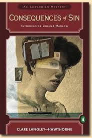
My own experience with book covers, however, has been mixed – with less-than ideal cover art for my first novel in hardback:

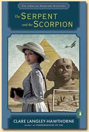
Followed by three wonderful covers for my paperbacks (all involving the same artist and model).
I think what made all the difference was that the paperback covers truly reflected the tone, mood and genre of my novels – with the right blend of historical details, female characterization and intrigue. Now, as I contemplate the possibility of getting my rights back and possibly repackaging/re-releasing these books, I’ve started to think more about the issue of cover art and what makes a book cover great…I hesitate, though – mainly out of fear that I might chose badly. As Bookbub points out, a bad cover can have a negative impact on book sales. Hence I sometimes get that ‘deer in headlights’ look when it comes to book covers.
There are some informative blog posts providing advice when it comes to designing cover art. Jane Friedman has had some interesting guest posts on her blog on this issue (see for example 5 steps to great cover art and getting the right fit). At the end of the day, all the advice seems to boil down to making sure the cover fits your book and attracts your target readers (something that feels easier said than done!).
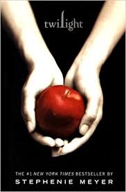
When I look at my own book shelves, a few (mainly YA) book covers stand out. There’s the original Twilight series covers which (at the time at least) stood out as unique.
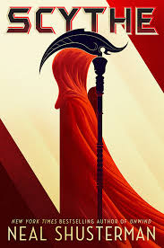
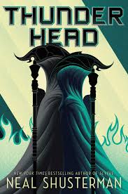
Then there’s the Scythe series by Neal Shusterman – these covers are gorgeous.
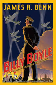
When it comes to mysteries I love the covers for James R Benn’s Billy Boyle series:
But a beautiful cover is only on element of the equation – it must also appropriately reflect the type of novel you’ve written and appeal to readers of that genre. If there’s a disconnect between the cover and the content then beauty alone won’t work. When I look at some of the list of beautiful book covers (such as Buzzfeed’s compilation for 2017, which can be found here) many of them, while certainly aesthetically appealing, wouldn’t necessarily make me want to pick up and read the book.
So what are your favorite book covers? What do you look for when seeking cover art for your own novels? What’s your experience been with cover art (either as a traditionally published or indie author) and what advice would you offer to someone thinking about repackaging their books with new cover art??
Having just “re-covered” my first 4 Blackthorne, Inc. books to bring the series into line, my first advice would be to remember that your cover is a marketing tool. Find someone who understands what readers want, what brands you, your books, your series. Don’t try for that “this is a scene in my book and everything has to look right” approach.
And yes, the cover should reflect the genre. Based on reader reviews, my personal preferences weren’t doing my books any good, as they didn’t say “This is a romantic suspsense.” Readers (other than myself) want people on covers so they know there’s someone they can relate to. I would get dinged in my reviews because “there’s sex in this book!” when the cover didn’t hint to non-romance readers seeing the book that it was a *romantic* suspense. They could have read the description but …
I blogged more about my thoughts and compared covers here: https://terryodell.com/author-branding-part-2-cover-art/
That’s terrifying!
How on earth am I, as a an Adult Epic Fantasy writer, supposed to convey such things in a cover as sex or LGTBQ elements so as not to get dinged by dingbats who can’t read a description? It’s not and never will be “romance!”
I already knew that cover art was going to be a major roadblock, but I never considered the idea that readers (or NON-readers, as the case may be) might flip out over the fact that the cover doesn’t reveal everything.
I wouldn’t consider that either!
Additional: I checked out your blog post on the subject, Terry. Thanks for including that!
I agree…the whole floating heads & embracing couples is so…Ehhh.
But I have say, Killon did a great job with the revamp! Concise, tight design which (to me) certainly spells “romance” and “series!” very well!
Thanks! 🙂
Thanks Terry – It’s amazing how the different covers changed reader perception!
Love your covers, Clare! I’ve learned some hard lessons regarding covers. One of the most important lessons is, blood on a cover turns readers off. Dead bodies are okay, as long as there isn’t blood. Go figure. The other lesson I learned is, don’t use the same colors in all the books in a series. At signings, potential readers often think Wings of Mayhem and Blessed Mayhem are the same book, even though they show different images. It’s the way the similar colors catch the eye, I guess.
Interesting…I wouldn’t have thought blood (but not dead bodies!) on the cover would turn off readers. The color issue is good point as I could totally see myself making that mistake assuming the color meant the book was the same one (clearly I’m just not observant enough!)
LOL – with my old covers, people would say, “I read one of your books and liked it but I can’t remember the title.”
I’d ask them what color it was.
As an art director/designer — and now (Indie) author — one of the biggest mistakes I see with covers heading for the online marketplace is: readability at small size. Most covers will be shown as very small thumbnails in important places like “Also Bought” sections and “Top Sellers” lists. I’m talking 150 pixels tall; smaller than what you see above in the main post. (and if you don’t know what a pixel is, you need to get busy 🙂
Think small.
P.S. I run the Book Cover Reviews group on Goodreads. Feel free to use it.
Great point – and one thing every author needs to remember given they will undoubtedly have an ebook that will display in thumbnail size. I’ll also check out the Book Cover Reviews group on Goodreads – thanks!
My favorite book covers are from fantasy novels. The colors are bold and many, and there’s always a detail included from some creature’s strange anatomy. But just because they’re beautiful, it doesn’t make me want to read fantasy. ALMOST, I’ll pick the book up and look at it, but no, I’m just not into the fantasy genre.
I also like the cover art from novels set in space. The setting allows the artist to use watercolor-like images where the pigments fight and mingle and blend just like glowing gases of far away galaxies. The cover of John Scalzi’s Old Man’s War is an example. And yes, the lure of the cover (along with the opening two sentences) lured me into reading the book.
A recently published book cover I like is Mercedes M. Yardley’s Pretty Little Dead Girls. The cover is beautiful! It doesn’t have blood, but the red flower petals suggest blood. The artistic composition is a little off kilter, and the background is black, both hinting at the horror genre. Yes, the cover made me interested enough to read the blurb and the sample intro pages.
The cover for Pretty Little Dead Girls is certainly evocative! I find YA novels have some of the most stunning book covers at the moment – but that might be because I have teenage boys so I’m always on the hunt for new books for them to read. Leigh Bardugo’s Grisha series has some great fantasy covers – beautiful and eye catching – the books are also terrific so that helps:)
One mistake I see in indie covers is the impulse to tell the “whole” story in the graphics of the cover. Writers (trying to be designers) overlay several images or do a montage that does not “read” well on the Amazon thumbnails.
Another mistake is to use weird fonts (like the fancy-serif type of the York Times name) in an attempt to convey a bygone age or something overly frilly for a romance novel. If you can’t READ the type, it fails.
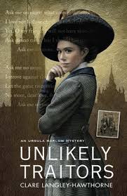
A while back I did a post on cover trends (April, I think it was) and one that stood out to me was the use of one strong graphic element that stands as a powerful metaphor for the story. This is what made the Stephanie Meyer covers so good. Ditto Gone Girl with that wisp of blonde hair disappearing into that sea of black. I think this is why your own “Unlikely Traitors” is so good — our eye is drawn immediately to the dominant female figure in the great hat. (Message immediately conveyed: historical about a strong woman!) Yes, there are buildings in the background (London?) but they are nicely fuzzy. Compare this with your “Consequences of Sin” cover where all the graphic elements have the same weight an the eye has no true focus.
It’s very hard, if you are doing your own books or working with a designer, to come up with something evocative. And you also have to be aware that the general design has to transfer over several covers if you have a series…ie the same fonts, roughly same format.
The bottom line, for me, is to err on the side of simplicity. And pick one really great image!
Good points about the covers and I hadn’t really noticed the change between Consequences of Sin and Unlikely Traitors but you’re right. I think simplicity is key and being original as well as evocative – there are far too many ho-hum covers out there.
I’m a follower of covers and see the same stock photos used again and again: The top-hatted Victorian gentleman (from the back), and the modern girl in the red coat.
Ah yes…the girl in the red coat. Getting to be as big a cliche as the red shirt guy in Star Trek…
Crazy how these same images get used so often!
Joel Friedlander’s website, The Book Designer is a great resource on cover design. Each month he runs a column where he critiques ebook covers. It’s here: https://www.thebookdesigner.com/
Thanks Brian – I must check the column out!
RWA has done a professional survey of readers several times about marketing. The results are the three most important elements of a reader buying a book are author name recognition, the cover, and the book blurb/back cover description. So, spending the money on a first-rate artist who knows your genre and the current cover trends is more than worth the money. Also, titles are over-rated in their importance.
I read lots of self-published authors and get most of the free and sales-priced ebook mailings like Bookbub and Fussy Librarian. The biggest mistake I see is authors not understanding their genre so they market them to the wrong audience. Last night, in fact, I started a book with a fantasy cover but was a paranormal mystery. Annoying, although I’d guessed the genre by the book blurb.
Book blurbs are my primary area of interest, and I do an occasional blog on bad blurbs in the real world where I dissect book blurbs I’ve seen. Click on my name and click on the label “Book blurb” if you are interested in these train wrecks of promotion.
Definitely interested in train wrecks of promotion – if only to try and avoid them myself!