Atticus – New Formatting Software for Writers

by Steve Hooley

A Writer’s Best Friend?

Atticus is a new writers’ program for writing, editing, and formatting. It is on-line based, but can also be downloaded to your computer for off-line work. The program works on Windows, Mac, iOS, Chromebook, and Linux computers. It is available for purchase, even as continuing additions and improvements are made. At this point, its main advantage is a formatting program for Macs and PCs that rivals Vellum (Mac only) for ease of use and beauty of final formatted file.

Atticus produces both PDF and EPUB files. (As of 10/1/21 Amazon Kindle accepts only EPUB files for new books.) I believe I read somewhere that Atticus plans to develop the capability to produce a MOBI file for sideloading into a Kindle device.

I learned about Atticus while reading a review of Vellum. The review was by Dave Chesson, founder of the Atticus project. At the end of the summary at the top, tucked into the end of “Bottom Line,” was a single sentence: “I recommend Atticus overall, though.” I followed the links. (The tutorials are all the way at the bottom.)

I was excited when I saw that the program worked for Windows. I was skeptical when I read their goal of being a combination of Scrivener + Word + Vellum. And I was pulled in to explore more when I saw the price. At that point, the price for “early adopters” was $117. It is currently $147 ($102 cheaper than Vellum). And all continuing and future updates and improvements are free. They had me hooked, and I began exploring.

I found my way to the tutorials, and studied them thoroughly, reading them first, then viewing the computer views while the tutorial was narrated. The tutorials were exceptionally good.

I was most impressed with the formatting component, the component most fully developed at this time. I had downloaded the free Vellum program (for trial use without the ability to produce a file until you pay) on a Mac laptop that I use to write. Atticus seemed to have the ease of use that Vellum is known for. It had been a couple years since I examined Vellum, but Atticus looked like it had more options and choices for theme and style.

I was not impressed with the writing component. (Atticus is currently working on that component). At the time of this writing, the writing component is bare bones, with very few choices for font and size in the writing frame. The chapters are listed in a column on the left (like Scrivener), but that’s where the comparison ends. I write in Scrivener, and I’m guessing that Atticus will have a huge uphill battle in convincing Scrivener users to switch to Atticus for the writing component. Note that Atticus will allow .docx files from other programs to be easily uploaded and formatted.

At the time of this writing, I have not found any editing tool or component (like Word) in the program. The promise is for an editing component. I hope the developers will use an open-source program (such as Open Office or LibreOffice) and develop it for both the writing and the editing tools. That is a weakness of Scrivener (editing). And, if a writer could have the main capabilities of Scrivener, with added robust editing tools (without having to export the file), while being able to produce a .docx file, the writer might be willing to give Atticus a try.

Bottom line for me: I felt like the formatting component alone was worth the price of the program. Until further improvements come along, I plan to write in Scrivener, edit in Word, then upload a docx file into Atticus for formatting.

My experience thus far:

I uploaded a docx file of my first book in my Mad River Magic series. I had a new cover, and I wanted to reformat the interior of the book with a larger font. I also wanted an EPUB file for “going wide.”

I had first reviewed Garry’s “Ten Tips for Formatting eBooks from MS Word” (9/17/20). I removed as much formatting as possible. I specifically removed the front matter and the back matter (as per Atticus recommendations), creating a separate file for future use, and copy and paste capabilities.

I carefully removed existing formatting from the titles and formatted them with H1 style and 20-point size. I removed any spaces between the title and the text.

I then uploaded the docx file to Atticus. It successfully identified all chapter titles, and the beginning of my Table of Contents appeared in the left column.

Atticus did miss some of my scene breaks, (***) (Atticus calls them “ornamental breaks”). I learned by trial and error to remove them and any spaces, put my cursor on the end of the paragraph before the scene break, then “insert ornamental break” from the menu above the writing frame.

Foot notes were a problem for me. I had learned from the tutorials that Atticus changes footnotes into “end notes” (at end of chapter). I use footnotes for the interpretations of my magic spells. I played around with ways to adapt the endnotes, but finally gave up when I discovered that Atticus handles how it displays the numbering differently in PDF and EPUB files. I stripped out the footnotes. I believe that Atticus should standardize how it displays the numbering of end notes so they appear the same in EPUB or PDF.

The formatting came next. It was easy and fun. A window that shows how your formatting looks is placed on the right, and you can see what you are doing.

Adding and formatting front and back matter followed, and was easy, with a few hitches. Template pages can be added from a menu in the TOC column, and show up in the left column TOC. They can be easily dragged and dropped up and down to change their order. You can copy and paste from your front and back matter file (that you created when you stripped them out of your manuscript). If you have chosen your style and theme first, you can see what the page looks like in the formatting window.

Two problems I ran into here were Copyright page and Full-page images. I will say right away that Chris (with support), was unbelievably helpful. Responses to my questions were quick and accurate. Even when we ran into a real bug that needed to be fixed in the program, Chris had a work-around.

The first was mainly due to my stupidity. The copyright page does not show up accurately in the format window. I was used to Kindle formatting the copyright top and center. Atticus kept putting my copyright at the bottom of the page. When Chris explained that the page was formatted that way intentionally, I checked a bunch of books and discovered that the page I never look at was “now” being formatted to the bottom of the page. I didn’t like the way my tiny copyright looked, so I changed the font size from 6 to 8 point and put about 10 empty spaces below it before I repasted it into the formatted page. It worked.

The second problem was full-page images. Having struggled with inserting images into the Kindle formatter, I was amazed at the ease of inserting images into Atticus. The problem arose when the pictures (inserted into the backmatter) disappeared in the EPUB file. The empty page was there. The page was titled in the TOC, but no picture. Chris discovered that a true bug had been found and referred it development, but Chris also found a work around – put the page in the “body” rather than the backmatter. The order was the same, the page showed up in the TOC, and it worked. Two seconds to drag and drop.

Downloading the files:

Down loading the files was simple. Clicking the PDF button opened a screen notifying me that the file would be attached to an email. Clicking the EPUB button downloaded the file directly to my computer. If you have Kindle previewer on your computer (a free Word app), you can preview your EPUB file in Word (when I double clicked the file, Kindle previewer opened directly).

When I uploaded my PDF and EPUB files to Kindle, they were accepted immediately, and no changes were required. That was a new experience for me.

Recommendations:

If you have a Windows PC (or a Mac and are not using Vellum), check out Atticus. My plan is to write in Scrivener, edit in Word, and format in Atticus. I believe the program is worth the price for the formatting alone. And I look forward to those free additions as Atticus works on the Writing component and the Editing component.

Addendum:

Atticus had its official launch last week. At this point, the price is still $147, and improvements are continuing to be made. The link above (in the second paragraph) is an updated landing page with lots of details, including a comparison with Vellum. The tutorials at the very bottom of the page give you a good feel for how the program works and prepare you to jump in and format some beautiful manuscripts.

Some other improvements that Atticus has announced are coming soon:

  • Book writing goals and progress
  • Plotting and outlining features
  • Collaboration
  • Large Print
  • Custom font for writing area
  • Find and replace
  • Set opening page
  • Epub and Mobi import
  • Reusable elements (pages like “Also By” and “About the Author”) can be saved as templates and reused in other books

Okay, TKZ community:

  1. Do any of you have experience with Atticus? What are your thoughts?
  2. What would it take to convince you to use formatting software?
  3. We’ve only scratched the surface, but what other components would you like to see in Atticus?
  4. Do you write and edit on the same computer, or do you use two separate computers?

Tips For Formatting Your Book

by James Scott Bell
@jamesscottbell

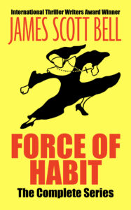
Allow me to get some shameless self promotion out of the way: Today is the release of FORCE OF HABIT: THE COMPLETE COLLECTION. The ebook is available for a limited time for the deal price of $2.99. (Outside the U.S. go to your Amazon store and plug this into the search box: B091DRDWRJ.)

Okay, now let’s talk about formatting your book. If you’re an indie writer, this is fundamental. But traditionally published writers may also wish to self publish some work (e.g., a short story or novella) as added marketing.

Formatting is critically important, because readers have been conditioned to expect a certain look. Like no spaces between paragraphs and standard indenting. If your formatting is clumsy a reader may set the book aside even if you have a solid story going.

For your book’s interior, you have two choices: You can learn to do your own formatting, or you can hire it out. For the latter, you may expect to pay somewhere in the range of $300–$800 for an EPUB and pdf file. (Note, the mobi format for Kindle is not being used anymore. EPUB is now the standard. However, you may wish to create a mobi file in order to send out an ARC that can be sideloaded onto a Kindle device.)

I’ve not used formatting services myself, but a few I’ve heard good things about are Booknook, EbookPbook, and BookDesignTemplates.

Reedsy also offers design services (and in addition has a free formatting app for DIY).

So let’s say you decide to format your own books. There are many options (and please share in the comments any you have found helpful).

I use Scrivener for my writing, and have used it in the past for my formatting. It’s tricky to get it right, however, and the formatting choices are limited. This blog post offers some useful Scrivener tips in that regard.

At one time I also used the free formatting app Calibre. I’ve not seen the latest iteration, but I think it’s still safe to say it does an adequate job.

The biggest problem I see with these options is that when you want certain design elements, like drop caps or ornamental breaks, it’s hard to get them to come out right.

Amazon now offers a free program called Kindle Create. I haven’t used it, but it looks pretty good. It seems to be a decent, though limited, alternative to my app of choice, Vellum.

Vellum is a Mac-only program that is so simple to use, with such beautiful results, that I cannot recommend it highly enough. It’s well worth the price, because you’ll probably be using it the rest of your indie life. (NOTE: I am not affiliated with Vellum, so get no compensation from recommending it.)

Broadly speaking, you choose a design template from the Vellum library. Within a template you select various options, such as how you want opening paragraphs to look, if you want drop caps, and what style of ornamental break you like (you can import your own, too). Front matter and back matter are easy with Vellum’s pre-designed pages.

(NOTE: Although Vellum is a Mac-only program, I understand you can use a “Mac emulator” to run it on a PC. One such option is discussed here.)

The design choices in Vellum fit different genres. You can test the various styles, which show up instantly onscreen, and soon enough you’ll find the look you prefer.

For the pdf/print version, you can change the trim size, margins, and font size.

Vellum also automatically puts in a scene break line at the bottom or top of the page. This is incredibly helpful, as those breaks are hard to see on your own. (What I’m describing is when a scene ends at the bottom of a page and a new scene begins at the top of the next page. Good typography demands an ornamental line, such as ***, to indicate this for the reader.)

Another plus is the ability to put in different front and back matter for the ebook and print. For example, in your ebook back matter you’ll want to include direct links to your newsletter sign up, other titles, and the online store review page. But links don’t work in print, so you design those pages differently and choose “Include in Print only” from a drop down menu.

I have to say, the print edition of FORCE OF HABIT is gorgeous. For my fiction, I choose cream paper over plain white. It just looks and feels better to me. For my ornamental break I used the flying fists of fury nun design. The pages look like this:

Print Formatting Errors to Avoid

At a conference years ago, a writing friend joined a bunch of us who were sitting around, and showed us a copy of her new, DIY print version, several copies of which she’d consigned to the conference bookstore. I gave it a quick glance…and almost didn’t have the heart to tell her of a glaring formatting error. At the end of one her chapters was a blank page. But she had the title-header at the top of the page and the page number at the bottom.

Ack! A reader seeing that will think there was a printing error, and the book is missing text!

A blank page, if you have one, should be as clean as driven snow (as an L.A. resident I don’t know why I choose this metaphor). Vellum knows this, and takes off header/page number when you have a blank page.

Another error is having even-numbered pages on the right hand side. Never! Always start your book (after front matter) with page 1 on the right.

Isn’t it quite amazing that today an author can create both an e- and print book that looks every bit as good as a something from a big publishing house? (The answer you’re looking for is YES.)

So what is your formatting process? What programs do you use? And please share any additional tips you have!

Submission Protocol

Nancy J. Cohen

Last week, I sent a submission via snail mail. “What’s that?” you ask. It’s almost a forgotten art. I hadn’t sent out a physical manuscript in so long that I’d forgotten the specifics. I think it’s been at least five years, likely longer, since I last had to send anything from the post office. This submission went to a niche market and was another of my father’s travel journals.

So what was involved? After reading the online submission guidelines, I reviewed my manuscript. Oops, I’d forgotten all about headers and footers with the book title, author name, and page number. Having formatted for ebook requirements, I added those back in.

writing

Since this book is nonfiction, I had to include a Table of Contents. No problem. I know how to do this in Word. Oh, wait. I forgot to write a Foreword like I did with my father’s other journal, Thumbs Up, that I’d indie published. So I added the TOC. Then I deleted some of the book buy hyperlinks in the back. I shouldn’t include those for this type of submission.

A query letter topped it all off. I polished mine once more before adding it to the pile of papers. It’s also been ages since I’d had to write one of these things. It’s never easy, is it?

Now what? I printed out the whole work, since it is short and about equivalent to a normal book proposal in page count. Next came the SASE. How do you do this again? If you want the manuscript back, you have to put actual postage stamps on a suitably sized manila envelope. This means you have to weigh the envelope for return postage with the manuscript inside, affix the stamps, remove the pages and stuff them into the outer envelope along with the folded SASE. A complicated business, isn’t it? Or you can just include a stamped and self-addressed #10 business envelope for the form rejection letter you’re sure to get.

envelopes

And then comes the great sigh of relief when you send your baby off at the post office. This generates a more visceral response than sending a book into cyberspace. Somehow the physical manuscript seems more a part of you.

Weeks pass and then months. You watch the mail for the return envelope. Once you see it, gloom sets in. You’ve been rejected. And you start the process all over again.

At least that’s how it used to be done in the old days. Do you remember those times? Do you miss them?

Let’s Discuss the Latest on Self-Publishing Resources

Jordan Dane
@JordanDane


Just a short blog post today from me, but I could really use your help. I’m interested in hearing from those who have good resources for self-publishing regarding formatting and sales ops. Since we have a wealth of experienced followers on this blog, I’d like to hear your thoughts to broaden my horizons. Self-publishing is a HUGE topic, but I’d like our chat to be focused on the questions below.


Here are some of the things I’m interested in getting updated on:

Format Questions


1.) Do you have format service companies or individuals you would recommend?
I’d like to find a one-stop company or individual who formats for all the major sales outlets: Amazon, B&N, ITunes, Kobo. Please share your experiences.


2.) What format add-ons do you recommend (as far as website links or features) that have worked for you? (ie website links, mailing list signups, retailer sales links, etc.) In other words, what marketing tools do you add to your formats that you would recommend?


3.) Within your format of text, are there navigational aspects or enhancements (bells & whistles) you would recommend to add to your content? (ie chapter list with links to easily navigate within your book, audio enhancements, etc. Some of these might be costly, but I’d love to hear any new ideas.)


4.) Does anyone have a special format service provider for Lightning Source? I hear the LS set up is expensive and corrected proofs must be reloaded. This could be cumbersome, but I hear the quality is good and LS does hardcovers with different distribution outlets. It’s something I’d like more information on.

Sales Enhancements


5.) Regarding sales outlets, are there any new players worth considering?
If you have a site, please post it and comment as to why you would recommend it. I’m thinking the sites mentioned above encompass the majority of sales, but if you’ve found other sites worth considering, I’d love to hear about them.


6.) Has anyone added sales/purchase capability onto their website where a reader could buy from the author directly? I’ve seen this done via a secured PayPal app, but had concerns on sales tax and shipping. I wondered how this worked (for anyone who has experience).


7.) I know promotion is a big topic, but for the purposes of discussion and brevity, what one promotional activity or service provider do you use without fail and would recommend to anyone?

Editing & Cover Design


I haven’t mentioned editing, because again that is a must have for any author and the cost can have a wide range, depending on services needed from line edits to book doctoring. I also haven’t asked about book cover designers. I work with Croco Designs and love Frauke Spanuth. But feel free to mention any other self-publishing services you’ve found helpful.


I bow to your infinite wisdom, TKZers. Please share your thoughts.

First Page Critique: Kerguelen

by Michelle Gagnon
We’re winding up our first page critiques this week. Thank you everyone for your patience, especially all of you brave folks who submitted pages. We apologize for any delays in posting them.
Today I thought I’d talk a little bit about formatting. As a savvy commenter pointed out last week, some of the first pages we’ve posted appear to be longer than others. Some of you sly dogs submitted a 10 pt font, single-spaced page. This isn’t something an agent or editor will let you get away with, however, so in the interest of keeping the process as fair and helpful as possible I re-formatted today’s submission (which ended up weighing in at TWO full pages, not one).
Here’s why: the point of this process is that we’re critiquing what most agents would read, and that’s one page. You have that much time to grab their (and our) attention. So fudging the formatting doesn’t really help. The main goal should be to make that first page compelling enough to keep a reader turning to the second, and then the third…and so on.
Here, then, is the true opening page of Kerguelen:

Prologue

My boots are slick with blood and guano. I push my feet through dead terns and petrels, their downy wings flopping, their necks lolling as though life never belonged there. I plow ahead, daring not lift my feet. In some places the litter of birds is half-a-foot deep across this flat headland overlooking the gunmetal ocean. Not a sound from the cliff-face rookery just beyond the edge, an odd braid of birds now and then falling off into dead space. I turn around and follow my plowed trail over the headland back toward my cottage.
Day without wind—a rarity. Fog creeps past the knobheads of grass and fennel, thinning, whispering above the flagstone steps of my cottage. It’s simple really. Fog is moisture, water laden with whatever is in the air: pollution, particulates, poisons. Give us our gales, thank you, from sea-borne air currents that daily carry more and more of the rest of the world to us. Even as far away as the southern Indian Ocean. No one lives isolated—even on a remote island like Kerguelen. Air circulation patterns being what they are in our little whirlpool pocket of climate, yes, in time, we will breathe the same air as everyone else.
There. My last breath was joined by some remainder of a cough from a 19th century Liverpool tubercular ward and a little something from a hacking terminal flu case in Coeur-d’Alene and, of course, the tick-tick-ticking of some isotope, Strontium 90, perhaps, Lawrencium, Polonium.
Some of us thought of going underground, but now it’s surely too late for that. We hope that each day will bring a topping out, and then we will begin the downhill slide, nursing our inevitable lesions, losing hair, pressing on despite frail appetites. We’ve all read and reread the survival manual. We know how it will go. We just hope it won’t turn out as badly as all that.
The good news here is that I would definitely keep reading. I’m a sucker for post-apocalyptic novels anyway (ORYX AND CRAKE, anyone?) I do think the language could use a merciless edit, however. Some of the metaphors didn’t really work for me, they felt somewhat melodramatic and cumbersome. For example, in the second sentence: “I push my feet through dead terns and petrels, their downy wings flopping, their necks lolling as though life never belonged there.”
I think the image of the dead birds is powerful enough on its own: lose the “as though life never belonged there.” Also, consider cutting “my feet.” You also repeat “plow” in the first paragraph, a big no-no. I’m not entirely certain what a braid of birds looks like: that expression briefly took me out of the story.
I’m assuming that the rookery is on a sea cliff- shouldn’t there be a splash when the birds hit the water? I actually think incorporating one makes that sentence more effective. Word choice is always critical. Instead of “some of us thought about,” I would write, “some of us considered.” It’s tighter and less clunky. Also, the second half of that sentence, “but now it’s surely too late for that,” is overwritten. Just say, “it’s too late for that now.”
I’m a little confused by the “topping out” and “eventual slide” in the final paragraph. Is the topping out when air quality reaches the absolute worst point, then gradually starts improving? Or is it when the worst of those air currents finally reaches the island, setting about the inevitable death of the inhabitants? I think if that information is being offered on page one, clarity is key. I love how the page ends, however. Great work.
So, to sum up: compelling premise, just needs some tightening up. And since I’m just emerging from full-bore editing mode on my own manuscript, here are my suggestions for a much tighter opening page:
My boots are slick with blood and guano. I push through dead terns and petrels, their downy wings flopping, necks lolling. In some places the litter of birds is half-a-foot deep across this flat headland overlooking the gunmetal ocean. Not a sound from the cliff-face rookery, except for the occasional splash of a dead bird tumbling into the water. I turn around and follow my plowed trail over the headland back toward my cottage.
Day without wind—a rarity. Fog creeps past the knobheads of grass and fennel,
whispering above the flagstone steps of my cottage. Fog is moisture, water laden with
whatever is in the air: pollution, particulates, poisons. Give us our gales, sea-borne air
currents that daily carry more of the rest of the world to us. No life remains isolated—even
on a remote island like Kerguelen. Air circulation patterns being what they are, in time we
will breathe the same air as everyone else.
There. My last breath was joined by the remnants of a cough from a 19th century
Liverpool tubercular ward, combined with a hacking terminal flu case in Coeur-d’Alene
and, of course, the tick-tick-ticking of some isotope: Strontium 90, perhaps, or Polonium.
Some of us considered going underground, but it’s too late for that now. Every day we pray for a
topping out, after which we begin the downhill slide, nursing our inevitable lesions, losing hair,
pressing on despite frail appetites. We’ve all read the survival manual. We know how it will go.
We just hope it won’t turn out as badly as they promised.