By P.J. Parrish
If you hire someone, please don’t abdicate your power! Because YOU have final say on your cover and if your instincts say “it doesn’t quite work” go back to your artist and get a redo. I recently saw an author lament on a writer’s list that she “half-heartedly approved” her cover because it “sort of conveyed the idea of the book and it was sort of okay.” She added it was too late before she noticed her name was so small and pale as to be unreadable. I looked at the cover. It’s clean, it’s professional looking, but it has no pop.
That author won’t get a second chance to make a good first impression.
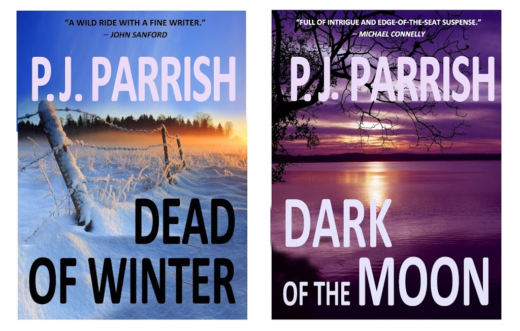
I can hear you saying, “Huh, why should I listen to her?” Well, my professional resume on this is kinda thin. I’ve got a degree in art which included ad design classes, and I once made my living designing newspaper feature pages. And full disclaimer, my sister Kelly has a side business designing covers. But more important, I’ve studied this in preparation for our own eBook debuts. (Our backlist title DEAD OF WINTER came out last month and our novella CLAW BACK comes out this week. CLICK HERE to see them).
KEEP IT SIMPLE BUT STRONG: What works on a regular book cover usually doesn’t translate to eBook. One word: thumbnail. That’s the size your book comes up on most eBook lists. A paperback cover is about 64 square inches, a big canvas to display an image, title, author name and maybe a tagline and blurb. But an eBook cover is really just an icon, meant to be judged in the blink of an eye. So intricate detail, slender san-serif fonts, murky colors can put you at a disadvantage. Subtle isn’t always good in the Lilliputian world of e-bookstores.
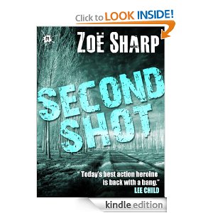
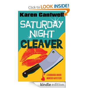
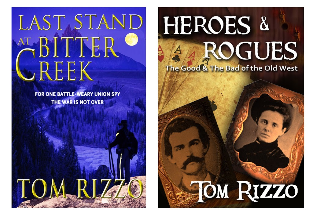
Use a limited font palate. Yes, you can combine different typefaces on a cover, but be careful. Again, they must be readable and complementary. Here’s a good basic article on FONT SELECTION. And I realize that this is probably inside baseball, but it you don’t know about kerning, weight and how to align type, please hire someone who does.
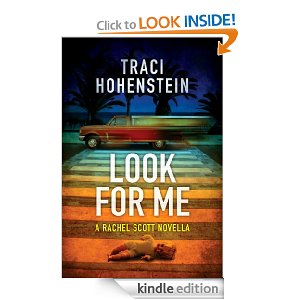
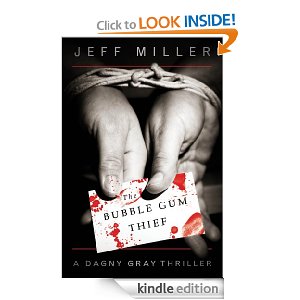
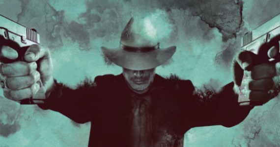
GRAPHIC ELEMENT: You can use either a photograph or an illustration but make sure it is quality. There’s are some great sites for buying stock art and photos, some free. I read recently that publishers are using more people on crime novels because research indicates character-driven books are selling better of late. So we are getting more of this
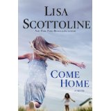
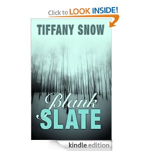
And less of this

But those examples also say something about TONE. Lisa Scottoline has moved away from her old lawyer series (Killer Smile) and now writes “family-in-jeopardy” crime novels. Likewise, you must find the right image for your mood. Other stuff: Don’t use the artwork of a relative unless your relative is a professional. Don’t photo-shop too many elements in an effort to convey EVERYTHING about your plot. This works: