So here are my tips, with some sample covers I found at random on the Kindle site. First some general stuff.
PICK A MOOD: You need to convey the TONE of your book immediately. Is it amateur sleuth a la
Elaine Viets or hardboiled realism a la
Barry Eisler, or wacky stuff a la
Tim Dorsey? Make sure the colors, illustrations and fonts work together to support the mood. Zoe Sharp tells us at a glance what kind of book she writes
I don’t think we’re going to confuse her with this author
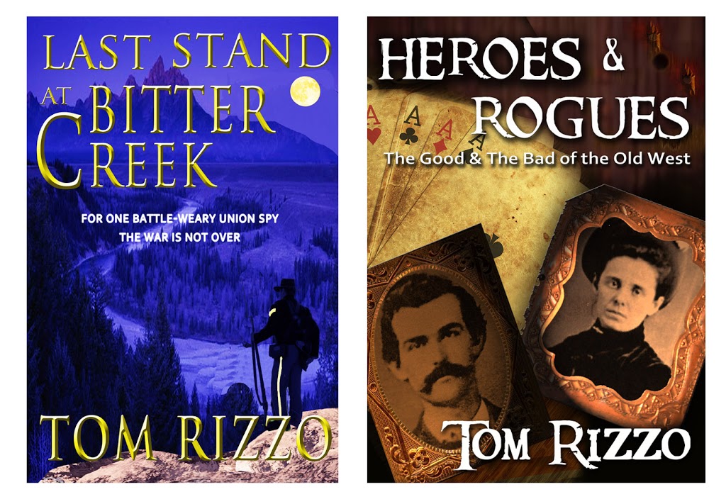
While we’re at it, non-fiction should have a different feel than fiction. Here are covers my sister designed for an author who wrote two books about the Civil War.
You can tell at a glance which is the novel and which is non-fiction. And note the use of blue versus brown. The blue conveys an elegiac tone; the sepia brown historic. Now let’s talk specifics.
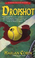
to this
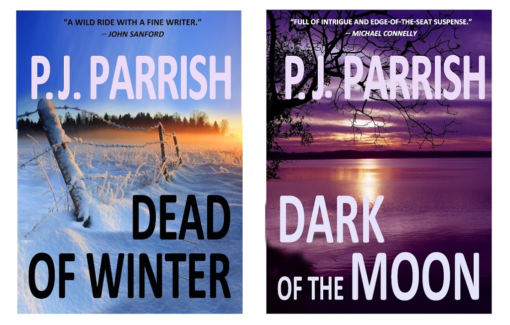
thanks to a good cover designer. Coben became visually branded via his striking neon covers. You, too, need to think about branding with your eBook covers, especially if you have a series. Before we settled on our final covers, Kelly and I came up with these for our first two Louis Kincaid novels.
Note the uniformity of the type, mood, colors and use of landscape imagery. We jettisoned these because another author, CJ Lyons, used the exact same stock photo at left on one of her books. Try to stay away from all the cliche images that are showing up on eBooks now — like blood dripping from a woman’s eyes like tears and bloody hand-prints on windows. I mean, c’mon, you can do better.
FONTS: I have a thing for typefaces. I love them. Within their simple designs lie, well, fonts of emotion and you can almost feel the glee of their inventors. Look at how different these are:
THE KILL ZONE
THE KILL ZONE
THE KILL ZONE
THE KILL ZONE
THE KILL ZONE
THE KILL ZONE
Each conveys a different mood. Fonts are fun to play around with. But fonts are like sex. The more exotic it is, the more trouble you can get into. Go for READABILITY. Stay away from the cliche correlations because they tend to look like you’re trying to hard, in other words: amateur hour. Don’t use Comic Sans on a comic novel (don’t use it for anything…it’s ugly). Don’t use Lithos if your setting is a Greek Isle. Don’t fall back on Papyrus if you’re writing about Egypt. Don’t use Old English for a book set in 1800s London. (It’s not only a visual cliche it’s unreadable!) Remember: The three elements — color, graphic, type — must
complement each other, not fight each other for attention.
Use a limited font palate. Yes, you can combine different typefaces on a cover, but be careful. Again, they must be readable and complementary. Here’s a good basic article on FONT SELECTION. And I realize that this is probably inside baseball, but it you don’t know about kerning, weight and how to align type, please hire someone who does.
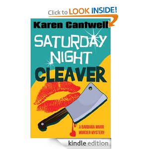
GRAPHIC ELEMENT: You can use either a photograph or an illustration but make sure it is quality. There’s are some great sites for buying stock art and photos, some free. I read recently that publishers are using more people on crime novels because research indicates character-driven books are selling better of late. So we are getting more of this
And less of this
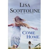
But those examples also say something about TONE. Lisa Scottoline has moved away from her old lawyer series (Killer Smile) and now writes “family-in-jeopardy” crime novels. Likewise, you must find the right image for your mood. Other stuff: Don’t use the artwork of a relative unless your relative is a professional. Don’t photo-shop too many elements in an effort to convey EVERYTHING about your plot. This works:
So does this:
I like the way this cover blends a powerful image with the type and a touch of color:
This is not bad but to me it just misses:
Why? The blended images don’t make sense and the cover is a tad hard to read. And you be the judge of this one:
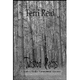
Here’s one last example that sort of summarizes everything I’m talking about. Terri Reid is an eBook author with some real success. Here’s one of her eBooks:
All her books have the same gray background and similar type faces. She uses trees as her signature image, which is a good idea because she’s writing a series. They’re serviceable covers. Would they be better if they could be “read” more easily at the e-bookstore? Would they stimulate you to try them if they “said” more about the content? (I had to go to her website to find out she wrote ghost stories; I thought this was psychological suspense.) Would a touch of color help “pop” the cover? I think so. Compare it to this similar “tree” cover:
But Terri Reid apparently sold 60K books through Amazon last year (
CLICK HERE) so maybe I’m wrong. Maybe you CAN break the rules and get away with it.
Which leads us to this cover. You might have seen it.
Why did it work? It shouldn’t. It’s gray. It’s sort of dull. The font is sort of just “there.” At first glance, you can’t tell that’s a guy’s tie.
But it worked because it broke the OLD rules and went against the cliche of the erotic novel. Here’s Romance Times editor Audrey Goodman: “What may have tipped the scale for the ‘Fifty Shades’ trilogy are the nondescript covers. The classic ‘clinch’ covers on a lot of romance novels tend to carry a stigma of being ‘old-fashioned,’ so the covers on ‘Fifty Shades’ may have made the books more approachable for a larger range or readers.”
By the time the Grey eBook (originally published by
Writers Coffee Shop) was bought by Doubleday, the cover had become iconic. Doubleday wisely kept it for the hardcover editions and it’s now it is being copied for other erotic novels.
Whew. We could do this all day and this went on longer than I planned. I’m exhausted. I need a cigarette. Was it good for you?


Nicely said, Kris. Your post should be a checklist for all authors, indie or traditional. And in the case of indie covers, your point about not needing all the extra stuff like tag lines and blurbs is so important. All that stuff can now be consigned to the online description. Keep it simple. One last thing: make the author’s name as big as artistically possible.
Just to add to your last point, Joe, I’d only advise that unless your name is John Grisham, don’t make your author name larger than the title.
There’s so much more to say about this but I was running at the mouth! But you are spot-on about putting too much verbal description on covers. It REEKS of amateur. As you said, save it for the online description box. We could do a whole new post on how to make those descriptions sing.
A fantastic summary of covers. However the one thing I would say is I find solid orange covers repulsive and they literally turn me away from books. I’ve passed them by before and will do so again. I couldn’t tell you WHY orange is repulsive to me, it just is.
Also, I will pass by book covers that are extremely plain–no matter the intended effect, to me it says “they didn’t take time to design a good cover.” That’s how it hits me, anyway.
BK Jackson
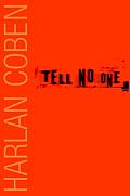
I hate orange covers too! (but I love the color in real life). But I remember the first time I saw Harlan Coben’s “Tell No One” cover. It was at my supermarket paperback rack. The plain orange cover literally jumped off the rack amid all the other cluttered one. Now, I don’t think it would work as well. Trends and times change so fast. Also like you, I don’t like overly plain covers. But sometimes, as with Gillian Flynn’s covers, they work brilliantly.
You know, I saw Tell No One at my local Crown (remember those?) in hardcover. What was so amazing about the hardcover is that Harlan’s name was not visible on the cover (unless you looked real close). It was stunning. Just the color and Tell No One in that font. Whoever designed that was a genius. It popped. It was SO different from all the other covers. Everything worked for Harlan on that. Not only did he nail that story, but the design was amazing.
I had not read any of his book before that, nor did his name register with me. But I bought that book on the spot, after doing what readers used to do in bookstores: cover, jacket copy, about the author, first chapter. Sale.
So very strange. This morning I woke up with the brilliant idea of having my cover designed by my friend’s son, a graphic arts student, when KAPOW! I read this post. And it makes a lot of sense. Thanks!
Also enjoyed the link to the really, really bad covers.
Amanda, If your friend’s son is good at what he does, it might be okay. But book cover design is very specific and not every artist can adapt. Maybe if and you he talked it over and looked at samples together you’d have a good basis. But I always worry about hiring friends or relatives. If it doesn’t work, you might have hurt feelings. 🙂
Awesome info, PJ. I saw once that the cover Sean Chercover originally wanted for his second novel, Trigger City (he liked the one he eventually got, btw), was a blue-on-white X-ray look of a man holding a gun to his head. I pictured that in my head and thought it would have looked evocative and brilliant, maybe with a strong color like a Navy for the title and author print. Do things like that (color-on-white) make a difference?
Jake, I remember Sean writing about that somewhere, too. Wish we could have seen both covers. Color and white is usually effective design. White backgrounds on covers, my editor says, usually work. But it depends on your setting, plot. White and blue work good on “winter” books (sounds cliche but it makes no sense to use red or yellow). Our new book, Heart of Ice, is set in Michigan’s winter and the cover is shades of blue. It works great, I think.
Kris,
Love what you and Kelly came up with for your first two Louis Kincaid novels. They speak to me. I was considering taking a class to learn how to do this myself. Can you provide a ball park figure for what you and your sis think is reasonable these days for getting someone else to do the cover for you? Do you do your own formatting?
Jillian,
Kelly is very reasonable and as an author, knows how to work with writers. Write to me offline at kristymontee@aol.com and we’ll talk!
Great tutorial, Kris. And one more item on the “don’t do” list. I’ve seen it quite a bit. And that’s putting “by” on the cover before the author’s name. Amateur hour!
James,
ARGH! Isn’t that the worst? And punctuation on covers? I mean, do we really need to see this:
THE MINOTAUR:
Book IV.
The thrilling story of a creature, half-man, half-beast, and the woman who loved him…
By Tim Socrates
Best-selling author of the Minotaur series.
I thought Spending Christmas With a Yeti was special. What was scary here was not only how bad the covers were, but how awful most of the titles were. I’m thinking there’s a correalation, or at least another blog post on bad titles.
Loved the Yeti…almost made me want to buy the book. Almost.
Reminds me of the first couple covers I made for my novels when I podcasted them as free audiobooks. Writers who are colorblind should never endeavor to create their own covers.
Luckily a couple professional cover designers who liked my stuff volunteered help.
When designing the cover of my debut novel, BABY GRAND, I had a definite idea of what I wanted. The designer that I hired used my ideas to select a series of photos for the cover. I chose one and suggested a crop, but the designer’s vision was far better than mine. In the end, I look at my cover, and I’m so thrilled that not only was I a part of its making, and the one who made the ultimate decisions, but that I was smart enough to relinquish that decision-making power and listen to the person whose job it is to know best.
Excellent tips, thanks! I am happy with all of my ebook covers, except for certain ones over which I have no control–meaning it was a publisher decision.
Wonderful advice. I remember doing (having my son do) my first e-book cover and he pointed out that we had to look at them as thumbnail images. Also black and white, since lots of e-reading devices don’t do color. AND now you have to check to see how the various e-stores ‘mess up’ your covers with their own additions. Used to be Kindle stuck an icon in the corner, so you needed to make sure your name/title wouldn’t disappear. They stopped doing that, but now Nook books have that bottom corner turned up like a page, which can also obscure the text.
Terry
Terry’s Place
Having just spent most of today trying to correct Kindle’s mashing up of my margins I sympathize Terry! Kelly and I have pretty much mastered the Kindle formatting now but it wasn’t easy. I understand why there is a cottage industry of folks who do this.
The blended images are becoming an annoyance to me. Yes, it’s cool that you can do that in Photoshop. Yes, it’s cool that you can invert things and make special effects. But, dang, can I see something that actually gets my attention in way of a connection?
I’m tired of looking at cool stuff. I would like for the cover to encompass the entirety of the story throughput. What does the story mean, at a glance.
Amen sister…just cuz you can do it doesn’t mean you should do it.
Hi Kris
What a fascinating post, and I love the ‘interesting’ examples of covers gone awry.
I’m absolutely over the moon with the covers my designer, Jane Hudson at NuDesign, has come up with for the Charlie Fox series. She’s so talented it’s enough to make you spit :))
I do have one green cover, btw – on ROAD KILL: Charlie Fox book five. But it’s of an angled road at speed through trees, and the book is set in Ireland, so it seemed to suit.
I had one green cover and it was our worst selling book! And it was a really good mystery. Vowed never to go green again.
PJ,
Thanks for the lesson. I’m in a quandary with the cover of my supernatural thriller.
It’s clean and simple, but my wife and I believe it is also generic. I don’t think the reader can identify the genre, let alone the story, because the image is so abstract.
Great summary, Kris. I’ve not seen one on covers this thorough. And thanks for using one of my Harpercollins covers as an example that works
Your bad covers have some real gems. Your point on thumbnails & digital design is key. Great & unique post. Thank you.
Fantastic post. One more I’d add to the list is also check your cover in grayscale. That is how it will appear on my Kindle. I may have downloaded a lot of free stuff and samples and other books and when I am sorting through it and clicking on titles at random, you want your cover to leap out at me in gray.
Also, the fantabulous Chuck Wendig of Terrible Minds won the Most Beautiful Cover of the Year and the Ranting Dragon blog. Blackbirds is stunning with the cleanest typeface I’ve ever seen. The use of negative space is without compare. But when you see all these heavy-hitter covers together and you have to vote, the flaws start popping out. Mostly questionable font and typeface placement choices.
http://www.rantingdragon.com/cover-battle-of-2012-help-us-find-the-years-best-cover/
And as for kerning, let’s not forget the classic “FLICKERING LIGHTS” box. You use F-L-I very carefully unless you want to end up as a FB meme.
And Happy Birthday to Joe Moore! *confetti*
Terri
This is really a great post. I can’t help but relate to every word you say, I got deceived by those ebook covers for so many times now. Thanks for this great tips.
As to the link to the cover blog, I have to step lightly, two of my friends are on it. :/
Fascinating stuff! Thanks for this!
I make Kindle covers out of book covers very easily. All the old books that no one uses can be made into good covers for iPads and Kindles 🙂
One last comment: If you make your own covers, be very careful about RIGHTS. If you steal an image, they will find you. And if you are pubbing a backlist title, you cannot use the same cover your traditional publisher did. They own the rights to that image.
Karen’s eBooks specialises in providing “How to…” ebooks on social media. Our services include LinkedIn, Facebook & Twitter account set up, training and support. We also carry out systematic assessments of your social media accounts, giving you tips on how to improve them.Karen’s eBooks – Showing you”How to…” get the most from your social media accounts.
This comment has been removed by a blog administrator.
I find the cover of Fifty Shades as dull and predictable as the book inside it.
As for the other examples, most of them are gaudy and tacky. Terri Reid’s is the classiest.