So here are my tips, with some sample covers I found at random on the Kindle site. First some general stuff.
PICK A MOOD: You need to convey the TONE of your book immediately. Is it amateur sleuth a la
Elaine Viets or hardboiled realism a la
Barry Eisler, or wacky stuff a la
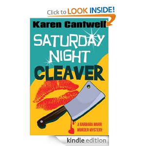
Tim Dorsey? Make sure the colors, illustrations and fonts work together to support the mood. Zoe Sharp tells us at a glance what kind of book she writes
I don’t think we’re going to confuse her with this author
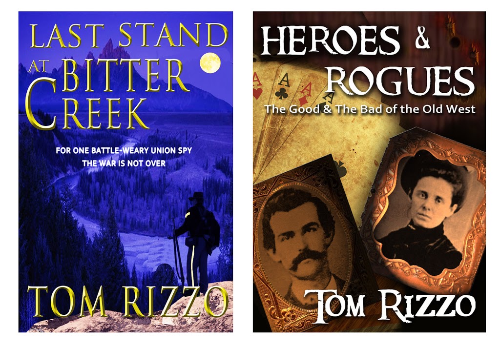
While we’re at it, non-fiction should have a different feel than fiction. Here are covers my sister designed for an author who wrote two books about the Civil War.
You can tell at a glance which is the novel and which is non-fiction. And note the use of blue versus brown. The blue conveys an elegiac tone; the sepia brown historic. Now let’s talk specifics.
to this
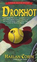
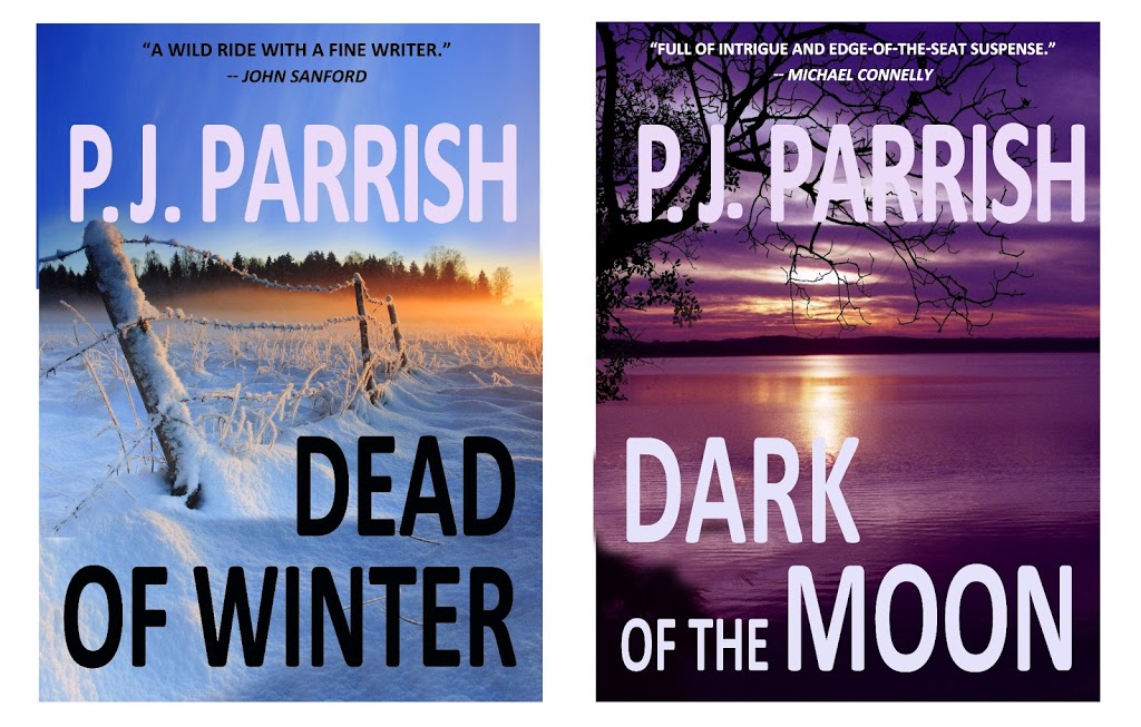
thanks to a good cover designer. Coben became visually branded via his striking neon covers. You, too, need to think about branding with your eBook covers, especially if you have a series. Before we settled on our final covers, Kelly and I came up with these for our first two Louis Kincaid novels.
Note the uniformity of the type, mood, colors and use of landscape imagery. We jettisoned these because another author, CJ Lyons, used the exact same stock photo at left on one of her books. Try to stay away from all the cliche images that are showing up on eBooks now — like blood dripping from a woman’s eyes like tears and bloody hand-prints on windows. I mean, c’mon, you can do better.
FONTS: I have a thing for typefaces. I love them. Within their simple designs lie, well, fonts of emotion and you can almost feel the glee of their inventors. Look at how different these are:
THE KILL ZONE
THE KILL ZONE
THE KILL ZONE
THE KILL ZONE
THE KILL ZONE
THE KILL ZONE
Each conveys a different mood. Fonts are fun to play around with. But fonts are like sex. The more exotic it is, the more trouble you can get into. Go for READABILITY. Stay away from the cliche correlations because they tend to look like you’re trying to hard, in other words: amateur hour. Don’t use Comic Sans on a comic novel (don’t use it for anything…it’s ugly). Don’t use Lithos if your setting is a Greek Isle. Don’t fall back on Papyrus if you’re writing about Egypt. Don’t use Old English for a book set in 1800s London. (It’s not only a visual cliche it’s unreadable!) Remember: The three elements — color, graphic, type — must
complement each other, not fight each other for attention.
Use a limited font palate. Yes, you can combine different typefaces on a cover, but be careful. Again, they must be readable and complementary. Here’s a good basic article on FONT SELECTION. And I realize that this is probably inside baseball, but it you don’t know about kerning, weight and how to align type, please hire someone who does.
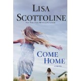
GRAPHIC ELEMENT: You can use either a photograph or an illustration but make sure it is quality. There’s are some great sites for buying stock art and photos, some free. I read recently that publishers are using more people on crime novels because research indicates character-driven books are selling better of late. So we are getting more of this
And less of this
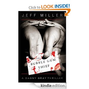
But those examples also say something about TONE. Lisa Scottoline has moved away from her old lawyer series (Killer Smile) and now writes “family-in-jeopardy” crime novels. Likewise, you must find the right image for your mood. Other stuff: Don’t use the artwork of a relative unless your relative is a professional. Don’t photo-shop too many elements in an effort to convey EVERYTHING about your plot. This works:
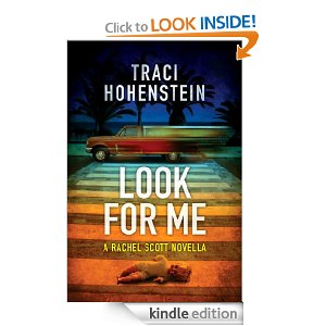
So does this:
I like the way this cover blends a powerful image with the type and a touch of color:
This is not bad but to me it just misses:
Why? The blended images don’t make sense and the cover is a tad hard to read. And you be the judge of this one:
Here’s one last example that sort of summarizes everything I’m talking about. Terri Reid is an eBook author with some real success. Here’s one of her eBooks:
All her books have the same gray background and similar type faces. She uses trees as her signature image, which is a good idea because she’s writing a series. They’re serviceable covers. Would they be better if they could be “read” more easily at the e-bookstore? Would they stimulate you to try them if they “said” more about the content? (I had to go to her website to find out she wrote ghost stories; I thought this was psychological suspense.) Would a touch of color help “pop” the cover? I think so. Compare it to this similar “tree” cover:
But Terri Reid apparently sold 60K books through Amazon last year (
CLICK HERE) so maybe I’m wrong. Maybe you CAN break the rules and get away with it.
Which leads us to this cover. You might have seen it.
Why did it work? It shouldn’t. It’s gray. It’s sort of dull. The font is sort of just “there.” At first glance, you can’t tell that’s a guy’s tie.
But it worked because it broke the OLD rules and went against the cliche of the erotic novel. Here’s Romance Times editor Audrey Goodman: “What may have tipped the scale for the ‘Fifty Shades’ trilogy are the nondescript covers. The classic ‘clinch’ covers on a lot of romance novels tend to carry a stigma of being ‘old-fashioned,’ so the covers on ‘Fifty Shades’ may have made the books more approachable for a larger range or readers.”
By the time the Grey eBook (originally published by
Writers Coffee Shop) was bought by Doubleday, the cover had become iconic. Doubleday wisely kept it for the hardcover editions and it’s now it is being copied for other erotic novels.
Whew. We could do this all day and this went on longer than I planned. I’m exhausted. I need a cigarette. Was it good for you?