

Awhile ago, I picked some of your brains (such as they were…#sorrynotsorry) to get some ideas for Friday posts. Just kidding… 🙂
This gem of an idea came from our own Elaine Viets.
Book covers are important.

To the author because after toiling for months or years on a book, getting to the point of actually hating the sight of the manuscript, then voila! Seeing the cover energizes like nothing else. I know you know what I mean.
To the reader because it’s like an appetizer for what comes next. Like a doorway into another world that the reader wants to step through, but is kind of scared to…should I leap through the door or sneak through? I know you know what I mean (again).
The questions to follow are from Elaine, and I thank you for them, friend!
How much does the cover of an author you don’t know influence whether you buy the book?
If you like cozies, does it help if you see a dog or cat on the cover?
For hard-boiled, do you prefer weapons, cars and other symbols of action?
(Please share your favorite covers in the comments if you want, either yours or your favorite author’s.)
***
Here are two of mine. And I might be biased, but I love them! 🙂

They are important. A good cover cements the story in your mind.
Hi Warren!
“A good cover cements the story in your mind.” Totally agree with that!
Have a good one, my friend!
This post gave me considerable pause for thought as I’ve thought about a cover’s impact (or not) on my reading choices over time. I’d say for me they’re somewhat important as a screening tool, but also I’d say for me to some degree, based on experience, covers are not critical because I’m probably mostly making choices based on word of mouth mention of an author. I don’t do many out-of-the-blue reads of an author.
As an experiment, I just went to Amazon and typed in “fiction best sellers” and glanced at the first half dozen covers that popped up–all of which are very bland and nondescript and in themselves don’t really tell a story. No way I could make a choice based on cover–I’d have to read a blurb about the story to see if it was of interest.
On the other hand, if I’m browsing books and a cover has a dagger dripping with blood or something very graphic, that will screen that book out for me. I’m not going to gravitate toward things with graphic violence. Yet by the same token, I’m not drawn to cartoonish, fluffy covers either.
Take our very own James Scott Bell for example. If you pull up a list of his books and see, for example, Romeo’s Hammer, it’s font, not graphics that catch your eye, even though there is a contemplative sea background behind the print. He’s a very well known author and covers don’t play much into it because you know who he is and that you’re going to get a great read.
To further mystify me about book covers and their impact on my choices–as a kid, I have no idea how I first found out about Zane Grey books. My parents didn’t read westerns and nobody I knew did either. And his books had no cover art at all! They were simply tan/red hard cover books and the only print was on the spine. Yet I found them somehow (and am eternally grateful!).
Back in the heydey of Pocket Books publishing many Star Trek The Original Series Novels, I used the book covers as a screener–Spock was my favorite character, so I went for the books that had him somewhere on the cover. Ones that didn’t have him on the cover were ones I read last (or not at all) because no Spock, no read. 😎
For me word of mouth really trumps cover. Take Victoria Thompson’s Gaslight Mystery Series. I began reading her books through word of mouth recommendation. If on my own I had browsed her books on Amazon, I wouldn’t have picked them because the covers all have New York City images–the last thing I’d go for.
Though cover art isn’t my final decision maker it helps if the cover honors the genre and gives you a little hint about the story and vibe within.
Good morning, Brenda. I enjoyed your analysis.
I remember my childhood sojourns with Nancy Drew. The covers were usually well-done, but what drew me was the “Nancy Drew and the…” titles. Same with Dame Agatha novels. Maybe covers are like periods and commas. They lurk there, doing their jobs so that we can get on with immersing ourselves in story.
And I really like this: Though cover art isn’t my final decision maker it helps if the cover honors the genre and gives you a little hint about the story and vibe within.
Thanks for your input today, and hope you have a great weekend.
Since I don’t have any nearby bookstores, most of my ‘shopping’ is online, and covers have to look good in thumbnail. They’re not my main influence. Authors and book descriptions do a lot more to sell me on a purchase. But an obviously “homemade” cover is an immediate turn off.
I did a post a while back on how covers can brand an author and a series.
https://killzoneblog.com/2021/02/branding-its-not-just-for-cows.html
Hi Terry!
I remember that post! I just clicked on the link and reacquainted myself with it. Still good info for sure.
I think you’re right about online shopping and the importance of the cover there. Graphics are what catch the eye, and we want our covers to do that. But, the blurb is what seals the deal for me.
Thanks for stopping by, and for your blast-from-the-past link. Have a good weekend…
First, thanks to BK for the shout out. I was purposeful in my choice. “Big name” series authors (e.g., Child, Sandford) have, ahem, big names above the title. Not fancy graphics. Now, I’m not in that stratosphere, but am reminded of Hearst’s philosophy: If the headline is big, the news is big.
My gut tells me that these days a bad cover drives away more potential readers than a great cover draws in.
Good morning, Jim!
My gut tells me that these days a bad cover drives away more potential readers than a great cover draws in.
I so agree with that. Maybe it’s because there’s so much “big” news these days, we all just want a bit of peace and quiet. And BTW, your Romeo covers are great! 🙂
Have a good one!
“…like an appetizer for what comes next.” Nice analogy, Deb. BTW, this dovetails with my upcoming Tuesday post about putting covers on business cards and bookmarks.
My personal taste runs to retro noir covers from the 1920s-1950s, Chandler, Hammett, Spillane, John D. MacDonald, probably cuz that’s what I read growing up. Also Florida beach covers.
Stark, spare fonts are eye-catching. Scrolling fancy ones are a turnoff.
Cozy covers can be really well done but are kind of busy. Yes, a dog is a magnet. Although I like cats, they don’t make me pick up a book–don’t know why.
Hi Debbie!
…putting covers on business cards and bookmarks. That sounds interesting! I think I have some of my earlier biz cards rattling around my office, and I think I did that! I’ll be interested in your take.
Dogs and cats don’t do much for me, unless they’re kitted up for a gun battle… 🙂
Some of my favorite covers for the genre I like to read are Mr. Gilstrap’s. Also Joel Rosenberg’s espionage novels. They’re the first peek into the story for me.
Thanks for stopping by, and have a good one on me!
I don’t pay much attention to covers. I’m not a visual person. I read the back cover blurb and look at the first few pages before I decide to buy. I used to only buy books by authors I know and love, but in recent years have tried to expand my horizons to new authors and genres. Instead of a steady diet of mystery/suspense/thrillers, I’m reading women’s fiction, historical, historical romance, and dystopian, even the occasional horror. It’s been eye-opening and enjoyable. I rarely look at the covers. It’s the story that draws me in. Have you noticed how many romantic suspense covers have women in red coats running toward or away from the “camera?” Because I’m traditionally published, I’ve had modest input into covers, but the editorial team had the last word. While I sometimes disagreed with the choices, I learned to accept that the sales folks had the best insight into what readers currently were liking/buying. However, I did a survey of my newsletter readers and word-of-mouth was the most cited way they pick their books. Some looked at covers first, but not the majority.
Good morning, Kelly. Thanks for your input.
If I’ve read an author and know and like their work, I don’t look much at the cover. But, if I’m not familiar with the author, and the cover isn’t to my liking, I may not pick it up, unless another reader recommends the author. So, I guess maybe an intriguing cover is just one more tool on the belt.
Thanks for dropping in today, and have a good weekend.
I see covers akin to a fine meal in that the first “taste” is with the eye, giving a reader a good sense of what a book is about and the vibe. I also agree with Jim’s observation that a bad cover will turn away readers more than a great cover will attract them. I think most readers register a cover almost subliminally, unless it draws the wrong kind of attention to itself.
That said, I love to admire covers.
I’ve been fortunate in my own publishing to work with some terrific cover designers. My current favorite, not surprisingly, is the cover for my latest novel, “Book Drop Dead”: https://m.media-amazon.com/images/I/81zlNa3Gm8L._SY522_.jpg
(Hopefully the link works.)
Hi Dale! Yes, the link worked. And I love that cover. It actually created curiosity about the story…like, what’s with the skateboard? You made me think about the curiosity factor in covers.
I’m getting ready to publish my sixth book at the end of this month, and my cover designer has outdone herself. I tried copying and pasting it here, but it didn’t work. (It’s not on Amazon yet.) So, I guess you’ll just have to wait! 🙂
Thanks for chiming in this morning!
Thanks for the shout-out, Deb. Covers are an important signal: if I see a badly done cover, I suspect I’m in for a book with poor editing and other flaws and don’t read it.
Hi Elaine!
…if I see a badly done cover, I suspect I’m in for a book with poor editing and other flaws and don’t read it.
Agreed!
Once, when looking over a prospective buy from a bookstore here in my town, it wasn’t the cover itself that made me re-shelve it. It was the 3-4 typos I noticed on the back cover blurb. I decided if there were that many in just a two paragraph blurb, there’d probably be many more in the 300 pages between the covers.
Thanks for the great idea for this post and for adding to the discussion today. Have a great weekend!
Great topic, Deb.
I can’t think of a time when I’ve bought a book because of the cover. However, I may pick up a book with an intriguing cover and read the blurb. But if the cover looks graphically violent or amateurish, I’ll skip it.
My selections are usually books by authors I admire, or books that were recommended by friends, written by colleagues, or book club selections. If I’m looking for a book in a particular genre, I’m more likely to go by recommendations rather than cover art.
Having said that, IMHO my cover designer has created gorgeous covers for my books. https://www.amazon.com/stores/Kay-DiBianca/author/B07HVHZVVB
My fifth novel, a middle grade book, is in the hands of a traditional publisher. I haven’t seen their cover design proposal yet.
Hi, Kay!
It kind of sounds like the consensus this morning is that the cover plays a part, but it’s certainly not the whole enchilada. Word-of-mouth and previous experience with the author play a bigger part.
I agree about your cover designer. Your covers are stunning. I must pick up your Lady Pilot story!
Have a great weekend, my friend!
RWA did several major studies of readers, and on the question of what attracts the reader to the book, a vast majority said first–the author’s name recognition, second–the cover, and third–the cover copy. At this point, they may be interested enough in the book to pick it up and flip through some pages to see if the writing grabs them. Since most of us aren’t Nora Roberts or Stephen King, we must get the best cover we can get. Note to self-published folks, put all your marketing budget into a good copy editor and a professional cover artist. The cover itself should reflect the specific market or part of the market you are trying to reach. One glance and the reader knows it’s a cozy or a thriller because of its iconic elements and art style.
As to your question, the dog or cat is a good cozy indicator, but there should a pet that’s part of the plot. If there’s a golden retriever on the cover, there dang well better be a golden that is in the story, not mentioned once and forgotten.
Good morning, Marilyn! Thanks for stopping by.
…put all your marketing budget into a good copy editor and a professional cover artist. Yes! I don’t know how many times I’ve said that very thing to newbies even newbier than myself. And, if I’d been writing when my mother was still with us, even though she was a stellar artist, hiring her to do my covers probably would’ve been a mistake.
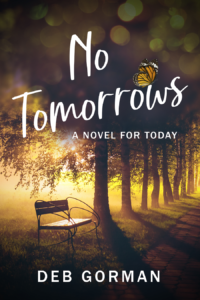
As to your golden retriever remark: I thought briefly about having Max, the huge black lab who shows up in chapter one of No Tomorrows and also a couple of later scenes, on the cover. I’m glad I didn’t. Why? Because as good a dog as he is, the story could’ve been written without him. He’s the family pet, and has quite a personality, but his presence is not germane to the story. If there’s a dog or a cat or a bear on the cover, I guess it’d better be an important character.
Have a good one!