By
John Gilstrap
www.johngilstrap.com
With the publication of No Mercy looming in just six months, I finally saw the cover art for the first time last week. If I knew how to insert pictures here, this would be the perfect place to do so, but alas, there lies the limit of my technical ability. So, please indulge me and visit my website via the link above. You don’t have to linger, but the new cover is proudly displayed there.
Sure, now’s fine. We’ll wait.
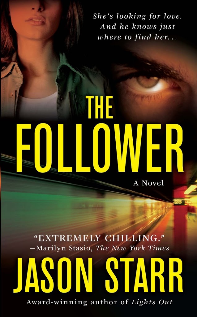
Thanks for that. Welcome back. Pretty cool, huh? I love the creepiness of it. When you consider that the primary purpose of a cover is to get a potential reader to pick it up off the shelf, I think it accomplishes its goal.
But I haven’t always been so lucky. In fact, early in my career, my covers ran the gamut from kinda weird to just plain boring. At All Costs, for example, featured a cityscape in the background, which I probably would have liked better if the book had taken place in a city. As it was, it was mostly set in remote, rural America. When I asked my editor at the time why they did the city thing, he told me it was because they couldn’t come up with anything better. Does that breed confidence, or what?
Nathan’s Run is a story about a 12-year-old boy on the run for murder, even as an assassin is on his heels to do him in. HarperCollins at the time saw fit to create a hardcover jacket that featured a sepia-colored image of a curve in the road. That’s it; just a road with stripes on it. It was certainly artistic, but I vastly preferred my British cover, which showed the image of a bad guy in whose sunglasses we could see the reflection of a boy running for his life.
The point where I am right now with No Mercy defines the stage of book-writing that I find most frustrating. From here forward, I am virtually powerless to affect the future of my labor of love. The manuscript is done, and with that final edit, I’ve handed the process over to the team of professionals who have to make all the other parts of the puzzle fit together. If the past is a predictor of the future, I’m in good hands; but it’s still hard to surrender control.
One of the great clichés of all time is that you can’t judge a book by its cover, yet all of us do it every day. So, what do y’all think? We’ve talked gender bias and age bias. We’ve touched on genre bias. What about cover bias? I confess that I’m a practitioner. Are you?