
Whoever coined the trope that you can’t judge a book by its cover had to have been an academic. Certainly, the trope-coiner was not a reader of novels. Yes, it is true that some great novels come encased in ugly wrappers, but few of them find a broad readership.
What follows is based on zero research and even less science, but it reflects quite a few decades of personal observation.
People buy books in steps.
First, they have to know to look for it. This is the unicorn hair in the mix. I don’t know what drives me to look for a book. Certainly, there’s word of mouth, and I read a lot of books for blurbs, but I don’t remember the last time I went into a bookstore blind–without a target I was looking for–and scoured the shelves, hoping to be attracted to a cover. I don’t think I’ve ever done that in the virtual world, where online bookstores are not, in my opinion, very browsable.
Next, there has to be an instant attraction. Perhaps it’s the author’s name—which highlights the importance of “branding”. But that instant attraction is just that—instant. It’s fleeting. There and gone. This is where the cover comes in, highlighting the reason that genres exist in the first place. The title is important here, too. A thriller has to look and sound like a thriller. Ditto a romance or horror novel. In that brief second of instant attraction, the artwork makes a connection and causes the reader to move to the next step . . .
They read the plot description. In just a few words, the pressure is on to pull the reader into the story. To make them gamble their hard-earned money that the ride you’re going to provide is worth the money. How do they make their final decision?
They read the first pages. Yesterday, PJ Parrish posted a terrific primer on the elements of a good opening. Here’s where that pays off. Boom! Decision made, one way or the other. There’s neither the time nor the real estate to flub the opening and make it better later.
So, where is the cynicism?
Okay, here it is: The covers and titles needn’t have much to do with the actual plot of the book. They work together to accomplish their jobs in a glance, and then they are forgotten. They work in tandem to convince a potential reader to take a chance, and if you, as the writer, do your job to entertain, no one will notice. Some examples from my own work:
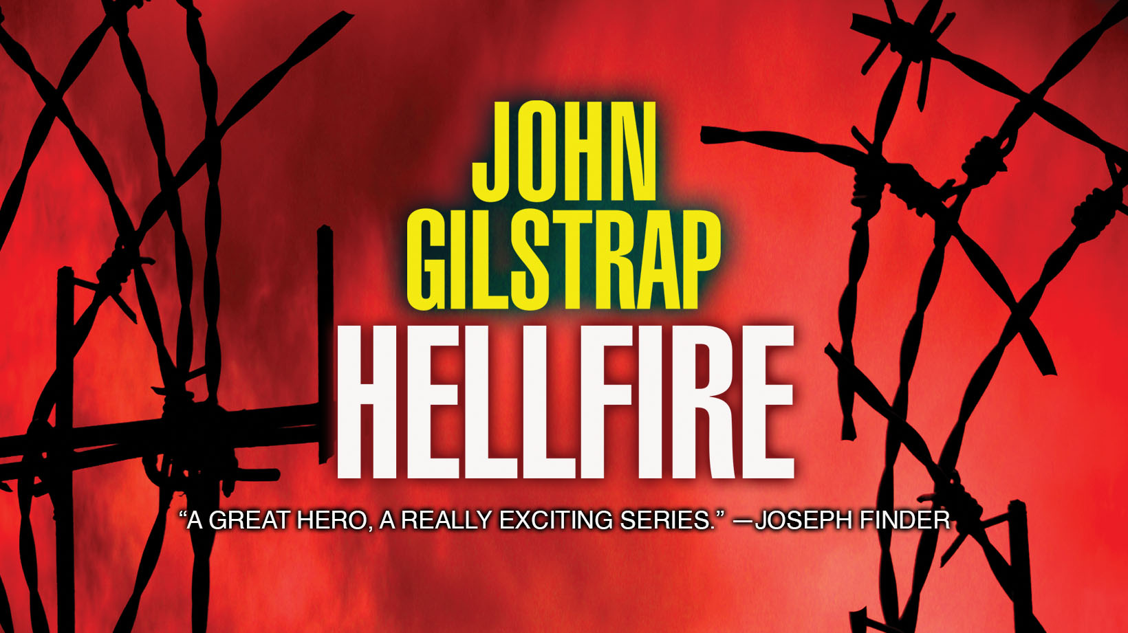
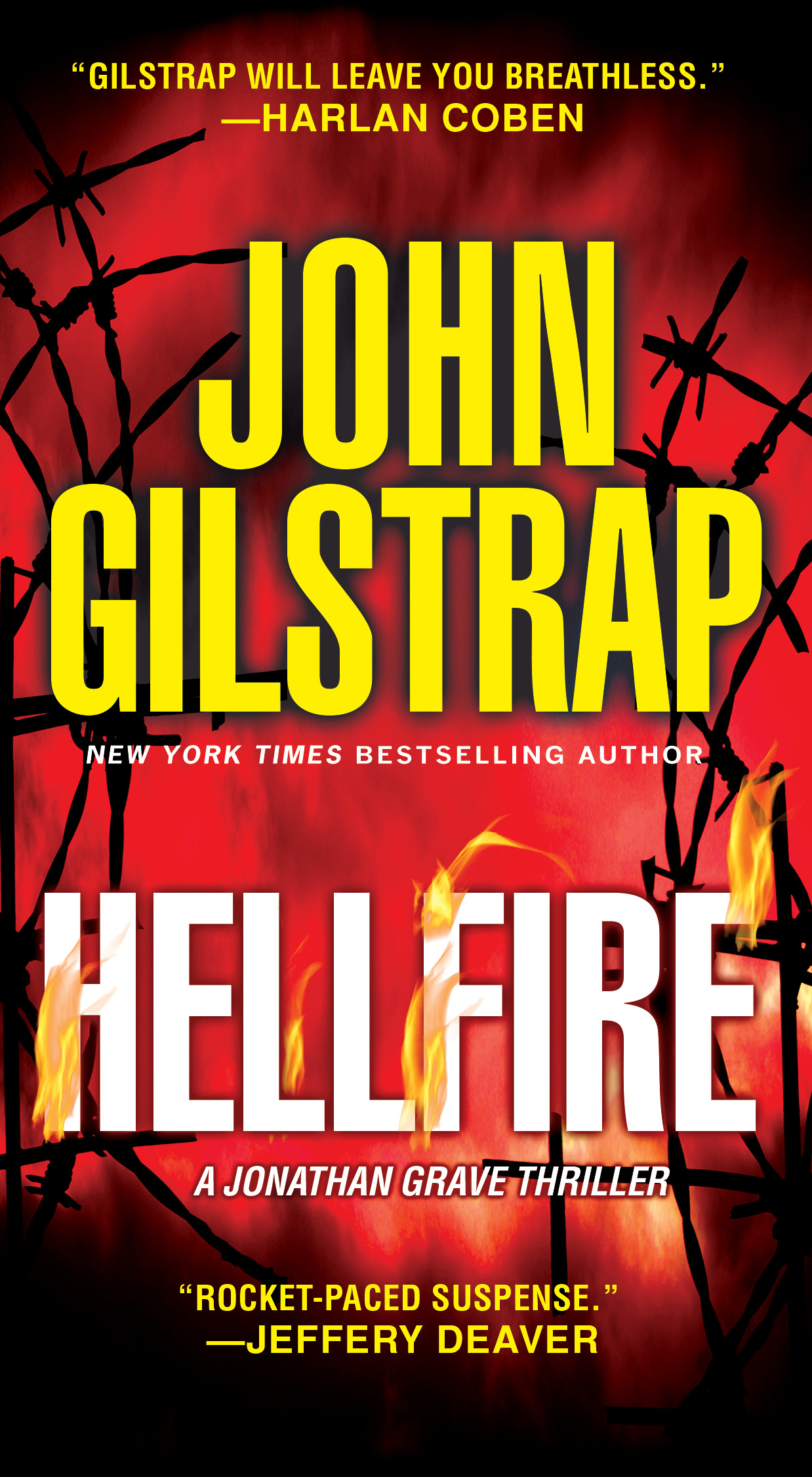 Hellfire is the Jonathan Grave book that hit the stands back in July. What does Hellfire even mean? The story is about two kids who are kidnapped to keep their mom from revealing a terrorist plot after she has been arrested. The word itself–Hellfire–is an oblique reference to an air-to-surface missile system. And it sounds cool. It positions the book properly in the minds of readers who generally enjoy the types of books I write.
 The red cover makes it distinctive on the shelf–unless or until red becomes the cover du jour for the current crop of cover designers. It also lends itself well as a Facebook cover image. But if you really look at the image and its various elements, it could be for a reprint of All’s Quiet On The Western Front, or it could be a story about Satan.
Other examples from my oeuvre (today is Pretend-I-Know-French Day): The second book in my Jonathan Grave series is Hostage Zero. It’s the title that broke the series out, and the phrase means nothing. None of the hostages are numbered, and none of them launch a plague, as in “patient zero”. It just sounded cool, and that’s why we went with it. The cover of Friendly Fire features the White House, yet neither the president nor his team are involved in the story. What we wanted to do is establish the book and its author as being “inside Washington”.
My point here is that storytelling and marketing are entirely different skillsets, with only distantly related goals. As an author, my job is to entertain my readers by giving them a helluva ride. To get that chance, I need to convince them (trick them?) into picking out my book from among all the others on the shelf.
Your turn, TKZers. Do you have any tricks you’re willing to share about how you convince readers to take the plunge?
Agreed. I shouldn’t admit this but I can’t even remember the name of the book I’m reading right now. I’m enjoying it, and racing through it, but I picked it as a result of the description, not because of the title or cover.
Re: covers…I have never picked up a book because of a cover, but I have shied away from a book because of one. When I see a book with the title on the cover written in faux lipstick with the tube sitting at the end of the last letter of the title, that’s a hint that it is probably not aimed at me, even the title is something like “For Love of Eating Brains.”
Great post, John. Thank you.
You raise an interesting point, Joe. Covers can just as easily push readers away as they can attract them.
“My point here is that storytelling and marketing are entirely different skillsets, with only distantly related goals.”
I totally agree. Indie authors like the control of their cover art. Trouble is, most authors don’t know diddly about cover design (and neither do some publishing houses.) It’s hard to remove yourself from the “My story’s about X, and Y, and there are elements of P and Q in it, and there’s this great scene that takes place in Z, so let’s get them all on the cover.”
I rebranded many of my series covers to (try to ) show they were romantic suspense, not thrillers after seeing enough reader reviews/complaints that the story wasn’t living up to expectation.
I’m with Joe. Hubster and I share a reading app, and when he said he was out of books, I told him he might like the one I was reading, but for the life of me, I was clueless about the title.
In my case, the small publishers and their cover artists knew nothing about genre iconograpy, and I developed a reputation for being a difficult writer because I understood it. No, my science fiction adventure novel shouldn’t have a romance cover just because my other books were romances, and my romantic suspense shouldn’t have a thriller cover. I actually paid a cover artist for one of my covers because the publisher was an idiot who refused to get it right. (No, a rose or a spaceship out of PLAN 9 FROM OUTER SPACE won’t attract science fiction readers. Sigh.)
Yikes! I believe I sense a touch of frustration. 🙂
I used to go into the local bookstore and just walk through the science fiction section looking at covers. I chose and purchased many books that way. I read the blurbs, but if the cover grabbed me, it didn’t matter much (I’m a simple creature). Some were big winners. Some were very forgettable, but I cannot remember any I disliked enough to quit reading.
Ms. Odell is correct in her observation that indies like to control their covers, and that few of us have any notion what makes good marketing sense. My method is to look at top-sellers in my genres, and in similar genres. This is all on Amazon, of course. I dislike more than half these covers. There’s a strange cover format that’s been going on for some time, featuring a story character in the foreground with his or her back to “the camera”, and rendered rather small. In the background is whatever the book is vaguely about. It could be dragons and castles, a nuclear mushroom cloud, the mean streets of some big city… whatever. The character is running into this. I’m not a fan. I had one of these made for my ”Two in the Trunk’ and regretted it. I don’t think I’ll use it. But as for “tricks” to share, studying what’s working for other authors makes logical sense.
For me, Carl, the chalk outline of a body on the floor is a high bar to overcome. A friends of mine won’t buy any books that has images of bare feet on the cover. I guess we all have our image prejudices.
I’ll be a little contrarian here. Keeping in mind that I’ve got 40+ years in marketing plus design/art direction/creative direction behind me (and now a newish novelist), it’s all one, big job of story packaging for me. Story. Title. Cover. Blurb/Description. Marketing activities. It’s one thing, broken into little project pieces. At least for an Indie like me who does—and loves—it all.
John: your last “Hellfire” cover is great. It reads Thriller right away. Short title. Good colors and good contrasts (the achilles heel for most Indies). And you can’t go wrong with barbed wire!
Harald, you’re clearly a Renaissance man when it comes to the indie book process. Do you think you’re a rare beast, though? Patterson was a marketing/advertising guru before he launched into the publishing world, and clearly, he knows what he’s doing. I don’t think most of us writerly types do. I know I certainly don’t.
Overall, I’m very happy with the covers Kensington designs for my books.
Whether back in the days of brick & mortar shopping or virtually, I usually get a book (strictly speaking fiction here) because it has come up on my radar from some other source–either via direct word of mouth recommendation, or because it was mentioned by a person/group with similar interests as mine. Then yes, I will give a cursory glance to the cover because I use book covers as a filter. One quick glance at a cover tells me (many times, not always) what the focus of the story is going to be & I either look a little deeper or walk away.
Guess I’m the oddball out. Because I buy mostly all my books online, the cover and title first attracts me. Then the description. If all that satisfies me, I peek inside to see if the opening draws me in.
The most striking book cover I ever saw was on the new release table at a Crown. It was hot orange, with small black lettering in kind of off-kilter painted style for the title. Most striking was that was it. No author name. No blurbs. Nothing but that color and title. It was genius marketing because it stuck out from all the other books like a cream pie at a Weight Watchers picnic. I immediately picked it up and looked at the dust jacket copy. Then at the flap with the author info. Never heard of him. So I read the first chapter and I don’t see how anyone could have done so and not been hooked. The author was a guy named Coben and the book was TELL NO ONE. So yeah, covers are huge.
I once bought a book because the cover and title together were irresistible. The cover showed a giant spaceship that had placed a glass dome over New York and was now ripping the city right off the Earth. I don’t read much SF, but that cover, with the title MANHATTAN TRANSFER, did it for me. (Author John E. Stith)
Jim, it’s interesting that you highlight Harlan’s first true breakout, TELL NO ONE. I thought that was a terrible cover! Clearly, it worked for him (how’s that for understatement?). The fact that it was ultimately so highly lauded goes to prove that I am not qualified to design covers. My publisher has stopped asking me for input, because my brain does not work that way.
My “tricks” as an indie, such as they are, is to work with talented cover designers who know the current cover trends in the genre I’m writing in. I research covers, but more importantly than that, I work hard to fill out the questionnaire form for each cover as best I can, so that they can create a cover that matches a prospective buyer’s expectations as being in the genre they’re seeking a book in.
It was challenging with my first series, since it was a crossover one, combining elements of three genres–superhero, urban fantasy, and thriller (mostly in the pacing for the thriller part). My designer nailed the covers. We did have a fair amount of back and forth on the first book’s cover, including her doing two very different designs. I then polled book store staff, and commissioned an online survey.
Actual market research! Darned good idea!
An acquaintance has just published his indie book. He posted two covers and asked options. I told him which one I liked and what changes I would make. He took offense. A few more people chimed in. The book is on Amazon now with a modified cover. It looks much better.
Even if you are an indie, talking with or hiring an artist is a good idea.
And understand genre iconography. You don’t want your romantic suspense with a thriller cover, or vice versa. It not only p*sses off the reader of the other genre for false advertising, but the people who would want to check out your book won’t.
I think I pick up a book because of the title and the blurb. The cover doesn’t have much influence over me. Excluding steamy romance covers, you know, all flesh and muscles, I’ve never not bought a book because of the cover. And I’m not an artist either, so as an indie, I hire a designer.
That being said, Mr. Gilstrap, I just downloaded the Kindle version of Hellfire because of the cover! How’s that for being a hypocrite? 🙂 (I also like the genre…)
It’ll be in my TBR stack, right after I read your first Graves story, which I bought some time ago and haven’t read yet.
Thanks, Deb. I hope the risk is worth the reward!
Best description of the book sales funnel I’ve read. Thanks, John. My two-cents on covers is for eBooks, they have to stand out at the thumbnail size. White covers on a white screen fade out so it’s best to use bold colors – like HELLFIRE. BTW, I was walking through the book aisle in a Vancouver Island drug store yesterday and HELLFIRE jumped off the shelf. It did its job!
I don’t normally care much about the covers of books I buy, but I found one recently that is fascinating. I bought a paperback of “Mr. Penumbra’s 24-hour Bookstore” because I had enjoyed the Overdrive version. I thought the cover was bland. It looked like a bunch of yellow book spines on a white background with the title/author sprawled across the front. I didn’t like it… until I read that it glowed in the dark. I took it in a completely dark room and I’ll be darned. The yellow book spines on the cover glow. What’s even more interesting is they glow on the front cover and spine, but not on the back cover. I know something must be encoded there. It’s just too clever. If anybody figures it out, please let me know.
RWA has actually done a professional study, several times, about what attracts a reader to a book on a bookstore shelf. Number one is author name recognition. That’s why Stephen King and Nora Roberts’ names are bigger than the title. Second is the cover and title which not only catches the eye but gives a sense of the genre and book content. That’s why so many romances look the same, but each subgenre looks different but is still obviously a romance, and why a thriller and a cozy look so different although both are shelved as mysteries. Book cover iconography is real. Third is the book cover copy. Fourth, the actual content of the book which involves opening it and reading a few pages.
(My additions, not RWA’s.–>) Outside of a physical bookstore’s requirements, add in the Internet/search engine factors. The right meta data and tags/labels must draw the browser search to your book from the genre to the specific content. Now throw in the online bookstore’s needs. The author’s name is just as important, but the book cover must pop as a thumbnail, not just full-sized. The cover copy is still important, but the reviews and plot summaries beneath by actual readers are as important. From my discussions with readers, the star/rating system is rarely trusted because it is so easily gamed by the publisher and the trolls.
The first content pages of the book must be reached ASAP because readers are too lazy to click through/scroll through other stuff to get to the book content, and Amazon only allows the reader a small amount of pages to make up their mind about a book. That’s why the traditional publishers’ fondness for lots of stuff before the first chapter isn’t a great idea for an ebook and why many indie authors put things like book dedications and forewards at the end of the book