
by James Scott Bell
@jamesscottbell
 Forty years ago this month, three significant events took place.
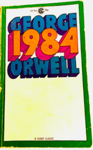
First, George Orwell’s novel, 1984, hit its mark. It’s the story of a totalitarian government keeping an eye on everyone, eradicating free speech, forcing group think, and cancelling those who resist. (Luckily, nothing like that could ever happen here.)
**Clears throat**
Second, Michael Jackson’s hair caught on fire during the shooting of a Pepsi commercial. A pyrotechnic explosion sent embers into the singer’s mane, setting it ablaze. At first he didn’t notice and kept right on dancing. But then he collapsed and, as one witness described it, “All his hair was gone and there was smoke coming out of his head.” He was rushed to the hospital and eventually recovered, but later said the accident got him addicted to pain killers.
Third, Steve Jobs gave the Macintosh to the world. It was famously introduced during the Super Bowl, in what is arguably the most famous commercial ever made. Directed by Ridley Scott (of Blade Runner fame) it riffed off the Orwellian Big Brother theme. The idea, of course, was that the staid, colorless world of personal computing was about to be disrupted by a bold new way of doing things. In the off chance you’ve never seen it, here it is:
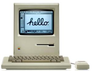
For me, it was love at first sight (which meant sorrowfully leaving my first love, the KayPro. But such are the machinations—pun intended—of the heart). The day it came to a local store I went to see it. So small, yet…you could paint hello and any other word on it. The screen wasn’t black with green characters. It had a mouse for point-and-click (cool!). And I knew I wanted to be on the hammer-thrower’s team, not a gray conformist. (No disrespect to you PC users out there. Some of my best friends are gray conformists.)
 It’s been me and Mac ever since, through all the ups and downs, the firing of Steve Jobs, the bringing him back. There was a time many of us thought the Mac might fall into a niche category, overwhelmed by the power of Microsoft. Although when Windows came out, looking suspiciously like the Mac interface, I recall a cartoon that had Bill Gates sitting under a tree, a la Isaac Newton, with the Apple logo falling on his head.
What saved Mac was what I consider the best ad campaign ever (Apple ads always seemed winners). That was the “I’m a Mac. I’m a PC” series. The branding was so perfect—a cool kid (Justin Long) as Mac, and a stodgy schlub (John Hodgman) as PC. You can watch ’em all here. But I have to share my favorite. It was when the ill-fated Vista operating system came out for the PC and had all sorts of issues:
So the foundation of the Mac brand is visual. The hammer thrower…the screen with hello…the cool kid. A print ad in a magazine captured the exact vibe I wanted for my writing life. I cut it out and taped it up in my office so I could see it every day (click to enlarge):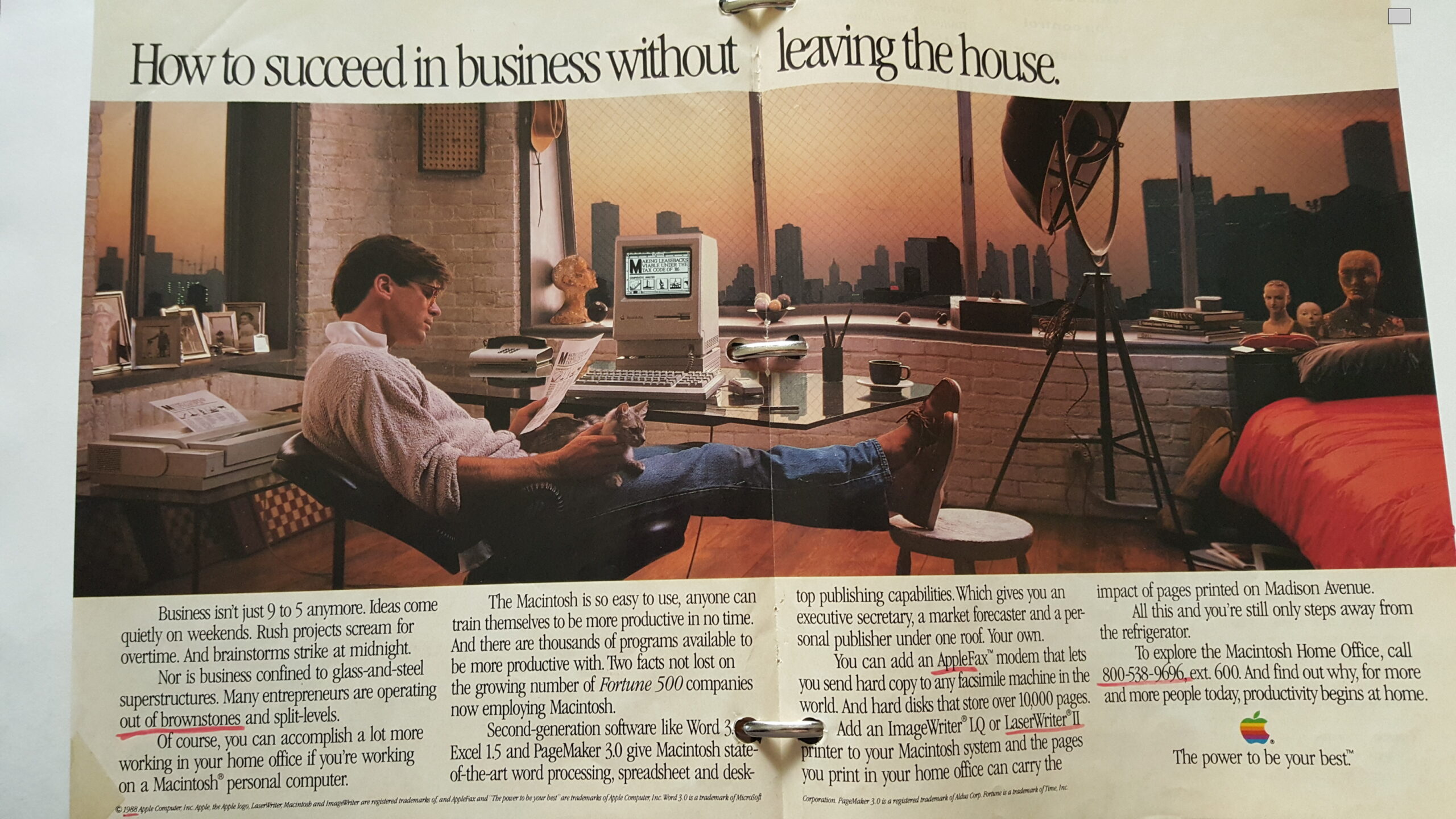 Happy to say I made it (albeit without the penthouse view of New York and the cat).
So when we talk about an author brand, we usually start with books and genre. Those are, of course, essential parts of the branding package. But I suggest starting with Mac logic—the visual.
A few years ago our own Terry Odell wrote about being at SleuthFest with her Triple-D Ranch series. When on a panel, she wore a cowboy hat. But when strolling through the hotel lobby, hatless, she was summoned by a “top gun” at Penguin Putnam, Neil Nyran. “Terry. Where’s your hat?” She was floored that he even knew her name. Terry said she wasn’t on any panels that day, so the hat was in her room. He responded, “It’s your brand. Wear it.”
Visual.
Even when walking around in a conference. (See, e.g., Reavis Wortham. You’re not going to catch him in a homburg.)
Start with your author photo. What does it “say” to the world about you as writer? James Patterson is all business. His photos say, “I write books that you won’t be able to put down, so there.” Harlan Coben, on the other hand, laces his thrillers with a bit of humor. Thus, in his author photos he always has the start of a wry smile.
You can go too far with this. Years ago a popular writing couple came out with a big historical mystery. On the back of the hardcover this couple was dressed as the characters. That struck me as a gimmick. It was trying too hard, plus it applied only to that one book.
So take some time to sit alone with a cup of joe and visualize yourself as a successful author, someone a reader wants to get to know, who writes the kind of books they want to read. What should you look like? What do your covers look like? How would you dress at a conference?
And speaking of conferences, where much of the important interactions take place at the bar or in the lobby, how is your personality? This is also visual in the sense that it gives off an impression. Don’t try to be something you’re not. Work with yourself. You can be soft-spoken and be classy. Or if you’re outgoing and love a crowd (a la Brother Gilstrap sipping his signature Beefeater martini) lean into it. Just remember the most important piece of advice of all, something that can sink your brand faster than the Lusitania. John gave it in his post in response to Terry’s: “Don’t be an a-hole.” (Applies to all your social media, too. I’ve chucked several authors off my to-be-read list because of ill-advised tweets…I mean Xs.)
So, to paraphrase Olivia Newton-John, “Let’s get visual, visual, let’s get into visual.”
Thoughts?