
by James Scott Bell
@jamesscottbell
 Forty years ago this month, three significant events took place.
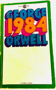
First, George Orwell’s novel, 1984, hit its mark. It’s the story of a totalitarian government keeping an eye on everyone, eradicating free speech, forcing group think, and cancelling those who resist. (Luckily, nothing like that could ever happen here.)
**Clears throat**
Second, Michael Jackson’s hair caught on fire during the shooting of a Pepsi commercial. A pyrotechnic explosion sent embers into the singer’s mane, setting it ablaze. At first he didn’t notice and kept right on dancing. But then he collapsed and, as one witness described it, “All his hair was gone and there was smoke coming out of his head.” He was rushed to the hospital and eventually recovered, but later said the accident got him addicted to pain killers.
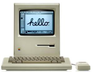
Third, Steve Jobs gave the Macintosh to the world. It was famously introduced during the Super Bowl, in what is arguably the most famous commercial ever made. Directed by Ridley Scott (of Blade Runner fame) it riffed off the Orwellian Big Brother theme. The idea, of course, was that the staid, colorless world of personal computing was about to be disrupted by a bold new way of doing things. In the off chance you’ve never seen it, here it is:
For me, it was love at first sight (which meant sorrowfully leaving my first love, the KayPro. But such are the machinations—pun intended—of the heart). The day it came to a local store I went to see it. So small, yet…you could paint hello and any other word on it. The screen wasn’t black with green characters. It had a mouse for point-and-click (cool!). And I knew I wanted to be on the hammer-thrower’s team, not a gray conformist. (No disrespect to you PC users out there. Some of my best friends are gray conformists.)
 It’s been me and Mac ever since, through all the ups and downs, the firing of Steve Jobs, the bringing him back. There was a time many of us thought the Mac might fall into a niche category, overwhelmed by the power of Microsoft. Although when Windows came out, looking suspiciously like the Mac interface, I recall a cartoon that had Bill Gates sitting under a tree, a la Isaac Newton, with the Apple logo falling on his head.
What saved Mac was what I consider the best ad campaign ever (Apple ads always seemed winners). That was the “I’m a Mac. I’m a PC” series. The branding was so perfect—a cool kid (Justin Long) as Mac, and a stodgy schlub (John Hodgman) as PC. You can watch ’em all here. But I have to share my favorite. It was when the ill-fated Vista operating system came out for the PC and had all sorts of issues:
So the foundation of the Mac brand is visual. The hammer thrower…the screen with hello…the cool kid. A print ad in a magazine captured the exact vibe I wanted for my writing life. I cut it out and taped it up in my office so I could see it every day (click to enlarge):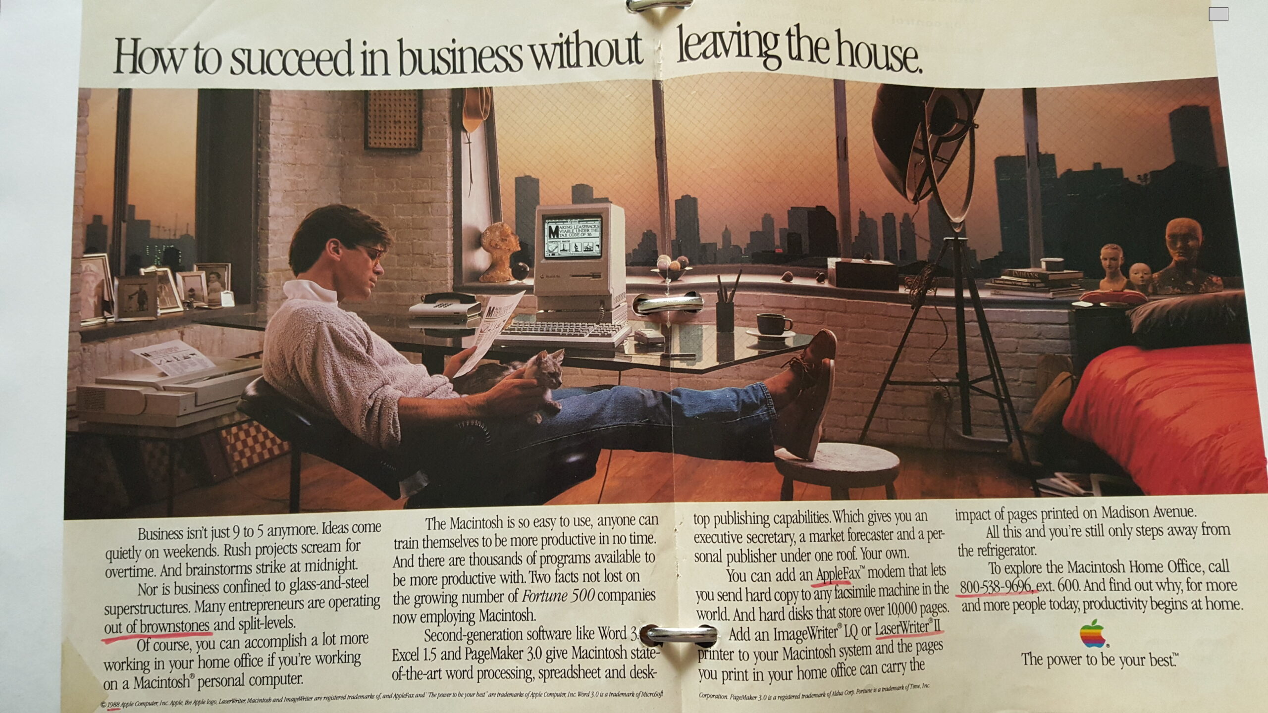 Happy to say I made it (albeit without the penthouse view of New York and the cat).
So when we talk about an author brand, we usually start with books and genre. Those are, of course, essential parts of the branding package. But I suggest starting with Mac logic—the visual.
A few years ago our own Terry Odell wrote about being at SleuthFest with her Triple-D Ranch series. When on a panel, she wore a cowboy hat. But when strolling through the hotel lobby, hatless, she was summoned by a “top gun” at Penguin Putnam, Neil Nyran. “Terry. Where’s your hat?” She was floored that he even knew her name. Terry said she wasn’t on any panels that day, so the hat was in her room. He responded, “It’s your brand. Wear it.”
Visual.
Even when walking around in a conference. (See, e.g., Reavis Wortham. You’re not going to catch him in a homburg.)
Start with your author photo. What does it “say” to the world about you as writer? James Patterson is all business. His photos say, “I write books that you won’t be able to put down, so there.” Harlan Coben, on the other hand, laces his thrillers with a bit of humor. Thus, in his author photos he always has the start of a wry smile.
You can go too far with this. Years ago a popular writing couple came out with a big historical mystery. On the back of the hardcover this couple was dressed as the characters. That struck me as a gimmick. It was trying too hard, plus it applied only to that one book.
So take some time to sit alone with a cup of joe and visualize yourself as a successful author, someone a reader wants to get to know, who writes the kind of books they want to read. What should you look like? What do your covers look like? How would you dress at a conference?
And speaking of conferences, where much of the important interactions take place at the bar or in the lobby, how is your personality? This is also visual in the sense that it gives off an impression. Don’t try to be something you’re not. Work with yourself. You can be soft-spoken and be classy. Or if you’re outgoing and love a crowd (a la Brother Gilstrap sipping his signature Beefeater martini) lean into it. Just remember the most important piece of advice of all, something that can sink your brand faster than the Lusitania. John gave it in his post in response to Terry’s: “Don’t be an a-hole.” (Applies to all your social media, too. I’ve chucked several authors off my to-be-read list because of ill-advised tweets…I mean Xs.)
So, to paraphrase Olivia Newton-John, “Let’s get visual, visual, let’s get into visual.”
Thoughts?
This subject is currently on my mind. As a yet to be published writer, (imminent, I hope) I’ve begun a slow careful approach of the whole marketing shebang. What image do I need? Do I need an author photo or not? I’ve been considering an author logo. Just wondering what the thoughts are on that idea?
Good questions, Bonnie, and the right time to ask. While you techinically don’t need an author photo, most readers I think like to put a face with a book. Have a look at one of our posts from the past:
https://killzoneblog.com/2017/01/how-to-take-great-author-photobrrule-no.html
As for a logo, I think that’s pointless., unless you sell a million hardcovers a year, and probably not even then.
Good luck with your writing.
This is going to be a rather obscure example, but bear with me.
In the 1980s, into the early 1990s, there was this indie music label from London called 4AD, with bands like the Cocteau Twins, This Mortal Coil and the Pixies. The label had a reconizable musical identity, but, even more so, a visual identity. At the time, branding was not as wide-spread, especially among niche music publishers.
But 4AD’s owner Ivo Watts-Russell decided to bring in Vaughan Oliver as the in-house visual artisan and put him in charge of the sleeve design. Vaughan is now a legend, widely considered one of the graphic design giants of the 20th century. His works are part of Victoria & Albert Museum collection and were exinited internationally throughtout a decades-long career.
Is there a point to this historical interlude?
Yes, there is.
Vaughan’s sleeves were so distinctive, so alluing, so captivating, that I sometimes ended up buying the records for the sake of the cover alone. Once in a while, I didn’t care for the music inside. I just wanted that beautifual physical object for myself.
That’s how powerful beauty is.
Great example, N. I think of all those gaudy cover on 50s papeerbacks, some the artwork being exquisite, designed to make an intant sale. I have many such origiginals in my collection.
Technology gives me a headache.
As to visual brand–I wrestle with this. Personally, as a reader, I don’t care about this except for the book cover. Because I will glance at a book cover to see if I’m interested. But I could care less whether the author’s photo is on the book or website. Does visual branding matter in non-book products? Yes, most definitely. But not to me for books. When I’m shopping for books all I’ve got is that tiny little thumbnail on the Amazon search results page so I’m just looking at the cover–that’s where I want visual design to grab me.
The other aspect of this is what do you then do if you write under multiple pen names or pen name for some work and your own name for other work–I think this has been addressed at some point in TKZ. Will have to search the archives.
Covers are, of course. of crucial importance, BK. As you say it’s often the first visual contact a reader has with an author.
The multiple pen name/genre question is complex. It’s hard to keep different images/profiles at the same time. I think covers are the key here. Different genre, different feel for the covers.
Thanks for the shout out, JSB. My Wednesday post touches on this topic.
I started as an Apple person — we had an Apple II. It was more for fun than anything else. Then, when computers hit the workplace, the Hubster decided we’d get a PC, which was what he used at work. My son’s Apple all the way. He keeps trying to “convert” me (by offering me his used equipment at what he considers a good price when he upgrades), but I’m an old dog.
It can be tough to remember the visuals when you don’t get out an mingle much anymore, but I’ve got a couple of conferences and workshops lined up. Guess I should decide which hat I’m taking.
I like the idea of different hats for different genres. Fedora for detective mystery, cowboy for Westerns…what else? Propeller beanie for humor?
Much of the year, my go-to hat is a knit wool watch cap. But I wouldn’t wear one to a professional meeting–they’re strictly practical up here in the mountains.
Interesting topic, Jim. I’m looking forward to the discussion.
As for computers, I’m “inclusive.” I write on a MacBook laptop and edit on a desktop PC.
As for “getting visual,” I’m getting to that age where I’m trying to become invisual (invisible). I cringe and feel sorry for the old geezers whose writing I love, but who are foolish enough to allow themselves to be posed for book covers as young and hot. (They’re not.)
So, with getting visual, be genuine. There’s an old gospel song with the words, “If you are who you ain’t, you ain’t who you are.”
Sorry for the gerontological grumbling. Have a bright sunny day.
I like that lyric, Steve! Sums the issue up nicely.
Ray Bradbury used the same author photo for 25 years or more (the one of him holding a cat), right up to his death. An interesting example to consider in all this.
Jim,
Thanks for that link to old PC vs. Mac commercials. About a year ago, I switched to Mac and am still getting used to it after four decades of PC. I should have been writing but instead I spent 40 minutes laughing.
What’s my brand? When people who’ve read my rather gritty books meet me in person, they often say, “But you seem like such a nice lady.” Just a nice lady who kills people (on the page).
There’s got to be a brand for that, Debbie. How about carrying around a knife?
Love it, Jim! As long as I can find a rubber one so I don’t get arrested. Of course, if I do, my mugshot could be the new author photo.
Good morning, Jim. How I longed for that Macintosh back in 1984-85. I had a friend who owned one, but I was back in college after a break and the price tag was far out of my range. Then Atari released the ST, a Mac clone of sorts that ran a different but quite similar interface, so I bought that right after New Years in 1986, and used the ST for seven years, upgrading to the 1040ST in 1989 with a color monitor. It ended up being more popular computer in Europe. Mine was connected to a daisy wheel printer.
My hat for writer’s conferences and science fiction conventions is a tailored fez. Usually I bring several, so I can wear a different one each day, like this one: https://fez-o-rama.com/collections/low-fezzes/products/retro-rocket-fez). I own several fezzes which work for mystery, such as crossed keys and a lock, which I’m considering wearing when I attend a mystery convention. I do need a new author photo.
Branding—as an urban fantasy author I didn’t work on branding too much. For my mystery series, it’s fun, fast-paced mysteries. A branding work-in-progress for sure.
Dale, I LOVE the fez idea, esp. for a sci-fi crowd where costumes abound. It’s unique and simple. And reminds me of Laurel and Hardy in Sons of the Desert. 😁
“Fezes are cool!” –Matt Smith’s Doctor Who.
Thanks for this, Jim. Good discussion.
I’m an equal opportunity computer user — I have two Macs and an HP Windows box. Each one has its own special job. I have to admit I sometimes goof when I want to copy or paste on the Mac and hit the Function key instead of the Ctrl key. So far I haven’t wiped out any big files, though. Whew.
I believe an author pic is important, even if it’s not particularly good because I think people make a stronger connection when they can see a face. Here’s an example: my husband and I attend a Zoom study session every Saturday morning. There are usually about twenty people logged in. About half of those have their video turned on. The other half only show a name. Even though everybody contributes, the opinions of the video users make a bigger impact on me.
Great point about the video visuals, Kay. I hadn’t thought about that, but now that you mention it I can see how I’ve thought the same thing.
Love it! I need to change my author photo. In the last two, my hair covers the straps of my top, so it looks like I’m naked. Bare skin might work for a spicy romance author, but not a thriller writer. LOL
TikTok (#BookTok, specifically) has become a selling machine because it forces authors to adopt visual branding. One of my videos sold 100 books in a day. And it took me all of five minutes to create.
Meant to add: Once I switched to Apple, I’ve never looked back. Microsoft can’t compete, IMO.
Yes, BookTok is a powerhouse, Sue. Can also be abused. A NYT bestselling author recently got hammered for soliciting “naughty” vids from female BookTokkers for his “erotic thriller.” His agent has dropped him.
I thought HE had dropped the AGENT for putting things out on HIS email without HIS permission.
https://www.publishersweekly.com/pw/by-topic/industry-news/publisher-news/article/94199-author-j-d-barker-dropped-by-agent-after-creepy-booktok-request.html
ITW’s board.announced his resignation.
I started with the Apple IIc and have never left the brand. I ended up debugging Appleworks which was made for letters, not long-ass manuscripts, and was on a first name basis with some of the Apple nerds for a short time. Good times.
At science fiction conventions, Allan Wold is famous for his paperback-sized cross-stitched name tag. He got tired of people having to move into his personal space to squint as his convention provided name tag, and it became part of his brand. Afterwards, he was better known for his writing seminars. He also became a ToastMaster to be better prepared for panels.
I love that name tag idea. Like John Hancock!
I’ve used both IBM PCs and Apple products since the early 1980s and continue to this day. Each have their strengths.
My current manuscript is complete but needs some polishing. I’m experimenting with some AI software to assist in this task before I hand it over to my human editor. Developed and guided by a professional human editing staff, the AI software runs only on the PC. After feeding it a 4,000 word block and waiting 10 to 15 seconds, I get a critique of Plot/Story, Character development, Tension, POV analysis, Setting development, Style/Voice, Clarity/Cohesion, Potential improvements, and Conclusion.
To date, it seems to be spot on identifying subtle things I had missed earlier. One artifact is it flags a need for additional character development in one 4,000 word block that has been developed in a previous block. This requires a human to integrate the pieces into a whole using the 2.5 million gigabytes of active memory we have. Sorry PCs, inactive memory in the form of disc or tape drives doesn’t count in this task.
To calibrate the software, I plan to use a short piece from a commercially successful novel in my genre to help find out “How much improvement is enough?” The AI software seems to always find more room for improvement.
Both fascinating and scary. I’ve seen all the Terminator movies!