
 Whenever I finish a new book, my publisher is kind enough to ask me if I have any ideas for what the cover should look like. It seems like a reasonable thing to expect, right? After all, I spent a year writing the thing, so you’d think I have some inclination as to what I want the cover image to be.
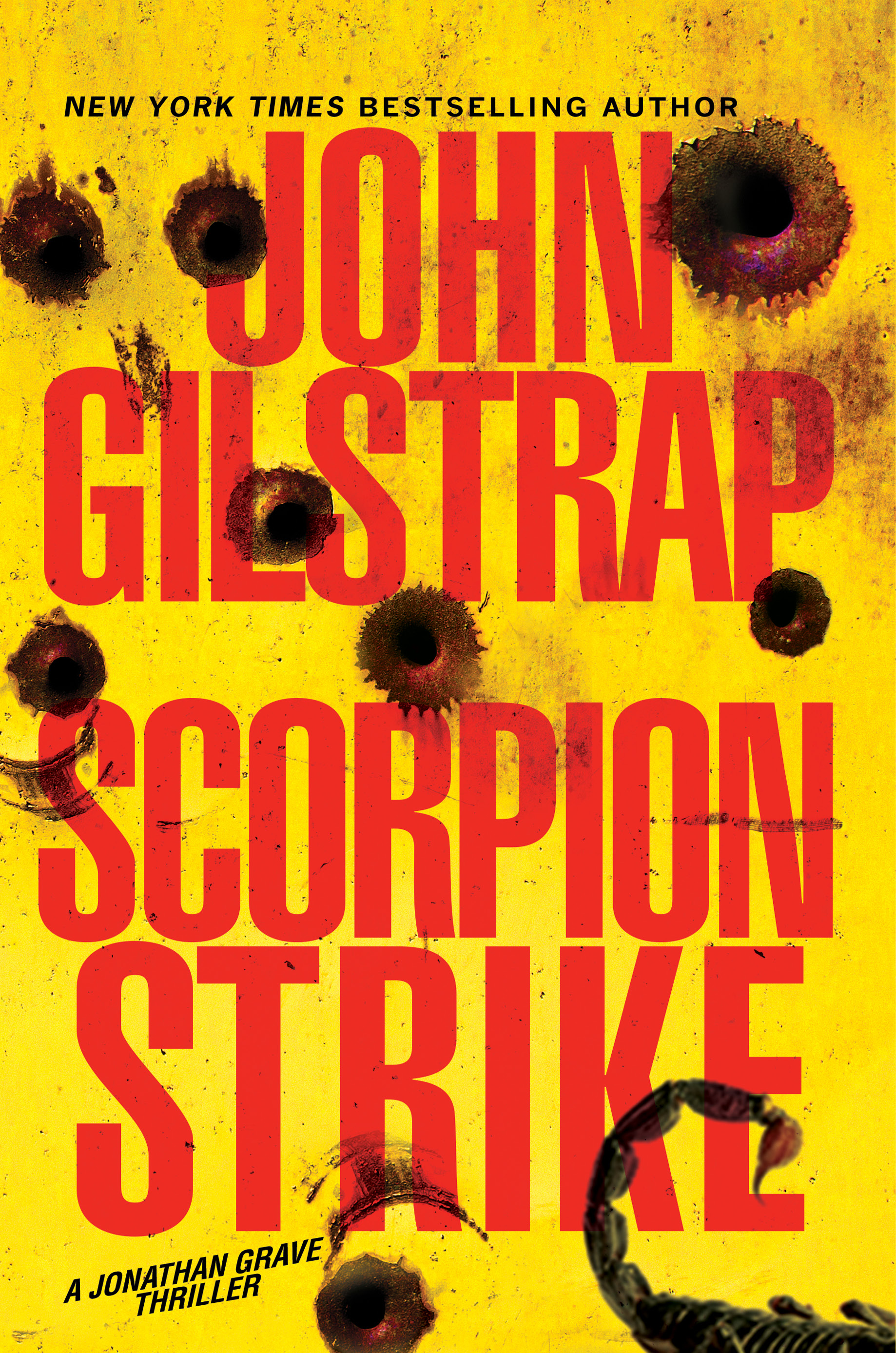
Well, I never do. I testify with neither pride nor shame that my mind simply does not work that way. I think I’ve mentioned here before that after 11 books in the series, I really don’t know what Jonathan Grave looks like. I know how he thinks, and I know what his skills are. I know his strengths and his weaknesses, but, physically, beyond having intense blue eyes and a number of scars, I don’t see him in my head. If I can’t see him, then I guess it should be of no surprise that I can’t cough up a cover image. That said, I know a good cover when I see one, and this one for Scorpion Strike (July, 2018) is my favorite of all my books.
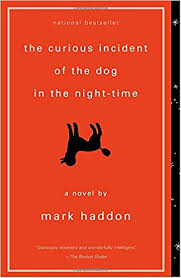 I think that the old adage that a book cannot be judged by its cover is at best disingenuous, and at worst a lie. We all do it, and publishers understand that we do. That’s why they have art departments. A book’s cover telegraphs more than just the story it tells. It says a lot about the attitude of the book and its intended audience. While my book covers are designed to project a Big Commercial Thriller, other covers, such as the one here for The Curious Incident of the Dog in the Night-time, telegraph quite clearly that they are targeted for a more literary audience.
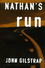 When my first thriller, Nathan’s Run, was released in hardcover in 1996, I was horrified by the cover. I was a rookie in the business and afraid to express my opinion, but I thought the cover with its drab brown tones and its weird font expressed nothing about the story while conveying the wrong tone. This was supposed to be a Big Commercial Thriller, but it projected . . . well, I don’t know. At best, the message seemed muddled. While the book sold well–certainly for a first novel–it fell short of expectations, and I’ve always thought the cover was a contributor to that.
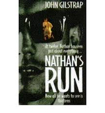 My British publisher, Michael Joseph, on the other hand, had a vision of the cover that fit way more closely to what I thought a cover should look like. The bad guy’s sunglasses reflecting a fleeing boy was “too literal” in the view of my peeps at HarperCollins, so I kept my mouth shut, but I loved the UK cover. And the tag line, “At twelve, Nathan has seen just about everything … Now all he wants to see is thirteen,” was a stroke of brilliance. Per capita, the book did much better in the UK than it did here in the U.S. We all know that correlation is not causation, but you’ll have a hard time convincing me that the cooler cover played a role in the better sales.
 Roughly eight years after the paper copies of Nathan’s Run went out of print, Kensington re-bought the publication rights and put it out as an eBook, along with my second novel, At All Costs. I’m not sure what I think about this latest cover. It shows motion, and I can’t complain about the size of my name relative to the title, but, to my eye, this version of the cover is kind of a place holder. It doesn’t really convey anything about the story, but I think it projects that it’s a commercial thriller. Maybe that’s all it needs. Again, I don’t know about this stuff.
Ultimately, I think cover art achieves its primary goal if it convinces a reader to pick up the book and take a look at the first page. After that, it’s all about the writing.
Or is it?
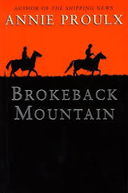 I suspect, in the utter absence of any empirical data, that covers are one of the big obstacles that keep a lot of genre fiction from reaching mainstream acceptance. We all know the story of Annie Proulx’s Brokeback Mountain. In its original printed form–before the movie tie-in version–the cover is clearly literary in its focus, and Western in its setting. In my busiest days of my fire service career, I wouldn’t have hesitated to carry this book with me and read it in the day room of the fire station. Replace the cover with a picture of a bare-chested man in chaps, though, and not only would I not have carried it, I never would have opened it. (Yes, I’m that shallow.) I know professional women who are secretly fans of romance novels, but won’t read them on the subway because the bodice-ripping covers.
And, in all fairness, I’m sure there will be professional men and women both who will feel a little uncomfortable toting a cover that features rusted bullet holes. But, man-oh-man, I do love it.
 I’ve learned one fascinating fact about covers over the years–and titles, too, for that matter: They needn’t have much to do with the story the book tells. Friendly Fire, for example, features a picture of the White House on the cover. I think it’s a terrific cover, but it hides a secret: Neither the White House nor the presidency play a role in the story. Once again, I was told that I was thinking too literally. The Jonathan Grave novels are “corridors-of-power” thrillers, and that is the message being conveyed by the cover image. Certainly, no one is going to mistake it for literary fiction or a romance. If it’s an engaging enough cover, people will pick it up. At that point, the cover will have done its job.
A critical component of any cover design is the title. Here again, the sole purpose of the title, in combination with the cover design, is to get a potential reader to crack the spine and take a peek inside. Thus, the title needn’t connect directly to the content of the book. Rather, it should convey the feel of the story. The most obvious example of this in my own career is Hostage Zero, the second in the Grave series. The phrase means nothing. There is no Hostage Zero in the book, but my team at Kensington liked the sound of it–and the look of it, too, when put on the page. In the ten years or so since that book dropped I haven’t heard from a single reader or critic who felt cheated by the asymmetry of title and story.
Now I throw it to you Zoners. How important are covers to you in your decision to give a book a try? Any favorites out there we should know about?
Oh, and before you go, please consider subscribing to my YouTube Channel, “A Writer’s View on Writing and Publishing.” I like to think there’s some interesting stuff there.
Happy Thanksgiving, everyone!
“I know professional women who are secretly fans of romance novels, but won’t read them on the subway because the bodice-ripping covers.” … And from this, Ellora’s Cave was born, and the idea of reading books electronically came into being.
As for covers … my traditional publishers asked for input, but basically, if your name was spelled right, you got what their art department gave you. I know my first publisher for my Blackthorne series tried to create a cover for each book with absolutely no thought to connecting them as a series.
It’s not easier being an indie author, where the burden of the cover falls on my shoulders. I’ve been fortunate to work with good designers, but I still agonize over each one. And, as you mentioned in your post, being too literal minded isn’t necessarily a good thing. I just commissioned a cover for my next novella, and I think the cover designer did a good job with mood and brand.
And then there’s the thumbnail aspect. Most of my readers buy my ebooks, so they’re judging covers based on those tiny screen images. Any text beyond author name and title is probably nothing more than a blurry line.
I hadn’t thought about the thumbnail-ability of the cover design. Interesting point.
I agree covers have an impact on sales. Readers expect certain designs in their favorite genres. Move too far one way or the other, and they may complain, or not pick up the book.
I think of the cover the same as the movie posters. They have to draw your audience.
Great post. Love the examples, and being both a fan of thrillers (of all kinds) and writing them myself, I love your rusted bullets and the partial picture of the scorpion. I’d pick that book up immediately.
Glad you like the cover, Cecilia. In a couple of weeks, the publicity team from Kensington is coming to my town with a bunch of actual covers, and the plan is to take them to the range where I will shoot them with real bullet holes for distribution to their best accounts. That should be fun.
(Subscription activated. But I was already an ad-hoc subscriber of sorts. Love your shorts. Wait… that didn’t come out right…) The tag line your UK publisher came up with for NATHAN’S RUN is indeed brilliant: “At twelve, Nathan has seen just about everything … Now all he wants to see is thirteen.” Great post, John. Newest novel cover is most definitely a winner also. I was just asked for cover art input on my thriller due out next year. Here’s to hoping it looks like a winner as well.
Thanks, Chris. In recent years, I’ve learned to limit my cover input merely to veto power. I haven’t had to exercise it, but I like to think if I REALLY hated a design, they’d go back to the drawing board.
I loved this post, John. I think we also need to be careful with symbolism. Too much, and the reader won’t understand the cover until after they read the book, which doesn’t work great for sales. Been there, done that. It’s one of my favorite covers, too. Live and learn.
Hey, I just learned that you’re friendly with my dear friend Garry Rodgers. Small world.
You bring up a great point, Sue. Covers aren’t important at all AFTER people have read the book.
Back in 2006, when my nonfiction book, SIX MINUTES TO FREEDOM, was being released, we threw a huge party at my house. Many of the real players from the book were there–Kurt and his co-conspirators, eight or ten Delta operators, State Department people–but nobody knew who they were because they hadn’t read the book yet! Duh.
RWA has paid for a number of large reader surveys over the years, and the consistent answer for what attracts a reader to pick up a book is 1) author name recognition, 2) cover/title, and 3) the cover copy (quote on the front and the descriptive information on the back or inside jacket.). So, if you aren’t a name writer, then you darn well have to have a great cover so the reader will pick it up or scroll down to check out everything else.
Oh, and don’t use the term “bodice ripper.” It’s like calling a new car a “fliver.” The term hasn’t been accurate since the early Seventies so you’re showing both ignorance and contempt for the biggest genre audience in the world, and many of those readers are omnivores who might read your books, too.
I have nothing but respect for romance novelists and readers. Many of my best writer friends are, in fact, romance authors.
And for what it’s worth, until this post, I had never heard of the word, “fliver.”
I always judge a book by its title. If the title is too long, I lose interest. I prefer one or two word adjectives for titles.
I interned at a literary agency this summer, and the agent I was working for had a huge issue with one of her clients cover. The publishers put a cupcake on the cover. The book is about a fat girl who struggles with self-worth. The only connection between the cupcake and the story was that she binge ate a bucket of frosting, then threw up. The cover depicted a cutesy story when the story was really dark with suicides and depression.
However, the book was published with the cupcake.
In context, the cupcake story is actually disturbing.
As for lots of words in the title, a dear friend and uber-successful writer put it like this: The longer the title is, the less room is left for the author’s name. (Did I mention I’m shallow?)
I can say I have picked up a book (more than once) because the cover caught my attention. Books that I normally wouldn’t have picked up – but was glad I did because I love them. I have worked in to graphics over the years at work. I hated doing all of the tough writing work and then letting someone else design for them…. I had spent all of that time with it, I had ideas on how I thought text and graphics could best represent it and it irritated me to not have input. So, I’ve done a lot of learning and work to learn how to convey mood and information with font, shape, space, color, and layout. I do like a book that actually conveys something about the actual story and book. I also grew up with fantastic covers because I read copious amounts of science fiction. I always thought thriller covers were boring – plain, mostly text with an occasional common image like your Whitehouse and flag cover…. canned, although I got used to the code that said they were “thriller”. Same with bodice-rippers…. the newer versions don’t have so much of boddices as they do canned chests, mostly male, mostly bare…. again, not a fan of the “canned” romance cover – but I do recognize the code for “romance”. Even fantasy & sci-fi covers have a lot of “canned” themes and images now – but we all understand the “code”. I think that is what they go for. I think it is lazy. I still think a pertinent – actually connected to the story, thought out and considered cover is way better. It is also more likely to catch my eyes. I love the new cover – seeing the scorpion and then the “sting” of the bullet holes made me smile and feel all warm and happy inside while conveying the type of story I expect within its covers. I also agree with you – of the 3 covers from your first book – The UK version is the best and most relevant – I would pick that one up. The other two – really don’t covey much to me. The newest one – that is so boring and pointless. It doesn’t even follow the “code” I wouldn’t know by looking at that cover if it was a romance or a thoughtful literary fiction piece. Without your name on it and knowing what you write – it would never get a second look. Covers are important. To me. Just as important as story and title…. a good one has just as much thought going into it as the story.
Covers definitely have a lot of power over initial reader selection. I hate it when I get a book based on the cover and a quick scan of the description only to discover that neither was really accurate, or that the cover had nothing to do with the story.
My current publisher did a pretty decent job on the covers for my re-released stuff, and on the first of my new series. But this past summer my editor left and was replaced by someone else who has different ideas about covers. I am kinda anxious to see what they do with the next books in the series, in hopes they will keep the continuity between the covers as the previous editor and I had planned.
By the way, your next cover is pretty cool John. Looking forward reading it.
Another element of the cover that I forgot to address is good old-fashioned branding. As an author’s career advances, I think it’s important that elements such as font and word alignment remain consistent. It’s particularly important for books within a series, but even with stand-alones, the branding helps. Even without reading the titles or author names, I think I could pick out a Grisham book or a Stephen King book at a glance. Perhaps the farthest extreme would be the Harry Potter books, whose design I never cared for, even though I was addicted to the stories.
I think people have always judged books by their covers, much the same way we judge everything by appearance. The “canned” aspect is there because it’s the easiest way to communicate to a potential reader that this is the kind of book that they are likely to enjoy, which is very important in genre fiction.
As an independent author I try to do as much work on my own covers as possible but it’s a lot of work, and deciding what the “right” look can be is almost as time consuming as the actual artwork. Overall I think (hope!) I’ve been reasonably successful with the ones I’ve done, but there’s always the worry that I’ve stuffed up. I also have to admit I’m probably a bit too literal-minded on the imagery I use-I’d never have come up with the idea of using the White House on a cover unless there was some connection with the story.
Thanks for the article, I enjoyed it!
Ain’t it the truth? I continue to delude myself into thinking I am the best judge of a book cover for the novel I’ve labored over. I’m not. My cover designer is, period.
Pingback: Writing Links 11/27/17 – Where Genres Collide