
By Joe Moore
My co-writer Lynn Sholes and I have been very fortunate to have our books published in different languages. Although most of the foreign covers are similar to the domestic versions, we’ve had some interesting surprises along the way. Inside the book, it’s the same story just translated into another language, but outside is a different story altogether. It’s obvious that each publisher must know and market to their unique audience. And in many cases, there’s a huge difference in the visual presentation and interpretation of our stories. Here are a few unique examples:
Our first book in the Cotten Stone series is THE GRAIL CONSPIRACY (2005) with a central theme of human cloning. The original cover is on the left followed by Spanish (Latin American), Russian and Bulgarian.

The main object on the English cover is the ancient symbol of the Knights Templar whose descendents are the bad guys in the book. The Spanish version looks like a space ship taking off while the upside down skull chalice is very cool in the Russian cover. I have no idea what’s going on in the Bulgarian version.
Our second in the series is THE LAST SECRET (2006). It deals with quantum mechanics and the ability to be in two places at once. The English cover is followed by Greek, Estonian and Czech.
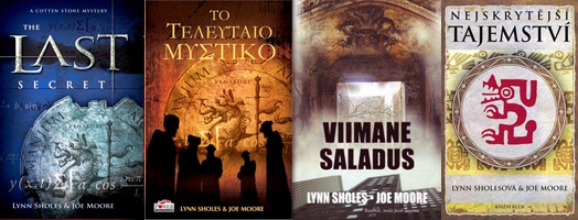
On the English cover is the emblem of the Venatori, the secret intelligence gathering arm of the Vatican and the oldest spy organization in the world. On the Greek version are a lot of sinister looking people standing around in front of the Venatori shield. Not sure what they’re doing but it appears serious. The Estonian cover is kind of vague, and the symbol on the Czech cover looks Aztec or Mayan but your guess is as good as mine as to what it means.
Number three is THE HADES PROJECT (2007) about a plot to use a quantum computer to wreak havoc on the world’s infrastructure. The domestic cover is followed by the Lithuanian, Bulgarian and Slovakian versions.

The symbol on the English cover is a pentagram because there’s a lot of devilish stuff going on inside. I think the Lithuanian cover is just plain weird like a strange Southwestern fire god, while the Bulgarian is spooky, and the Slovakian looks conservative and regal. Not sure why there’s a compass in the picture.
Number four is THE 731 LEGACY (2008), a scary story about state-sponsored terrorism and the reassembling of an ancient retrovirus that is carried in all human DNA. Here’s the English cover followed by Greek and Dutch (a bestseller in the Netherlands).

The domestic cover shows a modified Japanese war flag since Unit 731 was a WWII Japanese organization that performed terrible atrocities against their enemies. The Greek cover looks like "Stairway to Heaven" and the Dutch publisher decided to change the title to THE KYOTO VIRUS, although they did keep the Japanese flag in the background.
So can we judge a book by its cover? Each publisher must understand their market and audience, and know what kind of visual impression is needed to make a customer pick up a book. I like all the versions of our covers for different reasons and I think it’s really interesting to see how our stories are interpreted in various languages and cultures with the cover art. But most of all, I really like that Russian skull chalice.
If you’ve had foreign language versions of your books published, was the art work similar to your domestic version or did the artist take off into La-La-Land? What was your reaction when you saw the covers?
My first book THE LAST FAMILY was translated into 12 languages. The foreign covers were interesting and the best one was a Hard Cover Russian edition, which featured a picture of actor Ray Liotta (cocaine crazed eyes) aiming a gun at something off cover. I think that one was my favorite, even though Ray probably had no idea his picture graced the cover.
The Taiwanese version of Consequences had a photograph of a jungle and a canoe – which was a very different take on the book! I have yet to see the Russian or German covers – so that should be fun!
Those are some seriously cool covers. The neat thing is being able to get a different perspective of your own work. While we may not understand how they came up with a particular cover as long as it is cool in that countries perspective it will sell.
I love my foreign covers. The French one for Tunnels is a little incongruous, featuring a cobblestone tunnel, but what they hey, they also renamed the book “Circle of Blood.” Australia does amazing covers, I love the ones for both my books. And the Spanish one snagged a stock photo from my website, which was interesting.
I’ll be discussing variations of covers in my post tomorrow, funnily enough.
Thanks for the comments. Like I said, I like all the covers, but some are really out there. At the end of the day, I’m grateful that we’ve been published in other languages, no matter what the covers look like. 🙂
Love those! It would be great to assemble them all into a slick-looking wall poster or something, very pop art-looking.