
I was signing with Don Bently (bestselling author of the tom Clancy, Jack Ryan Jr, the Vince Flynn Mitch Rapp series, as well as his Matt Drake novels) in Alpine, Texas the weekend before Thanksgiving. During a lull, we settled back at our tables and visited with the owners of Front Street Books about all things writing.
We decided that next year we needed to add a couple of other authors to the mix and expand the signing into a mini-conference held during their art walk, complete with a panel. Names came up, and a plan began to gel. The conversation then turned to what we were reading, and someone handed me a new novel by an author I’ve never read.
The cover immediately caught my attention, and that skewed our topics to That Thing that causes authors to gnash their teeth.
The Cover.
Yep, That Thing which should attract buyers’ attention, but it often lost in interpretation. We all have “cover stories” to share. Many are filled with frustration, angst, and downright anger. As Don and I traded war stories, patrons collected around us and the discussion widened. We all agreed a cover should reach out and grab readers by the shirt, yanking them close to the shelves so they can pick up what authors worked so hard to produce.
“I often buy books by the covers,” one lady commented.
“That’s how my Bride sometimes buys wine,” I added.
Someone shouted huzzah, and a glass of wine appeared in my hand. The signing was definitely on the upswing and we settled in to swap ideas and our favorite book jackets.
As a new author well over a decade ago, I didn’t realize there would be so much to argue about, and that I’d have so little input. The original cover for The Rock Hole is still out there for some reason, because as you all know, nothing ever vanishes from the internet. They floated this one out there and I found unspeakably odd.
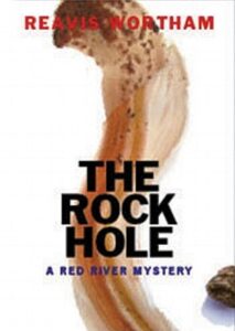
Standing up on my hind legs and argued with them. “I don’t know what that is.”
“It’s your cover.”
“It looks like someone skinned a flamingo’s head and neck. I don’t remember including flamingos in my novel.”
“It’s a blood smear.”
“From a flamingo?”
“No, from…something.”
“No.”
“Well, first time authors don’t usually have a lot of say in what our artists produce.”
“Then I won’t say a lot. Different art would be nice.”
We volleyed for quite a while until they came up with something more suitable and I kinda liked the bloody shoelaces.
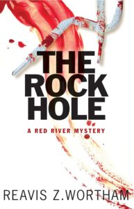
Other covers came and went for that series, though none of them excited me. It wasn’t until Laying Bones came out that I thought they understood what I was doing. They finally got it right on the re-release for The Rock Hole.
I’ve heard authors say the covers of their books had nothing to do with the contents, and they had to push back also. And I should have known the importance and argued even more in those earlyyears, because my first job was shelving books in a public library and I knew what caught my attention even back then. They called us pages, funny on several different levels, but I always noticed covers as they came through and still recall several novels I read, because the art was so good.
Then there were those earlier years, when I bought books off the spinning rack in the drugstore, or at a tiny independent bookstore near my house for sixty cents. It was always the cover that caught my attention, then I’d read the back.
It’s the same today, and due to reduced shelf space, many times only the spine is exposed. Whenever a book is placed outward, the dust jacket will either catch someone’s attention, or fade into the background.
I didn’t buy the first edition of Lonesome Dove, by Larry McMurtry, when it released in 1985, because I didn’t like the jacket. People told me how great that novel was, and I finally bought it, despite my original revulsion at the depiction of a cattle drive.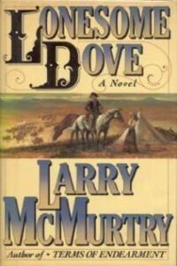
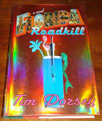
When Florida Roadkill, by Tim Dorsey, released in 1999, I snatched it off the shelf and have been a fan of his work ever since.
 Which leads me to another important part of marketing. The title. There’s always a lively discussion at my house whenever I’m coming up with what to call the latest work in progress. With the help of my Bride, we hit upon something that works for us, but doesn’t always tap the button at the publishing house.
More discussions ensue. For example, my first traditional western will release on April 23, 2024 under the title of The Journey South. The working title was Hostile Territory, which I loved. However, my editor called to say they’d already assigned that one to another author.
“Blankety Blank already has that title.”
“But I like it. My book takes place in the Indian territories. It’s perfect.”
“You’re right. It was perfect, for Blank’s book.”“
But I want it.”
“Your character’s taking a prisoner south from the territories to Texas.”
“Going South?”
“A movie that starred Jack Nicholson.”
“Dammit!”
We cussed and discussed ideas until settling on the new one. Then they sent their concept and I agreed.
The Only Salo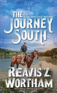 on in Town is in the can and I’m waiting on the cover art. It’s kinda nail biting, because I already have an image in my head that won’t be anything like their art department comes up with,but that’s half the fun of this job.
I wouldn’t have it any other way.
To me, so many current book covers seem so similar few stand out from the crowd.
When considering the cover for my current work, I asked myself if my goal was to conform to the norms. Answer, no.
During my misspent youth, I tried my hand at many things, art remains a subset of my skill base. For my current WIP, I developed the cover art and layout myself. I expect to submit it to my publisher’s staff professionals for polishing. Let you know how that works out.
For what it’s worth, simply hearing the title “The Journey South” doesn’t instill a strong reaction either way–although any time you include the word Journey that does give you a sense of anticipation for a rocky road ahead. But the cover image you showed above, combined with the title, is just right. You can’t lose when you have a horse with western gear. 😎
Even though I buy few books in print any more (aging eyes), the thumbnail image of the cover still very much matters when I’m searching online. I dispense with consideration of many books on cover art–that’s how I begin the whittling down process.
For myself I have much homework to do about cover art for mysteries. I haven’t looked at covers across the spectrum of mystery sub-genres, but one thing that is very popular with cozies that I don’t care for is the…I don’t know the right word…the cartoonish covers. The story I’m working on I don’t consider a cozy but from the limited review I’ve done of the more traditional mysteries, I don’t see that cartoonish style as much. More real-time cover art, and often use of darker colors.
But I’ll have to set aside my own cover art bias. Whatever genre/sub-genre I slot the book in I want readers to be able to find it. And I guess if that turns out to be cartoony covers, I’ll have to suck it up and deal with it. LOL!
Front Street Books is a great bookstore. Of course it would spark great conversations.
The cliche “Don’t judge a book by its cover” is the way most readers chose books. Before you ever mentioned skinned flamingo, that’s exactly the impression I saw in that original cover. Aaargh.
As Brenda mentions, the thumbnail cover is also important. What looks eye-catching on a physical book doesn’t necessarily translate to postage-stamp size.
The Journey South is an appealing cover looks good large or small.
IMHO, The Only Saloon in Town is a fabulous title!
My first publisher asked for input on the cover, but then when they created it, the only way they’d make a change was if your name was spelled wrong. Now, as an indie, I’m in charge of everything, and sometimes I wish I had someone else to blame.
Back when I was an Edgar judge, I swear, all the covers and titles looked the same. Except the winner in our category. I wonder if the cover had anything to do with it. (No, it didn’t–we judged the words.) But it was refreshing.
And those thumbnail images are so important these days.
Oh, yeah — I like your cover.
I saw a spilled milkshake rather than a skinned flamingo. It’s not even the right color for blood. I have an old cover kicking around online, too. A reader sent me tiny replicas of my Mayhem Series as charms on a keychain. Sure enough, the artist used that old, out-dated cover. Still love the gift, though.
This is a side-road to today’s post but I just found this quote and it is relevant to all the choices we have to make about our writing projects, cover art and all:
“The imperfect project you actually complete is worth more than the perfect project you never finish.” — James Clear
Well, as you know, I design my own covers. There’s still a lot of Sturm und Drang, but it’s *my* S & D.
Wouldn’t have it any other way.
Covers definitely matter when it comes to drawing the readers eye. I saw it all the time at the library—put a display together and the books with the striking covers typically went first. As with a fine meal, the first taste of a novel is with the cover.
I’m with you about The Rock Hole’s first cover. I wasn’t sure what that was supposed to be, maybe a weirdly drawn snake, seen from above? The cover for re-release, on the other hand, rocks it and is perfect.
As an indie author who is not a cover designer, my job is research similar recent releases in my genre as well as current covers on evergreen books in my genre, and fill out a cover questionnaire about my novel: genre, log line, character, summary etc. and then let my cover designer work their magic. The mockup is usually pretty darn close to finished, and my input is usually about a tweak or two in the design, if at all.
RWA had done a number of professional polls of readers, and they found out there are three reasons a reader will choose a book. A known author’s name. The cover. And the blurb/back cover copy. The name and/or the cover will make the reader pick it up. The cover copy will make them open the book and read a little. That seals the deal whether they buy the book or not. Authors who decide to go cheap with the artists, etc., wonder why no one buys their book.
I dealt with a lot of newbies and idiots in the early days of ebooks, both editors and artists. I spent a lot of time teaching about genre iconography and the need to make the visuals suitable for a thumbnail. I became known as a raging b*tch because I refused a cover with a single rose for a science fiction adventure, and, when they tried to replace it with a badly drawn flying sauce, I bought my own cover. Clueless, the lot of them. Sigh.
My first sale was to an indie publisher who had her own staff artist. Their monochrome blue cover included silhouettes of a boy and girl. The girl’s hair didn’t match the story, but that’s par for the course. Their back cover was better than the front. When they dropped the book from their line, I reissued it under my own imprint (Wyzard Hill Press) with a new cover. I used a stock image, added an imaginary ship, and proper front and back text. If you’re curious, here’s the new ($20) front cover:
https://m.media-amazon.com/images/I/61YnW8wt2pS._AC_CR0%2C0%2C0%2C0_SX410_SY308_.jpg
For comparison, here’s the original cover:
https://imgs.search.brave.com/3wpybUuO74DpPnbaCD2H7zqiUQDyI2v88Ys9GwzcEOM/rs:fit:860:0:0/g:ce/aHR0cHM6Ly9tLm1l/ZGlhLWFtYXpvbi5j/b20vaW1hZ2VzL0kv/NTFBWW9hZ3RxTkwu/anBn
(WordPress does odd things to links, here, so what you see may be an unrelated image or nothing.)