
By PJ Parrish
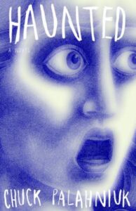
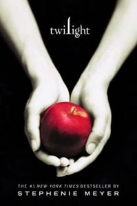
Maybe it’s my art background — or more likely because I write books that I hope get noticed — but I really pay attention to book covers. I’ve been known to pass by a good book with a what-the-hell? cover (Chuck Palahniuk’s Haunted) or get seduced by a meh book with a sexy cover (Stephanie Meyer’s Twilight)
Cover design is also on my mind because I’m working on my Edgar banquet stuff this week. This is my 15th year as banquet chair, and one of my duties is to put together the PowerPoint presentation of all the nominees’ book covers. I’ve seen a lot of trends come and go over that time. Some have become classic. Others, well, they belong down there with Juicy tracksuits and Nik Nik shirts. (Score yourself 5 pts if you wore a Nik Nik, 10 if you went out in public.)
Most authors are at the not-so-tender mercies of their publishers when it comes to cover design. But a lot of us also do our own covers or hire someone. A bad cover can really torpedo a book. I’ve seen some butt-ugly covers among the Edgar nominees. This year there doesn’t seem to be a dog in the bunch. So, I figure this is a good time for a quick survey course of what’s hot. (I’m covering only fiction here).
I’m thinking that fiction cover trends have stabilized in the last couple years, maybe because the industry seems to have figured out what a marketable cover should look like. Why reinvent the wheel? But then again, that kind of thinking gave us years of black covers. (Après Amy Dunne, le déluge). Those of you who publish your own stuff know the drill: Make sure your cover looks professional, reflects your book’s tone and meets genre standards. Those of you traditionally published — pray.
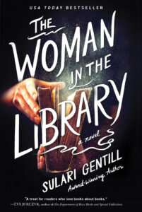
For a couple years now, we’ve been seeing minimalism in crime fiction covers — nothing fussy, maybe a plot-symbolic graphic, and strong typefaces with author name and title. This is baked in now, but there are some interesting break-aways as well. Here’s my rundown featuring this year’s nominees from the Edgars and the specials (Mary Higgins Clark, Lilian Jackson Braun and Sue Grafton awards):
San Serif Type. This has become the default design. Note that this approach translates well when reduced to a thumbnail on Amazon. Although I’m not sure about the white type against that pale background.
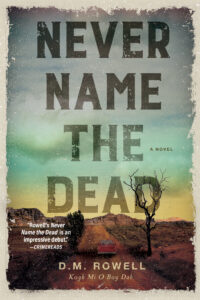
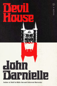
Written Type Faces. This trend emerged a couple years ago, and is still with us.
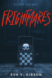
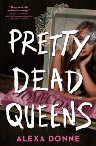
Note: All three are from the young adult category. Looking pretty scary, there.
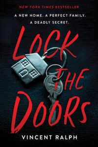
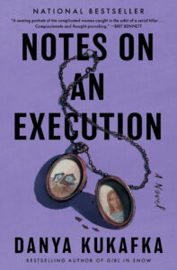
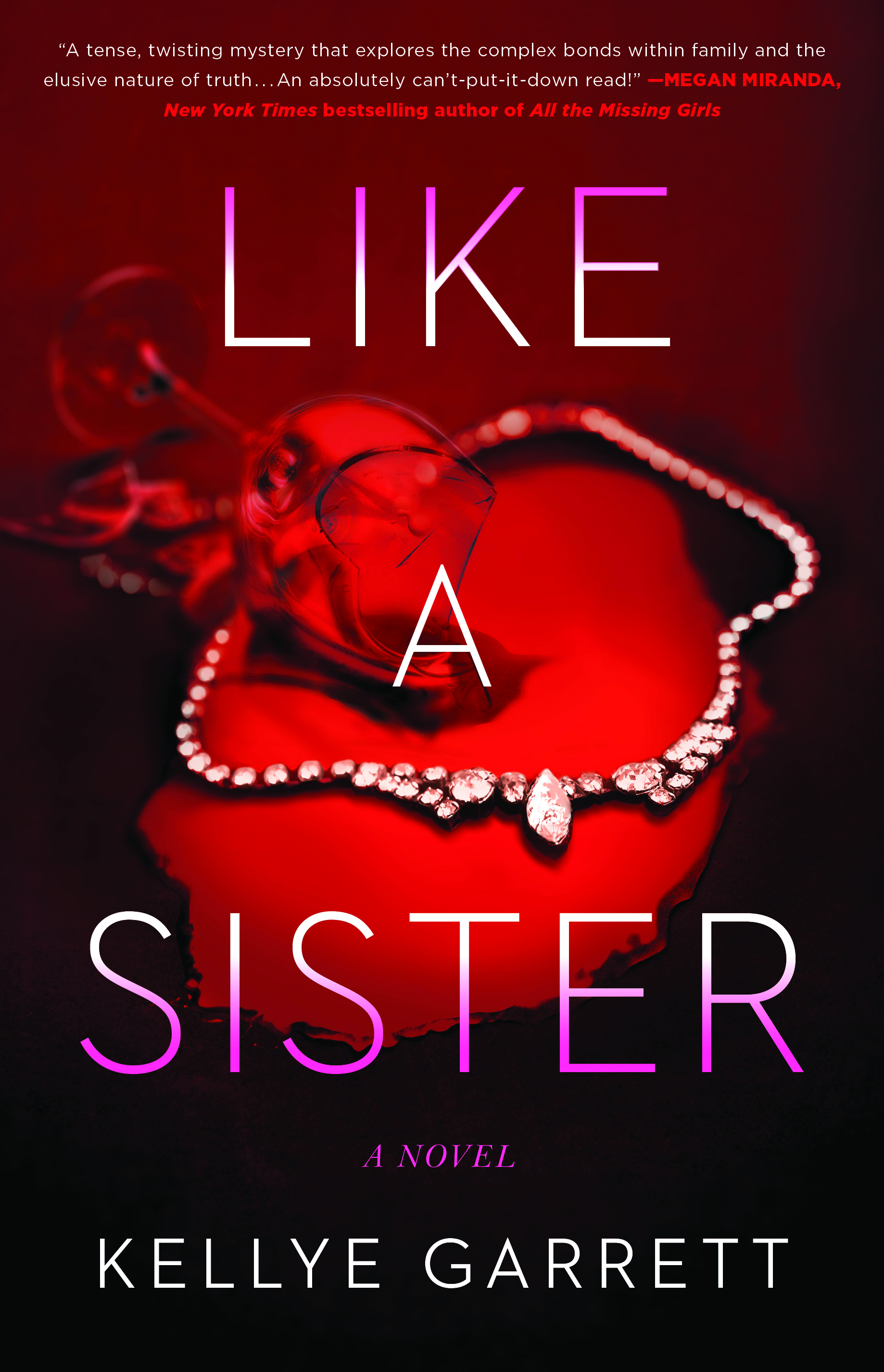
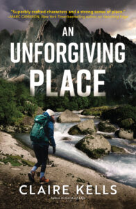
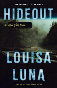
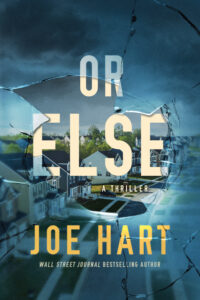
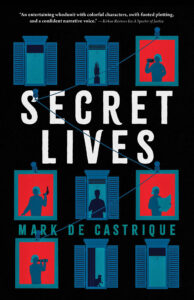
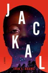
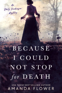
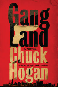
One Strong Graphic. Another evergreen trend that has become a hallmark of crime fiction. It is seen as being symbolic of the plot usually. Many strong examples in this year’s mix. (Click any image to see larger)
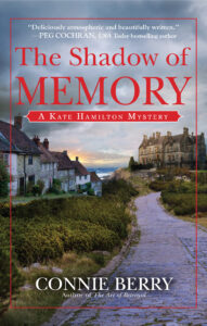
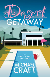
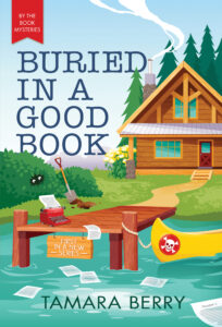
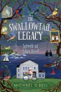
Sense of Place. Conveying the story’s geographic place also continues to be popular. Some authors revel in setting (William Kent Krueger brands all of his book covers in this way). We used to do this with our Louis Kincaid series, but it started to feel dated, so we repackaged around the symbolism idea. But setting remains a favorite this year.
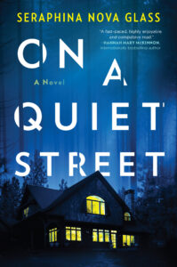
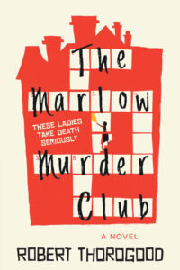
A Building Block. A similar device — tried and true for decades now — is to use a house or cabin as the central graphic. I’m not really crazy about this, as it always feels sort of vague to me, like the designer couldn’t quite grasp what the writer was doing. Our worst cover had a house graphic so maybe I’m just prejudiced.
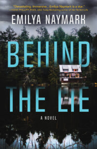
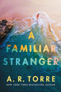
But what if your setting isn’t all dark and creepy? Well, beneath that Don Johnson pink Armani lies a black heart, wouldn’t you know. I love both these covers. I’d rent a VRBO in these towns, even if there was a serial killer a-lurk.
There are also some eye-popping pure graphic design going on this year:
And some successful attempts to capture a book’s tone. Notice the nice marriages of color, typeface and graphics that convey a mood. You know immediately what kind of books these are.
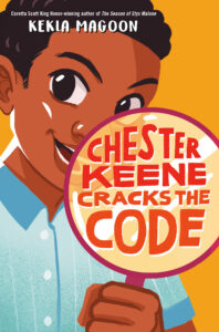
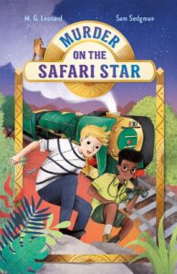
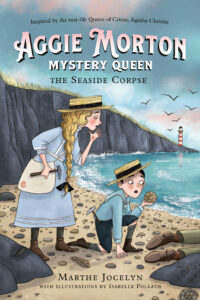
One of my favorite categories, as far as cover art goes, is juvenile. One trend that remains classic in this genre is use of protagonists’ images. Maybe because kids like to identify with them so closely? Hey, I was dark, chubby and had to babysit the Heller brats, but in my dreams I was that blonde in the blue roadster.
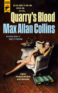
Which leaves us with some splendid covers that defy categorization. There’s a retro vibe this year, redolent of Gorky Park, shivering spies, dicks with gats and those fun-loving Corleone boys.
To see all the nominees on Mystery Writers of America’s website, click here. And that, crime dogs, is a wrap.
I love book covers. My first cover was executed by the publisher. It was better than the stock cover I chose for my Lulu preview copy, but it was monochrome blue, with my MCs in silhouette, and a gritty surface instead of glossy. I wasn’t thrilled. But when my publisher changed the terms of our contracts, I pulled out. They offered to sell me their interior & exterior design, but since I was planning to do my own cover, I turned them down. I love my new cover, put together with a $20 wrap-around stock image for front and back, using Libre Office Draw. Here’s the front:
https://www.amazon.com/Sail-Away-My-Silver-Dream-ebook/dp/B0979KJRPD/ref=sr_1_1?crid=34TASPKEDVMQB&keywords=%22sail+away+on+my+silver+dream%22&qid=1680590337&s=books&sprefix=sail+away+on+my+silver+dream+%2Cstripbooks%2C161&sr=1-1&asin=0997450339&revisionId=&format=4&depth=1
[push the paperback button to see the cover]
Derek Murphy has a lot to say about covers and marketing, etc. I’d provide a link, but I’ve found the hard way that two links in a Kill Zone comment sends the entire post, in all its genius, off into the Killed Zone, never to be seen again. Derek is not fond of clever covers. He prefers cliche designs, given that the objective is to let the reader know what the book is about, not to be cute. Check out his websites. Oh, and he had some free covers you can adapt for your Vella book. They’re mostly Fantasy.
Here’s the link to Derek. https://www.creativindie.com/
Thanks!
I like that cover. Draws your attention immediately.
Thank you. The cover matches the story: Sharon leads David–she is the one who thought up the Silver Dream, inspired by a poem they read at school.
Thanks, Kris. Re: the retro trend…Hard Case Crime, which is represented in your post by Quarry’s Blood by Max Allan Collins, has been keeping the retro vibe alive for years — almost two decades, actually — with both the cover and the contents of their wonderful books and graphic novels.
Have a great week!
Yeah, I should have mentioned that Hard Case has very effectively used the old pulp style as a branding tool.
Thanks for the rundown, Kris. Congrats on the 15th year as Edgar banquet chair. Good luck with the PowerPoint presentation.
When I was an Edgar judge, it seemed all the covers were the big block letters and an obscure image behind them. The few that varied from this template were refreshing. One thing I think is changing is that more people are buying books on line. The images that show up, even on my large monitor–forget a phone–don’t have the luxury of including a lot of detail. Subtitles, and cover quotes come across as blurry lines.
Exactly, Terry re the fact that a good cover has to be able to withstand the shrinkage factor for online purchases. Kelly and I actually have two separate images for just this reason.
Kris, I always learn from your posts about covers b/c you have the artist’s eye. Thanks for another excellent survey.
Fifteen years chairing a banquet is a lot of hard work!
Re the banquet: we pretty much have it down to a science by now but it was hairy the first year. Especially since the Grand Master that year was Stephen King. What an experience. He actually was trying to calm me down before hand. 🙂 Nice man.
Out of all these images, the ones that appealed to me most were the ones with a geographic image focus. Not really surprising, as I’m not going to lean toward an especially creepy or abstract cover. But it’s amazing to see all the different directions cover art can go. And I agree with you about the pale typeface on a pale background–since most of us probably shop online and are looking at small thumbnail images, it would seem a hard-to-see pale on pale combo would cause a book shopper to sail right past that particular title.
I think I paid more attention to book covers when I was an in-the-physical-bookstore shopper, but even online they are still important. The cover art determines if I click once more to read the book description. I need to start thinking about cover art for my first mystery. I’ll be curious to see what we end up settling on.
Yeah, I rely on cover impact more in a bookstore than on line. You can’t help that, because that bright shiny image calls out to you from a shelf. But now, time seems so short, that I rely almost exclusively on word of mouth from friends I trust.
Thanks for the terrific walk-through these cover categories. I love covers, and always enjoyed looking at covers of the new books when they arrived at the libraries I worked at. I’m with you and Terry about covers needing to be look good in thumbnail view these days.
As it so happens, yesterday my cover designer sent his initial cover mock-up for my second cozy library mystery, Book Drop Dead. He’s an absolute pro, starting with the excellent font choices. Capturing the feel of this cozy library series set in the 1980s is a challenge, but he’d meeting that challenge again.
I love the covers you chose to present here, Kris. I’m drawn to the bold and colorful ones.
I noticed most of the titles are two or three words long. That probably helps the thumbnail images on Amazon.
Good luck with your presentation!
Oh yeah, we could do a whole post on three-word titles. My editor at Kensington loved ’em. Art departments do too. 🙂
Thanks for this overview, Kris. I couldn’t get the images to enlarge, but that’s OK as I think covers need to be viewed and judged small. And your 3-up layout here works well.
As someone who’s created, judged, and reviewed lots of book covers, the one thing I’m always harping on is “brightness contrast” and doing the Grayscale Test. It never lets me down. Those interested in this can read my 2015 article/post on the Book Cover Reviews group I run on Goodreads:
https://www.goodreads.com/topic/show/13245444-a-touch-of-grey
By gray scale, I think you mean converted it to B&W and seeing if it still “scans”? If not, could you elaborate?
Basically, yes. A grayscale image is made up of Lightness values only, i.e., no color information (RGB or CMY). This is done with a simple conversion in an image-editing software like Photoshop or similar. Thanks for asking!
I also see a tendency to include at least one power word in the title:
Death
Murder
Code
Blood
Devil
House
Haunted
Twilight
Dead
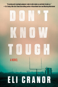
Tough
Stranger
Secret . . .
Ha. This is so true. I’d add to this:
Woman/Girl (or has this trend died finally?)
Lies
Missing
Sleep
Lost
Fatal
Grave
The Girl In the Ghoulish Grave….
Haha! All good. I have a spreadsheet with about 100 power words. Reminds me of the famous story of the writer who’d received 300 rejection slips and asked an agent what was selling. The agent said, “Books about medicine are hot. Also, anything about animals, and stories about motherhood or Abraham Lincoln.”
The author went away and six months later the agent received the manuscript for “Lincoln’s Mother’s Doctor’s Dog.”
Excellent information today. I do some design work from time to time. You should be designing for Amazon on a phone. Everything else can grow from that. Nicely, Amazon has an article about making covers. https://kdp.amazon.com/en_US/help/topic/G200645690
I find it odd that they don’t accept .png images. .png can have a transparent background. .jpg cannot.
“Amazon on a phone” is probably why there are so many short titles/big words/simple graphics on book covers today. I am a fontaholic and don’t plan on changing anytime soon. There is a newsletter for us fontaholics called “Typewolf Tuesday’. It can give you some ideas.
At the end of the day, the big thing is readability. Save your cover and send it to your phone. How readable is it? “Typewolf Tuesday
Fontaholic! Yes, so am I. I always zero in on what fonts are used in ads and especially movie credits. 🙂 My favorite font is called Bourgeois, used in the credits for the TV show House of Cards. Very elegant!
That is a nice one. An excellent choice for movie credits.
Thanks, Kris! This post is chock-full of good info, and very timely for me because I’ll be working with my designer on my novel #2 cover next month.
Looking for something a bit mysterious, but not scary, for No Tomorrows. Tall order, I guess. But my cover designer, IMHO, is a genius, so I’m looking forward to starting on it.
Have a great day! 🙂
You should post on this…take us thru the process of okaying your cover design.
I have to second Kris–I’d love to see your process of working with your designer. Just okayed mine today.
I’m curious too, Deb. I shared how I worked with a former cover artist on my blog–we can compare:
https://terryodell.com/extras/designing-a-book-cover/
PowerPoint presentation of all the nominees’ book covers