
By PJ Parrish
We should all have such problems…
I read a story in the New York Times this week about a debut author whose novel became an international bestseller with rights sold in 40 countries, was named Barnes & Noble’s book of the year, and is on track to be the bestselling debut novel of 2022. Oh yeah, an Apple TV+ adaption is in the works.
But she’s getting a lot of hate mail because of her….cover.
The book, Lessons In Chemistry, is about a woman scientist in the 1960s who is opinionated, funny and intelligent, but she’s cheated out of her doctorate and brutally sidelined by male colleagues who, as one reviewer put it, make Don Draper look like a SNAG (Sensitive New Age Guy). Think of The Queen’s Gambit set in the macho labs of abiogenesis. The heroine wears a sharp No. 2 pencil in her chignon not for style but as a weapon against sexual advances.
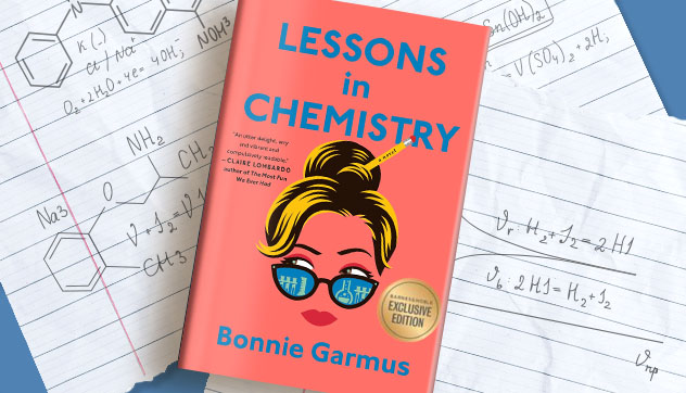
But then there’s that cover. Bubble-gum pink, with a cartoonish woman’s face peering over a pair of cat-eye sunglasses. Some readers picked it up as a quick beach read, expecting — I hate this phrase — “women’s fiction.” What they got was a serious look at the frustrations of a generation of women, who were relegated to the corners, ignored, or worse.
Garmus is able to laugh about the hate mail from some readers, saying, “They were like, ‘You’re the worst romance novelist ever!’” She says the cover has turned off a few men, admitting that during an talk to an all-male book club, members were dissuaded by the cover’s Necco Wafer shell. “But as I’m fond of saying,” Garmus said, “the book isn’t anti-men, it’s anti-sexism.”
It’s also, by all accounts, a fun read. There’s a mystery, mixed in with a shrewd look at politics, and a dysfunctional bad local TV station. The heroine has an addiction to her rowing machine, loves her daughter and her dog Six-Thirty.
James Daunt, chief executive of B&N, admits that aiming the novel at a female readership is “a bit pigeonholing….but the book has dominated the cover.”
Love that phrase — dominated its cover. As a writer who has had her share of bad covers, I sympathize. It’s an eye-catching cover, to be sure. But the dissonance between it and its message is jarring. I’m glad Garmus can joke about it. She had more than 100 rejections of other manuscripts before Lessons In Chemistry. Nice to break through — at the ripe young age of 65.
How To Get Back To Writing
Back from a long and lazy vacation where eating, drinking and reading were the only things on my brain, I’m having a devil of a time opening the file of the WIP. So when Jane Friedman’s latest blog popped up in the mailbox the other day, I clicked. It was by an author who, feeling exhausted and overwhelmed, found a way to grease the wheels again.
Matthew Duffus writes: “When I finished my MFA in 2005, I didn’t write for a year. Between exhaustion from completing a readable draft of a novel on deadline and the confusion caused by having too many critical voices in my head (thanks, workshop), I didn’t know where to begin, let alone how to get to The End of something. I’d burned out on my thesis, realizing it would be my “novel in the drawer,” and had no idea what to do next. After the first few maddening weeks, I tried embracing Richard Ford’s concept of ‘refilling the well.’ When this stopped working, I knew I needed to try something new.”
Duffus has three easy steps. And yeah, I’ve tried all three.
- Set a challenge. Forget stuff like NaNoWriMo. He says, “had I known about that event in 2005, I would have crawled into bed and not come out until December 1st.” Instead, he read like a maniac — English classics mainly. It made him eager to write again. I get that. After my vaca, I was sated on reading. My fingers longed for the keyboard again.
- Start small. Says Duffus, “Instead of aiming for 1,000 words per day, as I’d done in grad school, I bought a pack of three-by-five index cards and numbered the first thirty. I filled the lined side of one index card per day for the next month. By the end of that period, I had the beginnings of a longer piece that I was already dedicated to pursuing further.” For me, my small stuff was returning to a short story I had been stalled on, and sweating the deadline for an anthology.
- Try a new style. Focusing on his notecards forced Duffus to go slower rather than obsess about hitting a daily word count. He also switched a stalled novel from third to first person and it gave him momentum. That led him to finally set aside a novel he had worked on for 15 years and begin a new one. He finished it. I had a similar experience with my short story. It wasn’t working. I switched it from third to first and reset the time from the present to the 1960s, using John D. MacDonald’s style as my inspiration. I finished it this weekend. It was fun.
You’ve Gotta Be Good To Write This Badly
Finally, I give you the year’s best in really bad writing. No, no…not the Literary Review’s Bad Sex in Fiction Awards. They’ve cancelled them because as the judges wrote: “The public has been subjected to too many bad things this year to justify exposing it to bad sex as well.” Well, we’ll just have to go back and re-read our John Updike, right?
That leaves us with the Bulwer-Lytton Dark and Stormy Night contest. Since 1982 the Bulwer Lytton Fiction Contest has challenged participants to write an atrocious opening sentence to the worst novel never written. The contest honors Sir Edward George Bulwer-Lytton, whose 1830 novel Paul Clifford begins with “It was a dark and stormy night.”
I forgot to report these earlier this year, but attention must be paid. Especially since the grand prize winner this year is a fellow crime dog.
GRAND PRIZE WINNER by John Farmer Aurora Col.
I knew she was trouble the second she walked into my 24-hour deli, laundromat, and detective agency, and after dropping a load of unmentionables in one of the heavy-duty machines (a mistake that would soon turn deadly) she turned to me, asking for two things: find her missing husband and make her a salami on rye with spicy mustard, breaking into tears when I told her I couldn’t help—I was fresh out of salami.
CRIME AND DETECTIVE FIRST PLACE by Jim Anderson, Flushing, Mich.
The detectives wore booties, body suits, hair nets, masks and gloves and longed for the good old days when they could poke a corpse with the toes of their wingtips if they damn well felt like it.
Dishonorable Mentions
They called Rock Mahon the original hard-boiled detective, and it wasn’t because of his gravelly voice, or his crusty manner, or his chiseled jaw, or his cement-like abs, or his feldspar fists, or his iron incorruptibility, or his calcite cynicism, or his uzonite unsentimentality, but because of his goddamned, geezly, infuriating habit of polluting every crime scene with shells dropped from the hard-boiled eggs he munched without surcease.– Barbara Stevenson, Ottawa, Ontario, Canada
As detective Harry Bolton knelt down looking at the fifth murdered prostitute in as many weeks, he thought his was a cold cruel city and that maybe he should have taken that job in rural North Carolina but he didn’t think he could be like sheriff Andy Taylor all in black and white, plus he couldn’t stand Aunt Bea’s falsetto voice, and who names their kid Opie anyway, he had to know it rhymed with dopey, you might as well just call him dipstick, that doesn’t rhyme with much. — Doug Self, Brunswick, ME
The heat blanketed the small village in much the same way a body bag blankets a murder victim, except that a body bag is usually black, which the heat wasn’t, as heat is colorless, and the village wasn’t dead, which a murder victim usually is. — Eric Rice, Madison, WI
In honor of all the winners, I leave you with the queen of real talent laboring in the pursuit of artful awfulness — Lucille Ball. She made an enduring and endearing shtick about her caterwauling attempts to get on the stage. In real life, she was a pretty okay singer. Hit it, Lucy.
One of the reasons I like TKZ so much is because it reads like a safe haven from all of the cultural war raging right now everywhere else. Sure, once in a while it still creeps up and overtakes the much-needed focus on craft, but it hardly ever stoops to the lows it once did on those luckily now-gone dreadful Saturdays.
When it comes to my choices, this is what I will say:
1. Any book that tries, not merely to depict, but to advance real-life points of view I vehemently disagree with, gets immediately and irrevocably rejected. Should I crave a pamphlet, I have briefer options than a novel, like suffering through the New York Times.
2. Any book of historical fiction that attempts to portray large arbitrary categories like “men” and “women” as behaving uniformly bad and uniformly good already fails on a fundamental level, showing a lack of basic understanding of the human condition. It too gets rejected.
3. There is not enough time in one’s life to read what’s at hand. One needs expedite ways to select and discriminate between all that is on offer and those include covers. A poor or misleading cover will have to be accompanied by consistent rave reviews by select reviewers for me to ever pick that book up.
Morning NR,
Your third point resonates with me. I seem to have so little time these days for reading so I’ve become very selective in what packages I open. Popped into a bookstore up in Mason Mich over the holiday cuz I finished my current read and picked up Jess Walter’s latest. (he never disappoints me). As I was checking out, there it was — the bright pink book with the cat-eye woman. I sighed. Man, it just looks wrong. But yeah, it’s gotten rave reviews and huge word of mouth sales.
RE: the cover: I am not that author’s target market anyway, but yes, the cover is a turn-off. If I was walking past a row of books I’d sail right past it in a heartbeat. Both because of the color and the ‘modern’ design.
We all are contrary about something. My issue is the color pink. I despise it. I don’t own a single thing in that color. The one time someone gave me an article of clothing in that color, I gave it away. And there’s nothing more irritating than going to sign up for an MMA class and what’s the first set of boxing gloves they want to sell you across the counter? PINK! GRRRRRRR!!!!!!!! But hey, I have no issues. LOL!
The grand prize winning entry of the Bulwer Lytton contest made me laugh out loud. I’d actually be willing to read at least a little further. 😎
I despise the color pink, too, Brenda. Funny, I’ve never met anyone else with the same aversion. Guess we’re kindred spirits. 🙂
LOL! Yes, I’ve met very few with a pink aversion.
I actually rather like pink. My house is mid-century meets mess and pink and blue are my base colors. But there’s a whole lot of BLACK to bring me back to earth. But pink clothes, bathrooms, cake icing. Makes my teeth ache.
I third the motion to despise the color pink, as did Sue, for I am currently held prisoner in a pink room, now for almost two weeks, as I repair the butchery of a previous renter who removed half of a closet in a bedroom, which is not permitted by the landlord-lessee contract, and which he signed, yet chose to try to make alterations on his own, which were gruesome crude framing and even worse lack of craftsmanship when he attempted installing trim, but left quarter inch gaps between the joints, which required a five-gallon bucket of calk to hide, and then he covered the mess with PINK paint, presumably for a daughter who apparently had abhorrent taste, which brings me to the tale of my woes as I do battle with the multitude of carpentry sins, including covering gaping chasms in outside corners with trim, finishing trim inside the closet, which wasn’t even attempted, calking and calking the canyons and sink holes in the futilely-attempted trim which was never the less attempted, and finally covering the PINK with cheap white, which at least finally gave rest to my eyes, but will need to be covered with an additional two coats of the final peaceful and beautiful cream, which, hopefully, I will commence today.
I sympathize with you, Steve. No one should have to spend a minute in a pink room. UGH! (not to mention the repair nightmares)
What a great awful sentence. 🙂
Steve,
Don’t know if you did this on purpose but I LOVE your run-on description — one sentence with a sprinkle of commas that utterly conveys your agony. (I’ve actually used that run-on narrative technique in a short story once.) 🙂
Just thought I would warm up for next year’s Bulwer Lytton Fiction Contest.
There are subtle psychological aspects to the color pink. People have visceral reactions to it.
I recollect a story about some men’s prisons using the color for its stated calming effect (which I don’t believe for a minute). There was another story about the opponents’ locker room at a university football facility which I suppose was meant to be humiliating and demasculinizing-sort of a visual castrating message.
I dunno what the research shows. The color has its place though.
Another rabbit hole to go down and I have too many today.
I likely wouldn’t have been put off by the cover of Lessons in Chemistry because I rarely graze bookstore shelves for visuals-most of my reading list is generated by the Des Moines public library website, Half Price Books, and my Scribd subscription.
The cover could fool you though.
Covers are their own subject and it’s a doozy.
Steve, I’ve always said EVERYONE should own at least one renthouse in their lifetime. It would totally change their perspective…I could tell some tales, but I’m sure you can, too! lol
Yup. We had a renter once (handsome personable lawyer who passed all his references). When we finally evicted him, he left behind an apartment painted entirely black GLOSS, a dead iguana in a cage and a refrigerator that needed to be mowed.
Do you now hate gloss black?
Another pink-loather here…what are the odds??
Our book club chose Lessons in Chemistry one month last year. Choices are made by (usually) the Amazon book descriptions so we never see the covers. The book was one of the few I enjoyed, and it led to a great discussion of growing up female in the 60s. (Most of the members are old enough to remember and sympathize). Not my genre, but a good book.
How did I miss the Bulwer-Lyttons? Not only was the grand prize a mystery, but the author is a fellow Coloradan.
Since you read the book, Terry, do you think the cover is a misstep?
Frankly. Kris, I think the trend toward “cartoonish” covers is off-putting, but I think this one helps convey the tone of the book. What “bothers” me are the “They All Look The Same” covers, probably a remnant of what we saw when I was on the Edgar judging panel.
“I think the trend toward “cartoonish” covers is off-putting”
Absolutely agree there, Terry. No matter the genre, I slide right past those without a second look.
The only way I could get myself to start my first novel was to actually use “it was a dark and stormy night” as my first sentence. Everything else flowed from there. That line always makes me think of my favorite Snoopy cartoon.
“Never open with the weather.” Ha.
Have you seen “Throw Mama From the Train?” Billy Crystal plays a blocked novelist who can’t get past his first weather-description opening line: “The night was humid…”
https://www.youtube.com/watch?v=KfVunEjeQPQ
It was a great line for a first draft. lol. I’ll have to check out that clip. Thanks.
“the book has dominated the cover.” I like that. I would have sailed right past that cover, but the book is on my TBR list now. I generally don’t like books that force-fit entire groups of people or eras of history into simplistic categories, and the cover implies that. But I’ll keep an open mind going in. Glad you mentioned it.
Thanks for reporting on the Bulwer Lytton Fiction Contest. I laughed out loud at a couple of the entries. A good start to Tuesday morning.
The cover does seem a mismatch. I wouldn’t pick it up, although I don’t have the aversion to pink other commenters expressed. Steve, you cracked me up.
Glad you’re writing again, Kris!
The Bulwer-Lytton contest is always a hoot. Thanks for this morning’s smile.
Traditional-publisher writers are at the mercy of their publishers when it comes to covers. I have friends who had nightmare covers, but one turned a bad cover into a funny marketing campaign. I had a few knock-down drag-out fights with my small publishers about appalling covers, some for the wrong genre, and I always won because it mattered. I even commissioned one cover myself. I wore the term “pushy bitch” with pride.
A writing push: A group of friends and I were all suffering from writer’s block and depression after our publisher went belly up. We decided to write a series of romance/cross-genre short stories around the idea of a magical needle which brought true love. We set up the parameters of the needle’s abilities, picked a time period, and wrote the stories. We liked the results so well we sold it to a publisher. BY FATE’S HAND is still in print.
For those who like LESSONS IN CHEMISTRY, here’s a book for you. Review courtesy of me.
THE CHANGE, Kirsten Miller. Contemporary mystery with paranormal elements. Three menopausal women reach a turning point in their lives. All have been abused by partners or work colleagues/companies, have realized the glass ceiling still exists for women, and have failed relationships. They are mad as heck, and they aren’t taking it anymore. With the changes in their bodies, they each develop paranormal powers and come together. Nessa hears the dead, mainly girls who have been murdered, Harriet is becoming a cross between a nature goddess and Batman’s Poison Ivy who is able to hurt, heal, or kill with her plants, and Jo has become incredibly strong and able to turn those hot flashes into a tactical weapon. When Nessa leads them to the body of a young girl, murdered by a serial killer, they use their skills and their sleuthing abilities to find the killer. They quickly realize that the police are either good ol’ boys who think women are useless or they are being paid off by the billionaires who run the town. The women must decide if they will be avengers above the law for girls who won’t receive justice otherwise. A fascinating novel, but it’s so strongly anti-male I doubt a guy would enjoy reading it. I found the whole thing toxic, but as this novel is set up, I can’t say that I blame these women.
I don’t think I could read it — the anti-male thing would be an immediate turn off. I bet it didn’t have a pink cover.
It needn’t be pointed out that Bulwer-Lytton’s opening was perfectly apropos for 200 years ago. My entry to a Bulwer-Lyttonish Contest of several years ago:
December 2016: From her high-up window in the spider-infested attic of the old Suggins home―a run-down, ramshackle, hodge-podge of add-ons, lean-tos, and converted outbuildings that mercifully obscured the original structure, now devoid of paint these many decades―Becky Sue Suggins gazed out at the manure pile, the hen house, and, beyond that, the odoriferous pig sty, and wondered if it were true that she’d never own a brick privy, the dire fate often predicted for her by her unsympathetic father, Lafcadio Suggins, a man who knew the value of hard work and avoided it at every opportunity, but esteemed it highly in others.
Like I said, you have to know what you’re doing to come up with something that bad. 🙂
Great entry!
Pepto Bismol Pink…that’s the color on the cover. I don’t like all the cartoonish covers that seem so popular today–at least with the publishers.
Thank you, Marilyn, for the review. It’s not my cup of tea.
Ultra-technicolor covers are one of the hot trends this year in cover design. https://www.writtenwordmedia.com/5-popular-book-cover-design-trends-in-2022/
The comments for that link are interesting. “Ugly.” “Useless.” “Look the same.” “Tiresome.” “More a fad than a data-backed…decision.” “Completely lost from memory…” “Ugly.”
Derek Murphy says that covers must let the reader know what the book is about. These covers are about book covers.
If you’ve been into a Barnes & Noble lately (I know many of us haven’t), you’d have noticed 1/3 of the books most prominently displayed have pastel covers with cutesy, spare illustrations. Either Big Pub is clueless or this type of cover sells really well.
Meanwhile, do yourself the favor (disservice?) of checking out the godawful cover of poor Cormac McCarthy’s latest books. This man is a legend and they gave his latest dentist waiting room front cover art.
I post this every time the Bulwer-Lytton contest is mentioned. This is my all time favorite:
With a curvaceous figure that Venus would have envied, a tanned, unblemished oval face framed with lustrous thick brown hair, deep azure-blue eyes fringed with long black lashes, perfect teeth that vied for competition, and a small straight nose, Marilee had a beauty that defied description.
I just took a look at the book description (blurb in the British sense) on Amazon. From what I’ve read here the book is not only better than its cover, it’s better than its description on Amazon. I wouldn’t read the book based on that description, though I might based on what Kristy wrote.
To me the cover suggests a cozy, as does the description.