
 This week, I heard the words that every author lives to hear from his editor: “I love it!” This in response to reading my new entry in the Jonathan Grave series, to be published next July. The title is Threat Warning, and the opening scene features two young people opening fire on gridlocked traffic on the Woodrow Wilson Bridge, one of only two Beltway Bridges over the Potomac River. When the shooting is over and the panic is building, one of the shooters carjacks a mother and her son, launching a series of events that prompt Jonathan Grave to implement his very special skills.
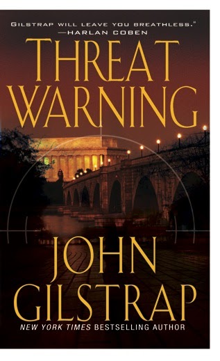
Previously, there’s been a considerable delay between manuscript submission and cover design, but this one came faster than most. The picture above is the concept they sent to me. What do you think?
My only concern at first glance is that the picture is not of the Woodrow Wilson Bridge, but rather of the Memorial Bridge. Of course, at the time when people are responding to the cover and picking the book up off the rack, they won’t know the significance of that.
Share your thoughts, and please be honest: Would this cover jump out at you from a rack at the store?
I like this cover. It speaks out to me of action and intrigue and big story. I admit, I wouldn’t know one bridge from another so that part didn’t phase me at all.
Yes, this cover definitely works for me. I like the color. I don’t think people are going to be bothered by the bridge thing. I mean, if you see a gun and a badge on a cover, I think it’s meant to represent the officer rather than actually be items that belong to him. I’m not opening the book looking to see if the gun on the cover is the same model he’s carrying.
The cover looks great, John.
That’s an excellent cover. On its own, and it also carries over the design elements from Hostage Zero.
Congrats. An excellent cover.
It’s a nice looking cover, but no, it wouldn’t jump out at me in a store. It looks like pretty much every other book in that genre. I suppose that’s good, in that the reader gets what he’s expecting, but I think it would be easy for the eye to pass over it as “just another one of those.”
I do really like the cover, and the title is great. The eye is drawn to title and the building, not the bridge, but I think that’s great. Few people will know or care about the difference between the named bridges, so I wouldn’t worry about that. I do like the continuation of the telescopic siting element (is that what it’s called?) from the previous book, although the center of the crosshair is on the river water rather than the bridge. I doubt that that would make any difference to the average person picking up the book. I’m like you, I agonize about every little detail about covers, but objections seldom make a difference to publishers. I would (and will!) definitely pick up this book as soon as it hits the shelves. This one is a winner.
It all works, John. Congrats!
I like it. The bridge might’ve been a problem if it was from Madison County.
John…I love that cover. I don’t think it matters a bit that it’s the wrong bridge…the cover is invoking a general sense of place and that’s fine. It is very moody and totally would make me pick it up. Excellent.
i’d be more impressed by the endorsement of harlen coben….that to me would say…’buy me’….but i really like the colors…it’s mysterious.
John,
I think this is a great cover. It’s very catching. You did *ask* for opinions…. Can you change the title? It sounds generic to me, but that is only one man’s opinion.
CJ
Thanks for the input, folks. I get so wrapped up in the minutae of this stuff that outside input is always welcome.
CJ, the title is locked at this point.
By way of full disclosure, I heard from my editor this morning that this artwork hasn’t even been presented to the sales department yet, so all of this might be premature. Still, input is always welcome and useful.
John
http://www.johngilstrap.com
I like the title font, size, setup. I like the cross-hairs and that it comes over from the other books. I like the color feel. No, most people won’t notice one bridge from another and it does establish D.C. However, based on the cover alone- No, it wouldn’t jump out and grab me so I would want to buy it. It has no sense of action or danger. It could be any old government conspiracy book. I love your other books, so based on your name and your character I’d look at it and get it, but not based on the cover. Sorry. (Don’t get me wrong- the artwork and layout is beautiful, but it leaves me in a state of non-grippedness.)
Like the cover, although I agree with Tim. The covers in this genre tend to look very similar.
Any way you can get a picture of the correct bridge on there? For readers in that area, it might be annoying.
I like the cover, John, though it doesn’t jump out for me. Part of the reason for this is that I’m color blind. That of course, isn’t a consideration with the Hard Case Crime books.
I LOVE your synopsis. Can’t wait to read this book!
Excellent cover, JG. Excellent.
I Like the cover, but the fact that you have asked for opinions on the bridge issue and explained your reasons for doing so, makes me think that it is something that is bothering you. With that in mind, my suggestion would be ask for a photo of the right bridge.People may not know one bridge from another, but you do and it’s your book and your name on the cover. It may not be a huge deal what the bridge is, but you, I’m sure, need to be happy with it.
Jane
John- I like the overall design, but I’m not 100% sure that those colors will pop. I’ve found that more muted tones just don’t seem to work as well, and it’s amazing how much darker they come across when they’re offscreen and not backlit. It’s early yet, any chance that your publisher could play around more with the color scheme?
Can’t wait to read it!
Thanks again, everybody. THis is exactly the kind of feedback I was looking for. I’ve decided not to worry about the bridge for a couple of reasons. First of all, the Woodrow Wilson Bridge is not very photogenic, and it would not give a real sense of place.
What the proposed imagery does is set the book in DC in the reader’s mind.
Most concerning are the comments about the cover being sort of “generic thriller.” I guess we’ll see what happens. The Kensignton art department hasn’t let me down yet, so I’ll place my faith there.
When the final design is available, I’ll be sure to post it here.
John
http://www.johngilstrap.com