Last weekend I once again had the privilege of being a panelist at Orycon, our local science fiction convention, and, among other things, moderated panels on writing and pacing your story. Creating a compelling story and keeping a reader turning the pages, to the point of missing sleep to read through to the end, are goals I believe all of us here at TKZ share.
Today’s Words of Wisdom considers three tools to help achieve those twin goals of creating a compelling story that is a page-turner. First off, Joe Moore looks at when and how to actual slow the pacing down. Then, Jordan Dane gives advice on managing narrative drive. Finally, Elaine Viets shares tips on creating cliffhangers.

Slow things down when you want to place emphasis on a particular event. In doing so, the reader naturally senses that the slower pace means there’s a great deal of importance in the information being imparted. And in many respects, the character(s) should sense it, too.
Another reason to slow the pacing is to give your readers a chance to catch their breath after an action or dramatic chapter or scene. Even on a real rollercoaster ride, there are moments when the car must climb to a higher level in order to take the thrill seeker back down the next exciting portion of the attraction. You may want to slow the pacing after a dramatic event so the reader has a break and the plot can start the process of building to the next peak of excitement or emotion. After all, an amusement ride that only goes up or down, or worse, stays level, would be either boring or frantic. The same goes for your story.
Another reason to slow the pace is to deal with emotions. Perhaps it’s a romantic love scene or one of deep internal reflection. Neither one would be appropriate if written with the same rapid-fire pacing of a car chase or shootout.
You might also want to slow the pacing during scenes of extreme drama. In real life, we often hear of a witness or victim of an accident describing it as if time slowed to a crawl and everything seemed to move in slow motion. The same technique can be used to describe a dramatic event in your book. Slow down and concentrate on each detail to enhance the drama.
What you want to avoid is to slow the scene beyond reason. One mistake new writers make is to slow the pacing of a dramatic scene, then somewhere in the middle throw in a flashback or a recalling of a previous event in the character’s life. In the middle of a head-on collision, no one stops to ponder a memory from childhood. Slow things down for a reason. The best reason is to enhance the drama.
A big element in controlling pacing is narration. Narrative always slows things down. It can be used quite effectively to do so or it can become boring and cumbersome. The former is always the choice.
When you intentionally slow the pace of your story, it doesn’t mean that you want to stretch out every action in every scene. It means that you want to take the time to embrace each detail and make it move the story forward. This involves skill, instinct and craft. Leave in the important stuff and delete the rest.
Joe Moore—March 18, 2015
Each author strives to create a compelling narrative drive (whether they understand what the term means or not) because they want readers eager to turn the page. That means the author MUST manipulate the world and the characters into the optimal story that involves mystery, suspense and intriguing relationships. This covers all genres of writing.
The author controls what is revealed to the reader and parses it out in the most optimal way by their judgement. They make choices on when to reveal things and how they are to be doled out. Natural born story tellers know how to do this instinctively.
The author is in control of EVERYTHING. He or she manipulates the reader with a titillating story and how that story is shared and how it affects the character relationships. Nothing should come as a surprise to the author.
To create MYSTERY elements, the author is guarded about what to share with the reader and when to share it. There’s misdirection with red herrings or through unreliable narrators, for example.
To create SUSPENSE, the author can have the reader follow along and reveal what they want the reader to know as the main characters discover things. This builds on suspense elements.
To give the reader an INSIDER VIEW, the author may reveal things to the reader that the characters don’t know. Let the readers play God from afar and watch the play that is told in the story.
KEEP A READER CURIOUS and/or WORRIED – Readers are naturally curious folks. Give them something to uncover. A wise author will let a reader’s minds be piqued by carefully placed clues. Or an author might make readers worry for the characters they’ve grown fond of. Make readers care and escalate the danger for the characters. Again, this post might sound geared for crime fiction, but it can apply to any genre. The threat does not have to involve life or death. It can involve the heart or the emotional survival of a family enduring a tragedy or a stigma.
WHAT KILLS NARRATIVE DRIVE
1.) Backstory dumps and long boring expositions can kill a strong page turner.
2.) When one scene doesn’t lead to a cause and effect, the plot may drift without cohesion. The reader gets lost in the amble. Actions must have consequences for the reader to want to come along for the ride.
3.) Cheating at mystery elements, where the author creates intrigue, but the outcome is a let down or a head fake for the reader. That’s when a reader will throw a book against a wall and may never buy an author again.
4.) Cheap surprises without build up is the same type of disappointment. Don’t pull a killer or a bad actor or a story element from thin air to end the book.
5.) No coincidences. An author might get away with a coincidence in the first few pages of a story, but a coincidence should never end the book. Major No-No.
HOW TO FIX A FAULTY NARRATIVE DRIVE:
I believe that each scene in a book should be like a mini-story. It should have a compelling beginning, a journey through the scene with purpose, and an ending that foreshadows what’s to come to create a page turner. Each scene should move the plot forward by 1-3 plot points, making that scene impossible to delete without toppling your story (like the wood block-building game of Jenga.)
I endeavor to build as many of these scenes as possible, even with scenes that build on a relationship as a subplot. The subplot should have a journey through the book as well.
Jordan Dane—October 3, 2019
Cliffhangers are the hooks that make your readers keep turning the pages, pulling them into the next scene or chapter. Most cliffhangers come at the end of the chapter. If your readers are hooked, they’ll continue reading.
Here are some tips for good cliffhangers:
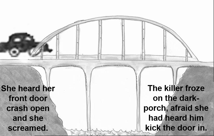
A cliffhanger should catch your readers by surprise.
Something unexpected has to happen: Someone threatens to jump off a bridge. Their car goes into a skid on a snowy curve. A door opens unexpectedly. Then, bam! The chapter ends.
Darkest Evening, Ann Cleeves’ new Vera Stanhope novel, has a perfect cliffhanger chapter ending. Vera follows a killer, who gets her alone and strangles her. I’ve edited out the killer’s name in this section, but you get the idea.
“As Vera began to lose consciousness, she thought that this was her fault. . . it was her pride again, making her think she was indestructible.
“Then the world went blank.”
I couldn’t wait to turn the page and see what happened to Vera. Not to mention the killer.
Someone unexpected arrives. A crook, an innocent person, a cop, just in time. This person is a surprise. They abruptly break up the scene.
Someone leaves.
A bride suddenly leaves the groom standing at the altar. A couple is fighting, and he walks out on her. She suddenly quits her job.
Sometimes, the cliffhanger is a new piece of information.
Your character learns something. She’s not married legally to her husband after all because he never divorced his first wife.
Or, he’s not the son of the man he called father: the DNA test proved it.
Your character notices something. The detective sees the scratches around the door lock and realizes the house had been broken into. A wife finds lipstick on her husband’s shirt – scarlet lipstick. She never wears that color.
Your character figures something out. She finally understands the key to the puzzle the dead man left behind. He finally knows why his dead father wanted him to listen to the CD he left in his desk drawer.
Your character decides something. She’s going to leave her abusive husband. He’s going to rob the store to get enough money to feed his family.
She’s going back to school.
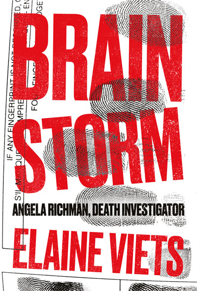
Elaine Viets—May 14, 2020
***
- How much do you think about slowing your story’s pacing when writing or editing? Do you have a favorite technique?
- What does narrative drive mean to you? How important is it to you?
- Do you use cliff-hangers? If so, what sort and when?
***
Empowered: Agent, the first book in my Empowered series, is currently free at all major ebook retailers.
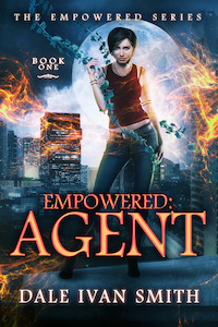
The world says those possessing superpowers are either heroes or villains. But what if you’re both? Mathilda Brandt isn’t the angry, out-of-control teenager she was before she got out of jail. She’s hungry for a chance at a normal life, but when a gang threatens her sisters, she has no choice but to use her illegal superpower to protect them. A secretive government agency gives her a choice: go back to prison for life, or infiltrate a notorious super-villain group in order to stop a psychotic Empowered. To save her city, her family, and herself, Mat must become the last thing she ever wanted to be again: a criminal.


![AWREATH3_thumb[1]](https://killzoneblog.com/wp-content/uploads/2013/12/AWREATH3_thumb-25255B1-25255D_thumb-25255B1-25255D.gif "AWREATH3_thumb[1]")