
By PJ Parrish
Morning folks. I am probably somewhere over Lake Erie right now, heading to New York for my annual gig as Edgar banquet chairman. So forgive me if I can’t engage in the usual dialogue here. In my place, here’s a gallery of this year’s Edgar nominees book covers.
Normally, I show you these to spotlight any trends in cover design. But I don’t see any clear direction in how book art is moving. Maybe there are no solid trends anymore. There used to be. Back in my salad days, BIG serif typefaces were the rage, usually with a small graphic that was supposed to somehow signify the book’s theme or such. Such as in my early Louis Kincaid books:


This was defnitely an attempt at branding, very uber-Patterson. Many, many other mysteries had the same look back in the early 2000s. But today, it seems to my eye at least, there is much more variety and less follow-the-leadering. Perhaps it is because the writing/subject matter in crime fiction is more small-c catholic these days?
Take a look at the covers for this year’s Best Novel:
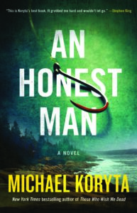
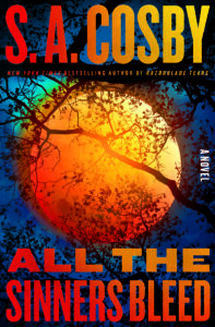
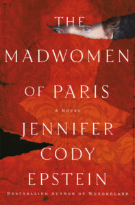
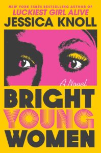
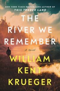
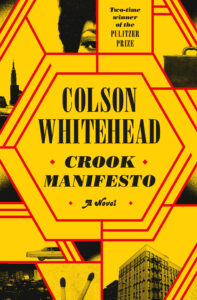

To my eye, the designs are very diverse — everything from the “traditional” lyrical design of Burke and Krueger to the hyper-graphic neon of Knoll and Whitehead. Koryta’s and Cosby’s covers look similar — bold san-serif type with that “old-fashioned” graphic element. And Edstein’s red cover seems out there on its own island, an attempt perhaps to suggest a more literary upmarket tilt? (Yeah, I hate the term upmarket too, but that does seem to be a trend of late).
Compare that group with the Lilian Jackson Braun nominees. (Caveat: This, like the Mary Higgins Clark Award and Sue Grafton Award, are not Edgars, but special auxiliary awards). The Braun nominees:
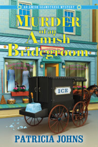

No way can a reader mistake these books for hardboiled, right? They clearly reflect Braun’s legacy. Mystery Writers of America is very clear on what qualifies for this award: “The book must be a contemporary cozy mystery with a current-day setting and the story emphasis on solving a crime, usually a murder. Historical mysteries, even if cozy in tone, do not qualify. However, the book may contain some historical elements (flashbacks, journal entries, etc.) as long as the emphasis is on the contemporary investigation of the mystery.” (There’s more VERY specific criteria if you want to read it — link here.)
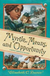
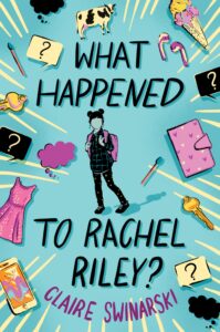
Likewise, the Best Juvenile nominees this year are all of a sort. These covers convey a child-like exhuberance and, like an ice cream triple-scooper, invite you to taste. It’s easy to identify the intended age audience:
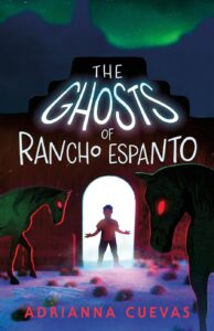
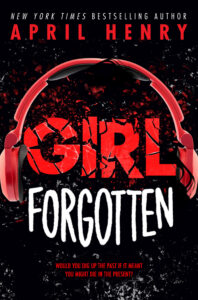
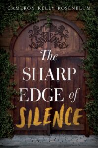
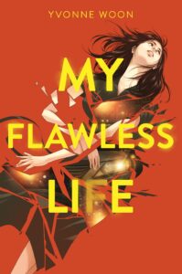
Compare that with the very dark mood seen among most the Best Young Adult nominees. Any of these covers could be comfortable among Best Novel category:
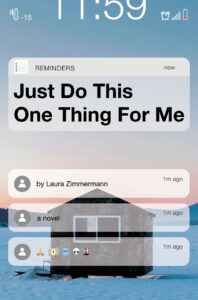
Just curious: What do you all think about that last blue cover Just Do This One Thing For Me? When I first saw it, I thought it was cropped wrong. But no, this is the full cover, intended to mimic an iphone, of course. I dunno…I find it hard to read. But then again, I’m not thirteen. At Staples yesterday, I had to get Brian’s help to find a lousy printer cord. (I had bought a modem cable by mistake).
One last category before I go. I was struck by the variety among the Paperback Original nominees this year. Usually, they tend to look alike, or at least as if they are from the same family. Maybe this is because PBO’s, being smaller, have to scan faster for the readers’ eyes. This year, they seem all over the place, mood-wise.
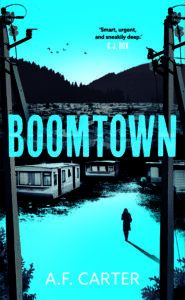
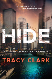
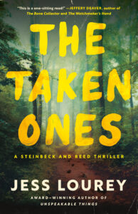
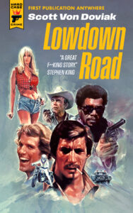
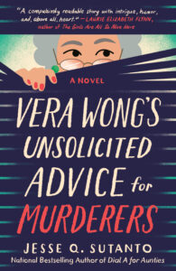
I like the creepy Cape Fear look of Boomtown. The cover defnitely conveys a sense of place and mood. I don’t think the cover of Hide is as successful because its geographic image is so generic. The Taken Ones has a certain tension, thanks to that ragged type face. Lowdown Road gets the signature Hard Case Crime treatment — you know you’re in neo-noir land. I’m not crazy about the Vera Wong cover. It feels like it belongs with the Braun entries, although the old peeking lady image is kind of cool. One reviewer called it perfect for readers looking for “more humor than angst.” I haven’t read the book, so what do I know?
There you go….covers for every taste. Your own takeaway here — if you are doing your own covers or hiring someone to do so — is just be very aware of what audience you’re aiming for (age group, traditional vs noir, light vs dark, humor vs deadly serious). Respect your sub-genre if necessary (ie Braun). Make sure your cover captivates possible readers AND that it captures the mood and theme of your story.
Oh, and pay attention to how it looks when it’s reduced down to a tiny thumbnail on Amazon. But that’s a blog for another day. See you when I get back.
In Murder of an Amish Bridegroom, the yellow font is lost in the background. I had to squint to make out it was “of an” between the capitalized words of the title. If I have to work that hard to read the cover, I won’t be reading the book.
The cover I liked the most was “Lowdown Road”, the Scott Von Doviak book. The minute I saw it, I immediately flashed back to the heyday of mass market fiction for Star Trek the Original Series—this gathering of headshots theme was very common to Star Trek covers in the 70’s and 80’s so to me, the style is a blast from the past.
And only one with “Girl” in the title. I judged PBOs in 2015 and the covers all looked alike. Maybe because so many dealt with serial killers. As I recall, the winner was the one book that had a very different cover, not that it had anything to do with our voting.
Thanks for this great overview, Kris.
Re the cover of: Just Do This One Thing
I like the concept of this cover. Back in 2016, the original cover for my first book Instrument of the Devil was the face of a cell phone held in a man’s hand with the image of the heroine displayed on the screen. The villain was surveilling/stalking her with then-new phone technology. The publisher changed the cover to a frog-green scene of her sitting in the woods beside a lake. I never liked it but they were paying me so I went with it.
Later, when they closed up shop, I got the rights back and republished it with a cover by the talented Brian Hoffman, TKZ regular.
Thanks for posting all these covers, Kris. It’s interesting to compare them and try to understand what the designers were trying to convey.
Two of the covers immediately brought to mind covers of recent best sellers. Bright Young Women made me think of Lessons in Chemistry, and The River We Remember brought back thoughts of Where the Crawdads Sing. Made me wonder if cover designers sometimes look for ways to make readers subconsciously connect the new titles with previous successful books.
I don’t like translucent images over another background, so I didn’t care for Just Do This One Thing for Me.
I like the retro look of Hard Case books. But you need the right artist, and that runs into money.
I wonder, though, if with AI gen one can find a way to do it.
Could AI do it?
Yes.
Used: Nightcafe AI, Raw pixel (book cover template, PhotoShop, Adobe Color. About 20 minutes.
https://aportman.com/wp-content/uploads/2024/04/red-dress-copy.png
Wow! Gorgeous.
Now I just need to channel my inner Mickey Splane and write a book.
Pretty cool. I see AI still hasn’t mastered human hands. The one on the bed has the usual issues. Why are faces so easy and hands so difficult?
Great rundown of covers from this year’s Edgar nominees, Kris. The covers showing the Lillian Jackson Braun nominees is especially interesting to this cozy mystery author. My own series is historical cozy, so definitely different emphasis in covers, still trying for the cozy vibe, but showing the era, too.
Safe travels!
My favorites are the Original Paperbacks. They seem to convey something about the story and you’re pretty sure you’re getting what you think you are. I would pass most of the others by without a second look.
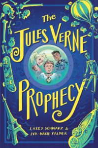
Just Do This One Thing for Me is a neat idea and certainly contemporary. But the text is too small. Whitehead is a little busy, but does stand out. I am going to have to check out the Jules Vern book.
The iPhone cover doesn’t do it for me, either. Too generic — we see the face of our cells every day — but the title isn’t bad.
Have fun at the Edgars!