
By guest blogger, Alison Gaylin
 This is a big month for me because I have two books coming out. HEARTLESS, my new standalone, launched in the states September 2, while TRASHED – which came out a year ago in the US – launched in the UK September 4.
Unlike Alafair Burke, who posted here recently, I was never 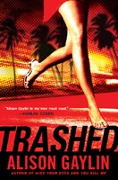 asked to make any changes to “Britishize” the book, which is set in L.A. and features a reluctant supermarket tabloid reporter who uncovers a grisly series of Hollywood murders. But what makes it feel like a new book to me is the cover. Check it out; TRASHED’s British exterior is markedly different.
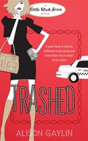 Not to jump into the whole “lipstick on a pig” dialogue but please look at this cover and tell me if any man would be caught dead carrying TRASHED to a checkout counter. (And don’t forget to factor in the chapter headers, which all feature sweet little striped satin hangers hovering over them).
I’m not surprised – LBD is a chick lit oriented imprint whose name says it all – and I actually think their covers are adorable. But I’m fascinated by all of this from a marketing perspective. A British friend assures me that chick lit is still huge in the land of Bridget Jones, but here’s the thing. I’m hoping I can fulfill my end of the deal. I’m hoping that the murders in TRASHED aren’t  too gruesome, that there’s enough romance and shoes and pure girly fun to live up to what the cover promises. Over the next year, my other four books will be coming out – four months apart – on the LBD imprint. I can’t wait to see what their covers look like – I know they’ll be miles away from my US covers. That’s fine with me. I just want British readers to buy my books, and read them. Cover to adorable cover.
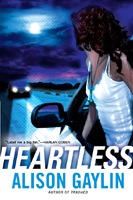
How important is a cover to you? Have you ever bought – or not bought – a book based on the jacket it’s wrapped in? (I sort of hope the answer is “yes,” because HEARTLESS’s cover is pretty great.)
Alison,
I think book covers are critical. They can cause a casual browser to pick up the book or move on–a decision that usually takes less than a second. I’ve had a number of my books be released in other countries with truly strange covers, but I have to trust in the marketing skills of the foreign pubs to know their readers and what’s worked for them in the past.
I must admit that I would be hard pressed to pick up the UK version of TRASHED based upon the cover alone. But again, you have to trust in the marketing judgment of the UK publisher. I hope they’re right.
The cover has a lot of power, to attract or not. Like Joe, I try to trust the publisher’s choice but they’re hard to fathom. I’ve had markedly opposite cover styles for the same book, from the hardback to the paperback editions, even when both are in the US.
Camille, how were your covers different, and did either prove more appealing to readers? Joe, I agree that covers really are critical. And if you’d be hard pressed to pick up UK TRASHED, consider the imprint’s slogan: “It’s a girl thing…”
Hi Alison, I think covers are absolutely critical. Unfortunately, not every author is as lucky as you are in getting publishers and art depts who know how to design such a good one! And we authors usually have little control over them, so you just have to keep your fingers crossed. Thanks for visiting today!! Great subject!
Alison-
Great post, thanks so much again for stopping by! And yes, I think most people do judge a book by its cover, sad to say. I’ve had mixed luck with mine- if I had to do it over again, I’d probably have fought for a different one on my first book, but on Boneyard I think the art department nailed it. And I really have loved my foreign covers, always so interesting to see the differences. My French cover for Tunnels was dark and spooky and featured a cobblestone tunnel that had no relation at all to what was in the book. Strange.