
By PJ Parrish
Morning, crime dogs. I’m up in Manhattan today, helping out at the Edgars again. My main duties as banquet chair don’t kick in until Wednesday night. As part of this gig — been doing it for more than 20 years now — I put together the Powerpoint of all the nominated book covers that are then projected on the ballroom’s big screens.
And I gotta tell you, from the reactions I’ve noticed from the nominees, seeing your cover six feet tall can make you feel six feet tall.
I love this job because I get to see all the covers ahead of time. It’s given me, over all these years, a unique viewpoint on trends in design. And there are some really stunning covers this year. So, as usual, I’m here today to share some of the goodies with you.
Some caveats.
- I’m no graphic design expert. Just an old art major who couldn’t get a job.
- This is only a broad sampling.
- And it’s only for mysteries and thrillers, so that might create some distinctions from, say, romance, fantasy, sci-fi and…ahem…literary fiction. (Go ahead. I can take your best shot).
But I can identify some trends within our genre that seem to be sustaining over the recent years. And maybe this is helpful to you if you are designing your own cover or hiring someone to do it. It’s good to know what is working in the market these days.
One is the use of really bold san-serif type faces. This has been strong for a couple years now, but it seems really cemented now. Very few books are using lighter serif fonts. Maybe it arises from the need to stand out graphically on the book shelf and the Amazon pages. Filigree is passe. It feels like books are “shouting” more than ever.
Second: graphics are tending to be simpler, more easily scan-able. Graphics and photos are more stylized or manipulated for greater eye appeal.
Third: Colors are intense and highly saturated. Even when the cover’s mood is noirish or bleak, it is countered with “hotter” type faces. Some examples from Best First:
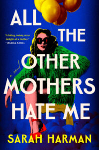
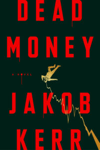
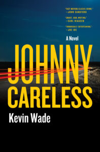
A sidenote: For All The Other Mothers Hate Me, I like the way the designer carefully positioned each word around the graphic so you focus on the woman’s face and those red shoes.
Here are a few samples from Best Paperback Original:
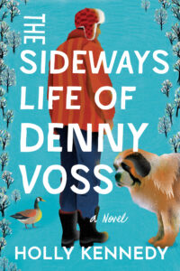
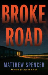

Note how the colors suggest different moods. I haven’t read any of these but to me the turquoise cover suggests a lighter story tone. Broke Road screams thriller. And The Backwater suggests, to me at least, a quieter, character-driven story. I could be wrong but that is what good cover design is all about — it conveys at a glance the mood, the tone, the themes of your story.
The Best Novel covers, to a one, all adhere to the bold sans-serif look. Here’s a few:
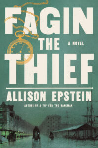

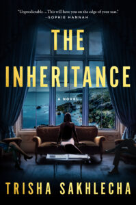
Fagin The Thief is interesting in that it is obviously a historical. In recent years, historicals tended to use softer, less in-your-face type, adhering to the idea that archaic looking type faces signaled the book took place in the past. Looks like that’s now “old hat.” Of course, if you’re a mega-bestseller like Robert Crais, well, your name gets star treatment. I like the quiet yet foreboding ambiance of The Inheritance. If you look closely, something is clearly not right between that trio sitting at the window. To my eye, an effective conveyance of mood.
Another on-going trend is the use of bold fonts that mimic free-drawn type faces. This was strong in Young Adult this year:

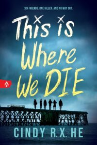
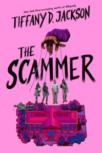
In the Best Juvenile nominees, however, the covers are staying traditional, with the busy, joyful and decidedly candy-store styles we’ve come to expect:
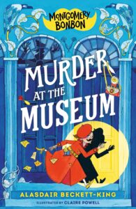
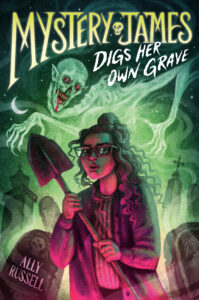
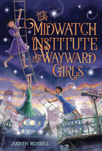
With one exception:
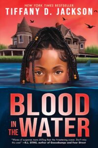
I have to confess, this is one of my favorites. Such graphic impact. And again, that bold san-serif font. More “young adult” looking than I’ve seen in this category.
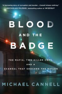
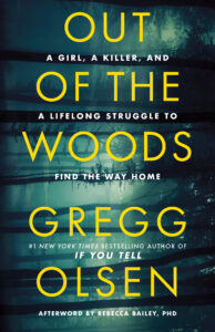
In non-fiction categories, trends seem to be more static. Often because the titles are so darn long (many with subtitles) that there’s not much room for graphic flights of fancy. Plus, the subject matter is mood-serious. A few standouts from True Crime, again all sans-serif.
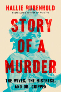
And some examples from Best Critical/Biographical. Again, note the lack of serif, the boldness. And how much title/subtitle type they’ve managed to get on those covers!


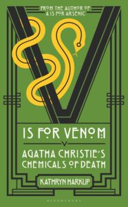
BUT…again, there is always an exception. It comes out of the Best Critical/Biographical, where normally, the designers must cram a title, a subtitle, author name and some kind of graphic onto very limited space. This gets my nod for the most striking cover of any nominated book this year:
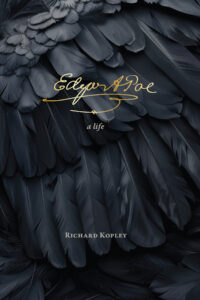
Such mood, such simplicity. Edgar Allen Poe preached what he called “unity of effect.” Every sentence, every detail has to be used to create a single, intense emotional effect. That’s a good rule for any of you out there who are designing your own covers or hiring someone to do it for you.
I think Poe himself would have liked this one.
Kris, your annual rundown of covers is always fascinating.
I too like the Poe cover b/c it perfectly captures his mood, theme, and personality. However, IMHO the title and author could have been brighter and bolder. Those of us with aging eyes prefer more contrast.
Yes, do not disagree there. If seen on Amazon or a small site somewhere, it would probably just look like a black monolith with the title barely visible. It is a universtiy press, so don’t know if that factored in. However, If I saw this on a bookshelf, I’d be tempted.
Some of them like the Poe biography fail the thumbnail test. They look great big but are hard to read small for those of us searching through Amazon or our public library catalog. Author and title shouldn’t be an afterthought in design.
Definitely….fail the thumbnail test. I didn’t want to show you any covers that I thought could have been better….no negativity here. I wonder how much designers and/or authors really consider that thumbnail test in their equation nowadays. My sister does a lot of cover design and so many authors request complicated, wordy and often muddy designs. Half of her job is trying to convince them to step up into the modern age. I think it goes to the idea that they want to convey EVERY literal aspect of their books — locale, mood, a human image that represents their hero — all on one small cover.
Always enjoy your insights, Kris. Love, love, love the Poe cover! It’s my absolute favorite on this list. The YA cover didn’t work for me, because the girl’s face coming out of the water looks too AI-generated.
I was an Edgar judge back in … 2015? … which may have been early in the bold sans serif fonts. Frankly, after looking at the vast number of books we had to read, they were boring, same-old, same-old, and maybe it’s stuck with me, because I still don’t like them. There seemed to be a lot of shadowy figures, too. As I recall, the winner in the category I judged, ‘Best Paperback Original” had a very different cover style, but I know that didn’t play into our judging.
Not to say there aren’t some good covers here this year.